- Progress ⇐
Control
- drawingChars :
Object The characters used to draw the progress bar.
- ProgressConfig
The configuration object for the progress class
- ProgressStyle
Defines the styles and settings for the progress bar
The configuration object for the progress class
Kind: global interface
Properties
| Name | Type | Description |
|---|---|---|
| id | string |
The id of the progress (required) |
| length | number |
The length of the progress bar (required) |
| thickness | number |
The thickness of the progress bar (required) |
| x | number |
The x position of the progress bar (required) |
| y | number |
The y position of the progress bar (required) |
| [value] | number |
The value of the progress bar (optional) |
| [min] | number |
The minimum value of the progress bar (optional) |
| [max] | number |
The maximum value of the progress bar (optional) |
| [unit] | string |
The unit of the progress bar (optional) |
| [increment] | number |
The increment of the progress bar (optional) |
| [label] | string |
The label of the progress bar (optional) |
| [style] | ProgressStyle |
The style of the progress bar (optional) |
| orientation | Orientation |
The orientation of the progress bar (required) |
| [interactive] | boolean |
Whether the progress bar is interactive (optional) |
| [visible] | boolean |
Whether the progress bar is visible (optional) |
| [enabled] | boolean |
Whether the progress bar is enabled (optional) |
| [draggable] | boolean |
Whether the progress bar is draggable (optional) |
Defines the styles and settings for the progress bar
Kind: global interface
| Param | Type | Description |
|---|---|---|
| background | BackgroundColorName | HEX | RGB |
The background color of the progress bar |
| borderColor | ForegroundColorName | HEX | RGB |
The color of the border |
| [textColor] | ForegroundColorName | HEX | RGB |
The color of the text |
| color | ForegroundColorName | HEX | RGB |
The color of the progress bar |
| [theme] | "precision" | "htop" | "htop-light" | "htop-heavy" |
The theme to use for the progress bar ["precision", "htop", "htop-light", "htop-heavy"] |
| [boxed] | boolean |
Whether or not to draw a box around the progress bar |
| [showPercentage] | boolean |
Whether or not to show the percentage |
| [showValue] | boolean |
Whether or not to show the value |
| [showMinMax] | boolean |
Whether or not to show the min and max values |
| [showTitle] | boolean |
Whether or not to show the title |
| [bold] | boolean |
Whether or not to bold the text |
| [italic] | boolean |
Whether or not to italicize the text |
| [dim] | boolean |
Whether or not to dim the text |
| [underline] | boolean |
Whether or not to underline the text |
| [inverse] | boolean |
Whether or not to inverse the text |
| [hidden] | boolean |
Whether or not to hide the text |
| [strikethrough] | boolean |
Whether or not to strikethrough the text |
| [overline] | boolean |
Whether or not to overline the text |
Kind: global class
Extends: Control
This class is an overload of Control that is used to create a Progress bar.
Emits the following events:
- "valueChanged" when the user changes the value of the progress bar with the scroll wheel (if interactive is true).
- "click" when the user clicks on the progress bar (if interactive is true).
- "relese" when the user releases the mouse button on the progress bar (if interactive is true).
- "rightClick" when the user clicks on the progress bar with right button (if interactive is true).
- "rightRelese" when the user releases the right mouse button on the progress bar (if interactive is true).
| Param | Type | Description |
|---|---|---|
| config | ProgressConfig |
The configuration object for the progress bar |
Example
const pStyle = {
boxed: true,
showTitle: true,
showValue: true,
showPercentage: true,
showMinMax: false,
}
const p = new Progress({
id: "prog1",
x: 10, y: 2,
style: pStyle,
theme: "htop",
length: 25,
label: "Mem"
})
const incr = setInterval(() => {
const value = p.getValue() + 0.25
p.setValue(value)
if (value >= p.getMax()) {
clearInterval(incr)
}
}, 100)
const p1Style = {
background: "bgBlack",
borderColor: "yellow",
color: "green",
boxed: true,
showTitle: true,
showValue: true,
showPercentage: true,
showMinMax: true,
}
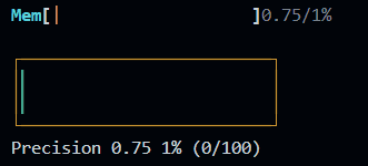
const p1 = new Progress({
id: "prog1",
x: 10, y: 4,
style: pStyle,
theme: "precision",
length: 25,
label: "Precision"
})
const incr1 = setInterval(() => {
const value = p1.getValue() + 0.25
p1.setValue(value)
if (value >= p1.getMax()) {
clearInterval(incr1)
}
}, 100)
const p2Style = {
background: "bgBlack",
borderColor: "yellow",
color: "magenta",
boxed: true,
showTitle: true,
showValue: true,
showPercentage: true,
showMinMax: true,
}
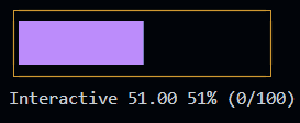
const p2 = new Progress({
id: "prog3",
x: 10, y: 6,
style: pStyle,
theme: "precision",
length: 25,
label: "Interactive",
direction: "vertical",
interactive: true,
})
p2.on("valueChanged", (value) => {
console.log(`Value changed: ${value}`)
})The characters used to draw the progress bar.
Kind: global constant