You signed in with another tab or window. Reload to refresh your session.You signed out in another tab or window. Reload to refresh your session.You switched accounts on another tab or window. Reload to refresh your session.Dismiss alert
Is your feature request related to a problem? Please describe.
I need a dynamic way to render charts based on summary statistics for categories from a single field (because the underlying data in changing constantly).
An image chart is worth a thousand words.
Describe the solution you'd like
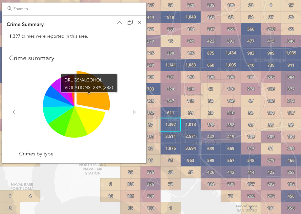
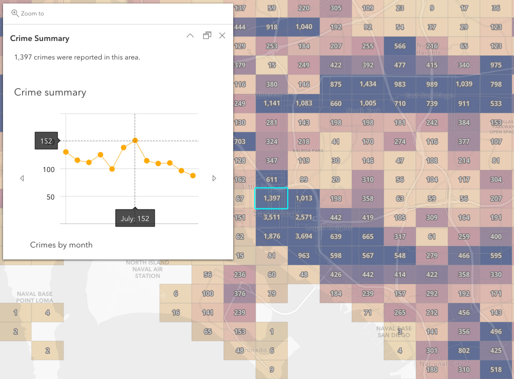
I want to be able to generate charts like this based on a point layer:
Pie chart - Based on category (e.g. crime type):
Line chart - Based on time field (e.g. crime date):
Describe alternatives you've considered
Precalculate fields using Aggregate fields tool, ArcGIS Pro, etc. (but it doesn't work when my data is static), or building custom code on each app
Check existing issues
Execution profile
Popup
Is your feature request related to a problem? Please describe.
I need a dynamic way to render charts based on summary statistics for categories from a single field (because the underlying data in changing constantly).
An
imagechart is worth a thousand words.Describe the solution you'd like
I want to be able to generate charts like this based on a point layer:
Pie chart - Based on category (e.g. crime type):

Line chart - Based on time field (e.g. crime date):

Describe alternatives you've considered
Precalculate fields using Aggregate fields tool, ArcGIS Pro, etc. (but it doesn't work when my data is static), or building custom code on each app
Additional context
This article and this webmap provide examples on how to do that.
The text was updated successfully, but these errors were encountered: