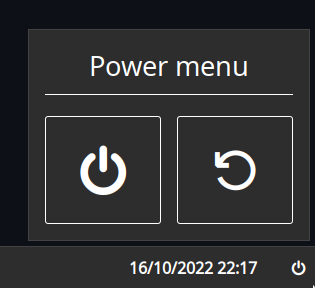
-
Notifications
You must be signed in to change notification settings - Fork 59
Custom
Allows you to compose custom modules consisting of multiple widgets, including popups. Labels can display dynamic content from scripts, and buttons can interact with the bar or execute commands on click.

Type:
custom
This module can be quite fiddly to configure as you effectively have to build a tree of widgets by hand. It is well worth looking at the examples.
| Name | Type | Default | Description |
|---|---|---|---|
class |
string |
null |
Container class name. |
bar |
Widget[] |
null |
List of widgets to add to the bar. |
popup |
Widget[] |
[] |
List of widgets to add to the popup. |
| Name | Type | Default | Description |
|---|---|---|---|
widget_type |
box or label or button
|
null |
Type of GTK widget to create. |
name |
string |
null |
Widget name. |
class |
string |
null |
Widget class name. |
label |
string |
null |
[label and button] Widget text label. Pango markup supported. |
on_click |
string |
null |
[button] Command to execute. More on this below. |
orientation |
horizontal or vertical
|
horizontal |
[box] Whether child widgets should be horizontally or vertically added. |
widgets |
Widget[] |
[] |
[box] List of widgets to add to this box. |
Labels can interpolate text from scripts to dynamically show content.
This can be done by including scripts in {{double braces}} using the shorthand script syntax.
For example, the following label would output your system uptime, updated every 30 seconds.
Uptime: {{30000:uptime -p | cut -d ' ' -f2-}}
Both polling and watching mode are supported. For more information on script syntax, see here.
Buttons can execute commands that interact with the bar, as well as any arbitrary shell command.
To execute shell commands, prefix them with an !.
For example, if you want to run ~/.local/bin/my-script.sh on click,
you'd set on_click to !~/.local/bin/my-script.sh.
The following bar commands are supported:
popup:togglepopup:openpopup:close
XML is arguably better-suited and easier to read for this sort of markup, but currently is not supported. Nonetheless, it may be worth comparing the examples to the below equivalent to help get your head around what's going on:
<?xml version="1.0" encoding="utf-8" ?>
<custom class="power-menu">
<bar>
<button name="power-btn" label="" on_click="popup:toggle"/>
</bar>
<popup>
<box orientation="vertical">
<label name="header" label="Power menu" />
<box>
<button class="power-btn" label="" on_click="!shutdown now" />
<button class="power-btn" label="" on_click="!reboot" />
</box>
<label name="uptime" label="Uptime: {{30000:uptime -p | cut -d ' ' -f2-}}" />
</box>
</popup>
</custom>JSON
{
"end": [
{
"type": "clock"
},
{
"bar": [
{
"on_click": "popup:toggle",
"label": "",
"name": "power-btn",
"type": "button"
}
],
"class": "power-menu",
"popup": [
{
"orientation": "vertical",
"type": "box",
"widgets": [
{
"label": "Power menu",
"name": "header",
"type": "label"
},
{
"type": "box",
"widgets": [
{
"class": "power-btn",
"on_click": "!shutdown now",
"label": "<span font-size='40pt'></span>",
"type": "button"
},
{
"class": "power-btn",
"on_click": "!reboot",
"label": "<span font-size='40pt'></span>",
"type": "button"
}
]
},
{
"label": "Uptime: {{30000:uptime -p | cut -d ' ' -f2-}}",
"name": "uptime",
"type": "label"
}
]
}
],
"type": "custom"
}
]
}TOML
[[end]]
type = 'clock'
[[end]]
class = 'power-menu'
type = 'custom'
[[end.bar]]
on_click = 'popup:toggle'
label = ''
name = 'power-btn'
type = 'button'
[[end.popup]]
orientation = 'vertical'
type = 'box'
[[end.popup.widgets]]
label = 'Power menu'
name = 'header'
type = 'label'
[[end.popup.widgets]]
type = 'box'
[[end.popup.widgets.widgets]]
class = 'power-btn'
on_click = '!shutdown now'
label = '''<span font-size='40pt'></span>'''
type = 'button'
[[end.popup.widgets.widgets]]
class = 'power-btn'
on_click = '!reboot'
label = '''<span font-size='40pt'></span>'''
type = 'button'
[[end.popup.widgets]]
label = '''Uptime: {{30000:uptime -p | cut -d ' ' -f2-}}'''
name = 'uptime'
type = 'label'YAML
end:
- type: clock
- bar:
- on_click: popup:toggle
label:
name: power-btn
type: button
class: power-menu
popup:
- orientation: vertical
type: box
widgets:
- label: Power menu
name: header
type: label
- type: box
widgets:
- class: power-btn
on_click: '!shutdown now'
label: <span font-size='40pt'></span>
type: button
- class: power-btn
on_click: '!reboot'
label: <span font-size='40pt'></span>
type: button
- label: 'Uptime: {{30000:uptime -p | cut -d '' '' -f2-}}'
name: uptime
type: label
type: customCorn
let {
$power_menu = {
type = "custom"
class = "power-menu"
bar = [ { type = "button" name="power-btn" label = "" on_click = "popup:toggle" } ]
popup = [ {
type = "box"
orientation = "vertical"
widgets = [
{ type = "label" name = "header" label = "Power menu" }
{
type = "box"
widgets = [
{ type = "button" class="power-btn" label = "<span font-size='40pt'></span>" on_click = "!shutdown now" }
{ type = "button" class="power-btn" label = "<span font-size='40pt'></span>" on_click = "!reboot" }
]
}
{ type = "label" name = "uptime" label = "Uptime: {{30000:uptime -p | cut -d ' ' -f2-}}" }
]
} ]
}
} in {
end = [ $power_menu ]
}
Since the widgets are all custom, you can target them using #name and .class.
| Selector | Description |
|---|---|
#custom |
Custom widget container |