suggestionInputViewVersion = suggestion-input-view-1.4.0
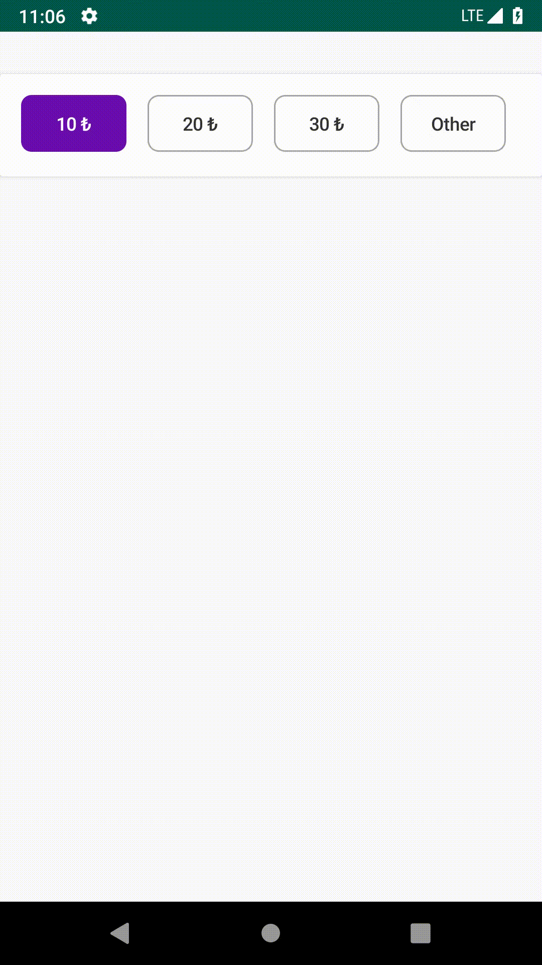
SuggestionInputView allows selecting pre-selected options or entering a custom option
- To implement SuggestionInputView to your Android project via Gradle, you need to add JitPack repository to your root build.gradle.
allprojects {
    repositories {
        ...
        maven { url 'https://jitpack.io' }
    }
}- After adding JitPack repository, you can add SuggestionInputView dependency to your app level build.gradle.
dependencies {
    implementation "com.github.Trendyol.android-ui-components:suggestion-input-view:$suggestionInputViewVersion"
}To set width you can use android:layout_width attribute. To customize more you can use following attributes directly from your layout xml file, or call the functions programmatically.
| Attribute | Method | Description | Default Value | Sample Usage |
|---|---|---|---|---|
app:unselectedBackground |
setUnselectedBackground(Drawable) |
Drawable resource of unselected item | shape_unselected_background_suggestion_item | app:unselectedBackground="@drawable/shape_unselected_background_suggestion_item" |
app:selectedBackground |
setSelectedBackground(Drawable) |
Drawable resource of selected item | shape_selected_background_suggestion_item | app:selectedBackground="@drawable/shape_unselected_background_suggestion_item" |
app:unselectedTextColor |
setUnselectedTextColor(Color) |
Color of unselected item text | #333333 | app:unselectedTextColor="@color/text_color_unselected_suggestion_item" |
app:selectedTextColor |
setSelectedTextColor(Color) |
Color of selected item text | #FFFFFF | app:selectedTextColor="@color/text_color_selected_suggestion_item" |
app:textSize |
setTextSize(Dimension) |
Text size of items | 14sp | app:textSize="@dimen/text_size_suggestion_input" |
app:horizontalPadding |
setHorizontalPadding(Dimension) |
Top and bottom padding of items | 4dp | app:horizontalPadding="@dimen/horizontal_padding_suggestion_item" |
app:verticalPadding |
setVerticalPadding(Dimension) |
Start and end padding of items | 8dp | app:verticalPadding="@dimen/vertical_padding_suggestion_item" |
app:minWidth |
setMinWidth(Dimension) |
Minimum width of items | 80dp | app:minWidth="@dimen/minWidth_suggestion_item" |
app:inputButtonText |
setInputButtonText(String) |
Text of input view's button | Empty String | app:inputButtonText="@string/done" |
app:inputButtonBackground |
setInputButtonBackground(Drawable) |
Drawable resource of input view's button background | shape_unselected_background_suggestion_item | app:inputEditTextBackground="@drawable/shape_unselected_background_suggestion_item" |
app:inputButtonTextColor |
setInputButtonTextColor(Color) |
Color of input view's button text color | #FFFFFF | app:inputButtonTextColor="@color/text_color_input_button" |
app:inputEditTextBackground |
setInputEditTextBackground(Drawable) |
Drawable of input view's edit text background | shape_unselected_background_suggestion_item | app:inputEditTextBackground="@drawable/shape_unselected_background_suggestion_item" |
app:inputSuffix |
setInputSuffix(String) |
Suffix of input view's edit text | Empty String | app:inputSuffix="₺" |
android:inputType |
`` | Input type of input view's edit text input type | TYPE_TEXT_VARIATION_NORMAL | android:inputType="number" |
app:shouldShowSelectableItemError |
shouldShowSelectableItemError(Boolean) |
Change suggestion item's background | false | app:shouldShowError="@{true}" |
app:inputHint |
setInputHint(String) |
Hint of input view's edit text | Empty String | app:inputHint="Hint of input edit text" |
app:showKeyboardByDefault |
show keyboard or not by default for input view | true | app:showKeyboardByDefault="false" | |
app:canDeselectedItem |
for can deselected item | false | app:canDeselectedItem="false" | |
app:badgeBackground |
setBadgeBackground(Drawable) |
Drawable resource of item badge | shape_background_suggestion_item_badge | app:badgeBackground="@drawable/shape_background_suggestion_item_badge" |
app:badgeHorizontalPadding |
setBadgeHorizontalPadding(Float) |
Start and end padding of badge | 8dp | app:badgeHorizontalPadding="@dimen/horizontal_padding_suggestion_item_badge" |
app:badgeVerticalPadding |
setBadgeVerticalPadding(Float) |
Top and bottom padding of badge | 2dp | app:badgeVerticalPadding="@dimen/vertical_padding_suggestion_item_badge" |
app:suggestionBadgeTextColor |
setBadgeTextColor(Color) |
Color of badge text | #F27A1A | app:suggestionBadgeTextColor="@color/text_color_suggestion_item_badge" |
app:badgeTextSize |
setBadgeTextSize(Float) |
Text size of badge | 10sp | app:badgeTextSize="@dimen/text_size_suggestion_input_badge" |
This library is maintained mainly by Trendyol Android Team members but also other Android lovers contributes.
Copyright 2022 Trendyol.com

Licensed under the Apache License, Version 2.0 (the "License");
you may not use this file except in compliance with the License.
You may obtain a copy of the License at

   http://www.apache.org/licenses/LICENSE-2.0

Unless required by applicable law or agreed to in writing, software
distributed under the License is distributed on an "AS IS" BASIS,
WITHOUT WARRANTIES OR CONDITIONS OF ANY KIND, either express or implied.
See the License for the specific language governing permissions and
limitations under the License.