- Overview
- Bio Content
- Mood Board
- Wireframes
- Design Considerations
- Style Guide
- Technology Decisions
- Challenges
- Conclusion
At all times, keeping in mind the primary audience of my website, i.e. potential employers, drove a lot of my design decisions.
Most employers have the following characteristics:
- They want to minimize their time spent considering potential candidates.
- They don't necessarily care if a website has fancy bells and whistles.
- They want to be able to see information about me quickly and easily without much distraction and clicking around.
With that in mind, I designed and built my portfolio website with these goals and specifications:
- Practical and to-the-point, i.e. give people, especially employers, a very quick (30 seconds and no more than 1 minute) and succinct overview about myself, my work, projects and skills.
- Responsive, user-friendly and easy to navigate, especially on mobile devices.
- Clean and aesthetically appealing yet true to my own personality and core values.
- Provide links to Github (for code samples), Medium (for blog posts I've written) and LinkedIn (for background about me).
- Provide a downloadable link to my resume to display my study and work history.
My website needed to have at least the following sections:
- Header and Hero
- About Me
- Projects
- Skills
- Contact Form
I thought carefully about the ordering of the sections. I initially placed skills before Projects. But I decided showing projects first was more important because projects are where skills are actually applied and put into practice.
I started out by coming up with a first draft of my bio, the idea being this might help me come up with some keywords for searches when putting a mood board together.
I came up with this initial draft which I would make changes to later but this provided a good starting point:
Whether I'm writing legal contracts or writing code, my work ethic and attitude are no different. I'm energetic, I enjoy working with people, I see things to completion and I get stuff done.
I love building things that solve real problems for real people. That's where my focus is in all the business websites, web applications and side projects I've been building.
I'm at Coder Academy in Melbourne doing an intensive bootcamp to gain the skills I need to do a better job at what I love doing.
The next stage of the creative design process was to collate inspiration in the form of a Pinterest mood board.
Doing this helped me think about the overall direction for the website and the message I wanted to convey.
In collecting material for the mood board, I browsed Unsplash, Pexels and Pixabay for images that might convey something meaningful about myself, especially my personality and core values. I also included images of typography and colour schemes.
From drafting my bio, some keywords that came to mind were "build", "building blocks", "energy", "work", "inspiration/inspire", "productivity/productive", "professional", "web developer", which generated some interesting search results.
This is also where I collected some typography samples and handwritten signature logos, which I know I wanted on my website.
Having the overall idea of what I wanted on my website, I went on to create wireframes for my website using Figma.
As a person who enjoys the coding process, it took discipline to not code for 2 days and to wait until I had finished the wireframes.
Creating wireframes in Figma turned out to be extremely useful as I this provided a great way to experiment and seek advice/opinions from other people. This is where made most of my design decisions. Once I'd made these decisions, converting the wireframes into code was the easy part.
Given the majority of visitors would likely be mobile users, it made sense to take a mobile-first approach and design the mobile website first before moving on to design for iPad and desktop sizes.
These were my wireframes, which can also be accessed from this link:

I explain my design considerations in detail in the next section.
In making decisions on design elements, including the type of website, colour scheme, typography and layout, I considered websites featuring simplicity, useability, meaningful interaction and subtle use of effects.
I first decided whether I wanted a one-page or multi-page website.
With the primary audience in mind, this was an easy decision to make: The one-page website would minimize the need to click on links and wait for pages to load.
I came across an excellent article about choosing a colour scheme for a website. This line in the article stood out to me:
Big companies don’t pick their dominant / brand colors by accident. It’s strategically chosen to be used as part of their branding and marketing initiatives.
The infographic in the article also informed my decision-making about colour scheme:

Here's another article on the psychology of colour with this infographic, which I also found to be helpful:

At the end of the day, colour choice is subjective. But I also didn't want to base my decision solely on preference.
After consideration, I chose this colour scheme:

- Navy Blue (#003D5B): Dominant colour for my website. Suited my personality and core values. The words dependable, trustworthy, results-oriented, being able to follow through, etc. resonated with me the most.
- Orange (#DA6D2C): Secondary colour. Complementary to blue and represents friendliness, enthusiasm and creativity.
- Dark gray (#C0C0C0): For certain icons on my website which I didn't want to emphasize.
- Light gray (#F1F1F1): For certain backgrounds on my website which I didn't want to be white.
- White (#FFFFFF): For signature logo and navbar items. For enhanced readability, emphasis, professionality and contrast against a dark background.
The majority of portfolio and other websites I've seen use sans-serif fonts.
I also prefer sans-serif fonts for their readability and clean, simple and modern look.
This article makes the observation that sans-serif fonts make websites look more modern, casual, informal and friendly. That's the kind of impression I wanted to convey.
I chose Poppins as the default font for both headings and body text as both its regular and bold characters are clean, modern and very readable.
When it comes to navigation for mobile devices, I really like websites with hamburger icons that morph into a "close (X)" icon when you click or tap on it.
I like the different cool animations you can choose from when you click or tap the icon, e.g. Hamburgers by John Suh.
But "coolness" was not part of the specification. Rather, the question was, "is it user friendly and practical?"
I wanted to resist making design choices purely based on the "cool" factor, aesthetic reasons, popularity or general wide usage across websites.
Instead, I considered what would be best from the standpoint of a user.
From this Medium article entitled "Hamburger menu alternatives for mobile navigation", the author notes:
The hamburger navigation on mobile (and desktop!) hurts UX metrics due to its low discoverability and efficiency.
There are many other articles which essentially say the same thing.
I'd agree the hamburger icon is not always obvious to users. I could be made obvious by adding a "MENU" or "NAVIGATION" label or tooltip next to it so the user knows to click on it.
But even then, a user cannot see the website's content without first clicking on it.
Furthermore, it takes at least 2 clicks or taps to navigate to another section: (1) First, click/tap the hamburger icon, (2) Second, click/tap the link you want to go to.
I wanted the user to be able to navigate to another section with one click. A great option to achieve this was a visible navbar, e.g.

The disadvantage of a visible navbar is it occupies screen real estate and somewhat distracts the user whilst browsing the site.
But the advantages are easy one-click navigation and the user can see right away the contents of my website and go straight to sections they are interested in.
Moreover, any distraction caused by the navbar can be decreased by reducing the size of it.
To minimize obstruction to my logo and hero image, I decided to only show the navbar once the user scrolled past the hero section.
As for positioning of the navbar, I experimented with placement on both the top and bottom of the screen.
I found an article, UX Design for Mobile: Bottom Navigation useful in deciding on navbar placement.
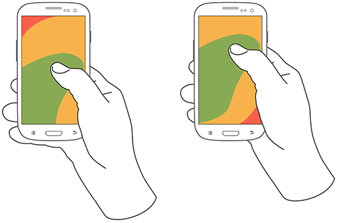
It is notable from that article that 49% of people rely on a one thumb to get things done on their phones.
This image shows areas a user can reach with their thumb to interact with a screen. Green indicates areas a user can reach easily; yellow indicates area that requires a stretch. Red indicates areas that require users to shift the way they're holding the device.
This is an example of Facebook's bottom tab bar:
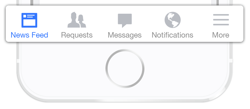
It therefore made a lot of sense to place my navigation at the bottom of the screen to be comfortably reached with one-thumb interactions. Also, top navigation would block the section headings.
This is arguably the most important section of the website as it's the first thing people see when they visit.
For this reason, this section had to be catchy and people had to be able to see my logo and colour scheme right away.
I considered both desktop and mobile versions of websites with clean, simple and bold hero sections.
Ian Lunn's portfolio website interestingly does not have an image for the hero section of the website. This has the advantage of putting the text at the forefront of the viewer's attention.
Mobile Version:

Desktop Version:

This got me thinking that whilst images are effective in conveying certain emotions, messages, feelings or information, not having one serves to highlight content and enhance readability.
The underlining effect when a navigation link item is hovered over or active is an example of meaningful user interaction, letting the user know which page he or she is on or going to.
The hero image on Matt Farley's portfolio website has a dark semi-transparent overlay, which allows the white text to be very readable. His yellow logo also adds a nice touch to the website.
Mobile Version:

Desktop Version:

In Mahédine Yahia's portolio website, I very much liked the white handwritten signature stamped against a dark background as a trademark or logo. I wanted this for own website as it would make it unique.
Unfortunately, the website isn't optimized for the mobile experience.
Mobile Version:

Desktop Version:

After much consideration, I chose to feature a picture of windmills as a hero image.

This image was one of the results generated from typing the word "energy" in keyword searches when collating my moodboard.
This image aptly conveyed my own personality and core values:
- Consistency: Windmills are built to keep going non-stop regardless of weather or other considerations)
- Teamwork: The windmills in the image do not operate in isolation. No one windmill does all the work. Just as multiple windmills generate more energy, much more can be achieved in teams.
I also included my handwritten signature in the hero section as a logo to make my website unique.
As viewer time is precious and limited, I spent a lot of time rewriting and shortening the bio to keep this section as short and to the point as possible.
This is also where I displayed a downloadable link to my resume in PDF format. I chose a downloadable link so prospective recruiters or employers would be able to pass the resume around if needed.
In summary, I wanted the About Me section to provide a short overview about myself and to sustain the viewer's interest long enough (say 3-5 seconds) to then download and view my resume. The text for this section could be viewed in its entirety using 1 thumb scroll or less on mobile devices.
In Ian Lunn's website, the projects are laid out so as to have no white space between them.
Mobile Version:

Desktop Version:

I've observed this layout in other websites as well, such as 24 Digital's website:
Mobile Version:

Desktop Version:

Whilst I liked this layout and considered implementing it in my own website, I decided not to as this is more suitable for displaying brands and logos of companies worked for.
Matt Farley, in his website, has two sections on his website for displaying projects. He displays brand logos of products he's worked on and actual screenshots of his work.
Mobile Version:

Desktop Version:

Mobile Version:

Desktop Version:

In both sections, he uses whitespace and provides space for a description. I also liked that he displays the project on both desktop and mobile, which demonstrates he cares about responsive design.
Another example that makes good use of whitespace in the projects section is this website by Jonny MacEachern.
Mobile Version:

Desktop Version:

For my website, I opted to space out the display of screenshots of my projects and include large images that span the width of the container. I did this to bring more attention to the screenshots themselves.
I also included short descriptions of each project so visitors could see at a glance my skills and/or technologies I used.
When listing my skills, I avoided using the actual logos of the technologies, e.g. the HTML, CSS, Ruby, Rails as they might disrupt the overall look of the page. Also, not all technologies have logos that are easily accessible.
Furthermore, I wanted potential employers to be able to see all my skills at a glance, preferably within the screen of a mobile device.
Instead, I grouped skills into different categories, namely:
- Programming Languages
- Frameworks and Libraries
- Tools
I had initially used some icons from Flaticon to visually represent each category and add colour to the website.
But after taking advice, I decided against it as these icons disrupted my website's colour scheme, were not my own and prevented users from seeing all my skills at a glance.
I also removed the checkbox icons as they unnecessarily added complexity to the layout and decreased readability of this section.
I wanted to keep the contact form section short and simple, especially on mobile devices.
I really liked 24 Digital's design of not having labels on top of the input and instead using placeholders as labels.
I also took some inspiration from Material Design, namely, the upwards floating label text when a user clicks the input fields.

The hollow button which gets filled with colour when hovered over provides a clean design which matches the form input fields.
These are the sorts of design elements I wanted and went on to implement in my own contact form.
Content other than within the hero section should be wrapped in a container with a maximum width of 700px to allow for easy reading.
- Navy Blue: Use this colour all paragraph text, borders for
<input>,<textarea>and<button>elements and logo when against a light background. - Orange: Use this colour for all header tags (e.g.
<h2>and<h3>tags) and active mobile navigation item icons and text. - Dark gray: Use this colour for icons, e.g. links to Github, except in the footer. Also use this colour for non-active navigation bar icons.
- Light gray: Use this colour for the footer background.
- White: Use this colour for the logo when against a dark background and top navbar items on devices with with 992px or greater.
Poppins should be used as the default font family throughout the website.
| Element | Pixel sizes | Description |
|---|---|---|
<h1> |
54px | Should be used for page titles and should appear no more than once per page. Font weight should be 700. |
<h2> |
48px | Should be used for section headings. Font weight should be 700 and should be centre-aligned. |
<h3> |
24px where device width is less than 768px and 32px where device width is 768px or greater | Should be used after <h2> tags. Font weight should be 700 and should be left-aligned |
<p> |
18px | Line height should be 1.7 |
<a> |
Varying | Text decoration should be removed on hover |
| Navbar items | 13px where device width is less than 960px and 28px where device width is 960px or greater | There are 2 kinds of navbar items. One for mobile devices fixed at the bottom of the screen and one for desktop devices fixed on the top of the screen |
| FontAwesome Icons | N/A | Apply fa-2x class |
The same breakpoints used for Bootstrap 4 (beta) should be used for media queries.
| Size | Pixel sizes |
|---|---|
| Extra small | <576px |
| Small | ≥576px |
| Medium | ≥768px |
| Large | ≥992px |
| Large | ≥1200px |
<input> and <textarea> elements should have 0 border radius and 2px border width. They should also have the form-control and form-control-lg classes added to them.
Font size and colour of input text should be the same as <p> elements. Font weight should be bold.
Font size, font weight and colour of placeholder text should be the same as <p> text elements.
Following the material design style for text fields, when an <input> or <textarea> element is clicked, the placeholder text should float to the top of the element and font-size should shrink to 65%.
<button> elements should be hollow with transparent background color. This can be achieved by applying the Bootstrap btn-outline-primary class. The primary colour should be set to #003D5B in the _variables.scss file.
<button> elements should have 0 border radius and 2px border width. They should also have the Bootstrap btn and btn-lg classes added to them.
I used jQuery to detect the page scroll points as well as add and remove classes.
I made selective use of Bootstrap components, including the responsive grid layout, buttons and forms.
I used the _variables.scss file to easily and quickly customize Bootstrap styles.
SASS made writing CSS easier and more enjoyable by allowing modular CSS and usage of variables and nested CSS rules.
Using SASS with Bootstrap also allowed me to specify exactly which Bootstrap files I wanted to package together.
This meant I could select only the Bootstrap components I needed (e.g. responsive grid, buttons and forms) and leave out unused components (e.g. alerts, etc.), thereby minimizing download size for static assets.
I chose Gulp for autoprefixing CSS rules and minifying CSS and JavaScript files.
Given the importance of responsive design, it was incredibly useful to be able to view a webpage on both desktop and mobile devices at the same time during development. Browserync allowed me to do that.
For SEO purposes, I ran my HTML through the W3C Markup Validation Service to ensure that my HTML was valid.
Netlify provides a platform for incredibly easy deployment, hosting of static assets and handling of form submissions.
As I was busy preparing for and attending a hackathon, I had 4 days to start and finish this project (Wednesday 6 September to Saturday 9 September 2017).
As such, time management was extremely important. Following the process of planning, thinking and wireframing before starting to code were crucial in finishing the project on time.
Had I started coding first, I would have made decisions that were not well thought out and I may have wasted time redoing things.
Once I had made my design decisions, coding turned out to be the easy part, which I managed to complete in less than 2 days.
Handling SVGs was tricky.
The first obstacle was converting my signature to SVG. After exploring several apps to no avail, I did some research on Youtube and through this video learnt how to convert my signature in .png format to SVG using Inkscape.
The other obstacle was knowing how to resize and yet maintain the scale of the SVG. Using this Stackoverflow answer, I got the idea of removing the width and height and setting a width for the SVG using CSS by targeting the <svg> element itself, which solved the problem.
I spent quite some time time struggling to figure out how to target the <label> tag with reference to the textarea. Given the following HTML:
<textarea class="form-control form-control-lg" name="message" rows="5"></textarea>
<label>Your Message</label>
I tried selecting the label via the following CSS selector:
textarea:focus + labelBut for a long time, I didn't realize that a grammarly tag was being inserted between the textarea and label tags.
This meant the adjacent sibling tag I used above would not work and I should have instead used the general sibling selector instead like so:
textarea:focus ~ labelI thought the outcome of my portfolio website was better than I had expected and met the goals and specifications I had set at the start of the project.
However, the process was more important than the outcome. I find it all too easy to do things without planning or thinking twice about it, which often leads to suboptimal results.
Contrary to what I had thought before, I found that the planning stage helps save time overall and leads to better results.