Before you add a new report, we ask you kindly to acknowledge the following:
Is your feature request related to a problem? Please describe.
Problem? Depends on how you define a problem... Could also be considered a preference, but if I were to express it as a problem, I'd say it like this: When I look at "Reporting\Traffic Graph," I see a beautiful graph going up and down while scrolling from right to left. I might immediately think "wow, my bandwidth is pegged" or maybe (less common) "oh, not much traffic at the moment..." But I might not be right... (e.g. maybe the graph is near the top, but the scale is only 1Mb, whereas I have 25Mb). To know what is actually going on, I have to take a look at the legend to see what the dynamic graph's Y axis scale is currently set to, so I can actually get meaning from the graph.
A clear and concise description of what the problem is including your motivation for the request,
For the purpose of determining whether any given slowness I'm experiencing is related to my bandwidth being at full capacity (or not), I am missing a solution that will allow me to instantly recognize a pegged interface."
Problem Summary: I can't just glance at the traffic graph and instantly know how much my WAN (or other) interface is used.
Describe the solution you like
A clear and concise description of what you want to happen.
I would like two Radio Buttons (or check boxes) on the /ui/Reporting/Traffic page, labelled "Auto Max Rate In" and "Auto Max Rate Out" which when set to the Auto position, would maintain current behavior of the traffic graphs, but which when NOT set to Auto, would enable two text fields that accept numbers (e.g. bps or kbps), specifying the maximum value of the Y axis, such that the graph becomes a visual representation of just how full "my pipe" is ("pipe," in the general sense, not the "traffic shaper" sense). i.e. When I specify a Max Rate (for either or both In and Out graphs), the Y axis will never change, so if I look at the graph and see all blue or all orange near the top of the graph, I'll instantly know that someone (probably my youngest daughter) is sucking up all our bandwidth.
Describe alternatives you considered
A clear and concise description of any alternative solutions or features you considered.
Another option I thought about suggesting is a feature like I used in DD-WRT (before I setup OpnSense), where the traffic graph has an option for "follow" (similar to OpnSense behavior) or "up," in which case the scale of the Y axis would only go up as you use more bandwidth, so, in theory, for example, when you start running the graph, it will be something low... Then, let's say you get 5Mb of traffic, the Y axis will jump to 5 or 6Mb (something close), and then you usage falls to 1Mb, but the Y axis stays at 5 or 6MB, then you get some more traffic (e.g. maybe you do a speedtest) that maxes out your bandwidth of, let's say 25Mb, so you graph goes up to ~25Mb on the Y-axis, and stays there. Sounds good in theory, as not it should be "locked" at a my max bandwidth and be a good representation of how full my pipe is. But... My IPs resets (or refreshes and reloads) something every ~10 minutes, and for a few seconds during that time, bandwidth is not artificially limited by the traffic shaper, and so while my normal max is 25 Mb/Sec, during that few seconds, it might spike to 50Mb or more, and with my graph in DD-WRT set to "Up," it now scales up to 50Mb on the Y-Axis and stay there, so now, if I look at the graph and see it about half way up the Y axis, I might assume I'm only using half my bandwidth, but since the graph (in this example) scaled up to 50Mb, due to a brief burst of speed, it only looks like half bandwidth usage, but is actually pegged. With my suggested feature, being able to lock the Y scale of the graph, puts the power in the users hands to specify a Y axis value that makes sense for what they'd expect to see on their graph.
Additional context
I wouldn't get rid of the Auto option, since it can be useful, as it can give you a more specific granularity, for example when bandwidth usage is low, if you want more specific info like 100k vs 250k, instead of seeing a graph that makes both those numbers look like ~1Mb. Another option would be to make both the Max and Min numbers something you can specify (e.g. maybe I'm testing some app and I want to see if it gets above 2Mb/sec, then maybe i set min to 2 Mb/Sec and either specify max as well or left max auto-range. I don't know that this is something I need, sounds like more work, etc, so it's not part of my suggestion, but if others have a use model for "I don't care about seeing traffic under X kbps" then it could be just as easily specified, I suppose.
Add any other context or screenshots about the feature request here or links to relevant forum thread or similar
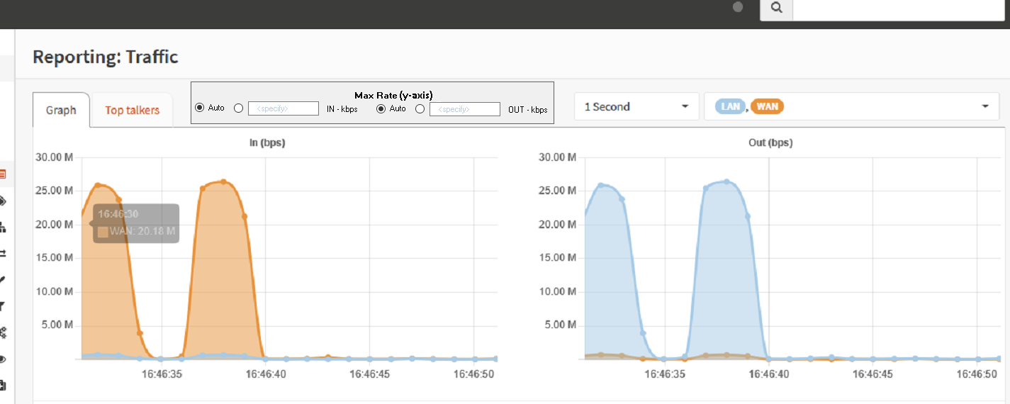
I've not put this in any other forum or thread, but here's a couple mock up screen shots of the general idea I'm getting at... (Not beautiful, but hopefully it gives the general idea; again, could also be checkboxes or different verbiage, etc)
Finally, I looked through the code a bit, but didn't immediately see where options like this could be set, so I thought I'd open this feature request to see if someone would want to pick up the feature and implement it. If people see this as possibly useful (like I do), but don't want to spend time on it, then if there was someone who wanted to point me in the right direction on roughly where code (both visual and calculation code) was located for setting the Y axis of the graph, then I might try to see if I can figure it out myself, and if I did, submit a pull request, but as life would have it, I'm just too busy to spend the time to dig in with no direction and barely any experience with the current code base. :-)
Thanks for your consideration in the matter.
-Mike
Before you add a new report, we ask you kindly to acknowledge the following:
Is your feature request related to a problem? Please describe.
Problem? Depends on how you define a problem... Could also be considered a preference, but if I were to express it as a problem, I'd say it like this: When I look at "Reporting\Traffic Graph," I see a beautiful graph going up and down while scrolling from right to left. I might immediately think "wow, my bandwidth is pegged" or maybe (less common) "oh, not much traffic at the moment..." But I might not be right... (e.g. maybe the graph is near the top, but the scale is only 1Mb, whereas I have 25Mb). To know what is actually going on, I have to take a look at the legend to see what the dynamic graph's Y axis scale is currently set to, so I can actually get meaning from the graph.
A clear and concise description of what the problem is including your motivation for the request,
For the purpose of determining whether any given slowness I'm experiencing is related to my bandwidth being at full capacity (or not), I am missing a solution that will allow me to instantly recognize a pegged interface."
Problem Summary: I can't just glance at the traffic graph and instantly know how much my WAN (or other) interface is used.
Describe the solution you like
A clear and concise description of what you want to happen.
I would like two Radio Buttons (or check boxes) on the
/ui/Reporting/Trafficpage, labelled "Auto Max Rate In" and "Auto Max Rate Out" which when set to the Auto position, would maintain current behavior of the traffic graphs, but which when NOT set to Auto, would enable two text fields that accept numbers (e.g. bps or kbps), specifying the maximum value of the Y axis, such that the graph becomes a visual representation of just how full "my pipe" is ("pipe," in the general sense, not the "traffic shaper" sense). i.e. When I specify a Max Rate (for either or both In and Out graphs), the Y axis will never change, so if I look at the graph and see all blue or all orange near the top of the graph, I'll instantly know that someone (probably my youngest daughter) is sucking up all our bandwidth.Describe alternatives you considered
A clear and concise description of any alternative solutions or features you considered.
Another option I thought about suggesting is a feature like I used in DD-WRT (before I setup OpnSense), where the traffic graph has an option for "follow" (similar to OpnSense behavior) or "up," in which case the scale of the Y axis would only go up as you use more bandwidth, so, in theory, for example, when you start running the graph, it will be something low... Then, let's say you get 5Mb of traffic, the Y axis will jump to 5 or 6Mb (something close), and then you usage falls to 1Mb, but the Y axis stays at 5 or 6MB, then you get some more traffic (e.g. maybe you do a speedtest) that maxes out your bandwidth of, let's say 25Mb, so you graph goes up to ~25Mb on the Y-axis, and stays there. Sounds good in theory, as not it should be "locked" at a my max bandwidth and be a good representation of how full my pipe is. But... My IPs resets (or refreshes and reloads) something every ~10 minutes, and for a few seconds during that time, bandwidth is not artificially limited by the traffic shaper, and so while my normal max is 25 Mb/Sec, during that few seconds, it might spike to 50Mb or more, and with my graph in DD-WRT set to "Up," it now scales up to 50Mb on the Y-Axis and stay there, so now, if I look at the graph and see it about half way up the Y axis, I might assume I'm only using half my bandwidth, but since the graph (in this example) scaled up to 50Mb, due to a brief burst of speed, it only looks like half bandwidth usage, but is actually pegged. With my suggested feature, being able to lock the Y scale of the graph, puts the power in the users hands to specify a Y axis value that makes sense for what they'd expect to see on their graph.
Additional context
I wouldn't get rid of the Auto option, since it can be useful, as it can give you a more specific granularity, for example when bandwidth usage is low, if you want more specific info like 100k vs 250k, instead of seeing a graph that makes both those numbers look like ~1Mb. Another option would be to make both the Max and Min numbers something you can specify (e.g. maybe I'm testing some app and I want to see if it gets above 2Mb/sec, then maybe i set min to 2 Mb/Sec and either specify max as well or left max auto-range. I don't know that this is something I need, sounds like more work, etc, so it's not part of my suggestion, but if others have a use model for "I don't care about seeing traffic under X kbps" then it could be just as easily specified, I suppose.
Add any other context or screenshots about the feature request here or links to relevant forum thread or similar
I've not put this in any other forum or thread, but here's a couple mock up screen shots of the general idea I'm getting at... (Not beautiful, but hopefully it gives the general idea; again, could also be checkboxes or different verbiage, etc)
Finally, I looked through the code a bit, but didn't immediately see where options like this could be set, so I thought I'd open this feature request to see if someone would want to pick up the feature and implement it. If people see this as possibly useful (like I do), but don't want to spend time on it, then if there was someone who wanted to point me in the right direction on roughly where code (both visual and calculation code) was located for setting the Y axis of the graph, then I might try to see if I can figure it out myself, and if I did, submit a pull request, but as life would have it, I'm just too busy to spend the time to dig in with no direction and barely any experience with the current code base. :-)
Thanks for your consideration in the matter.
-Mike