An enhanced, animated and customizable react-native modal.
- Smooth enter/exit animations
- Plain simple and flexible APIs
- Customizable backdrop opacity, color and timing
- Listeners for the modal animations ending
- Resize itself correctly on device rotation


This library is available on npm, install it with: npm install --save react-native-modal or yarn add react-native-modal.
import React, { Component } from 'react'
import { Text, TouchableOpacity, View } from 'react-native'
import Modal from 'react-native-modal'
export default class ModalTester extends Component {
state = {
isModalVisible: false
}
_toggleModal = () => this.setState({ isModalVisible: !this.state.isModalVisible })
render () {
return (
<View style={{ flex: 1 }}>
<TouchableOpacity onPress={this._toggleModal}>
<Text>Show Modal</Text>
</TouchableOpacity>
<Modal isVisible={this.state.isModalVisible}>
<View style={{ flex: 1 }}>
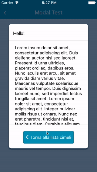
<Text>Hello!</Text>
</View>
</Modal>
</View>
)
}
}For a more complex example take a look at the /example directory.
| Name | Type | Default | Description |
|---|---|---|---|
| animationIn | string or object | 'slideInUp' | Modal show animation |
| animationInTiming | number | 300 | Timing for the modal show animation (in ms) |
| animationOut | string or object | 'slideOutDown' | Modal hide animation |
| animationOutTiming | number | 300 | Timing for the modal hide animation (in ms) |
| avoidKeyboard | bool | false | Move the modal up if the keyboard is open |
| backdropColor | string | 'black' | The backdrop background color |
| backdropOpacity | number | 0.70 | The backdrop opacity when the modal is visible |
| backdropTransitionInTiming | number | 300 | The backdrop show timing (in ms) |
| backdropTransitionOutTiming | number | 300 | The backdrop hide timing (in ms) |
| onBackButtonPress | func | () => null | Called when the Android back button is pressed |
| onBackdropPress | func | () => null | Called when the backdrop is pressed |
| useNativeDriver | bool | false | Define if animations should use native driver |
| isVisible | bool | REQUIRED | Show the modal? |
| children | node | REQUIRED | The modal content |
| onModalShow | func | () => null | Called when the modal is completely visible |
| onModalHide | func | () => null | Called when the modal is completely hidden |
| style | any | null | Style applied to the modal |
Under the hood react-native-modal uses react-native original Modal component.
Before reporting a bug, try swapping react-native-modal with react-native original Modal component and, if the issue persists, check if it has already been reported as a react-native issue.
Take a look at react-native-animatable to see the dozens of animations available out-of-the-box. You can also pass in custom animation definitions and have them automatically register with react-native-animatable. For more information on creating custom animations, see the react-native-animatable animation definition schema.
Pull requests, feedbacks and suggestions are welcome!
P.S.: Thanks @oblador for react-native-animatable, @brentvatne for the npm namespace and to anyone who contributed to this library!