Allows you to add css styles to any lovelace card.
For installation instructions see this guide.
Install card-mod.js as a module.
This is not a new card. Instead it changes the way pretty much any other card works.
Specifically, it looks for style: in any cards configuration, and applies the CSS specified there to the card.
The basis of almost all lovelace cards is a ha-card element, so that's probably where you'd want to start.
Note that some cards (conditional, entity-filter, horizontal-stack and vertical-stack as well as some custom cards, like layout-card, auto-entities and state-switch among others) do not have a ha-card element, and card-mod will thus not work for those. There is a workaround, though. See FAQ below.
Example:
Change the text color of an entities card to red.
type: entities
style: |
  ha-card {
    color: red;
  }
entities:
  - light.bed_light
  - light.ceiling_lights
  - light.kitchen_lights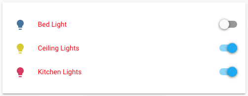
By using the element inspector of your browser (chrome, firefox, safari, explorer) you can find out how cards are built up and what styles they are using.
Example
Make a glance card use smallcaps and change the font size of the title
type: entities
style: |
  ha-card {
    font-variant: small-caps;
  }
  .card-header {
    font-size: 16px;
  }
entities:
  - light.bed_light
  - light.ceiling_lights
  - light.kitchen_lights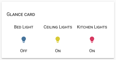
You can also use templating to change the styles dynamically.
Example
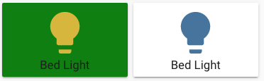
Make an entity-button card green when the light is on
type: entity-button
entity: light.bed_light
style: |
  ha-card {
    background: {% if is_state('light.bed_light', 'on') %} green {% endif %};
  }
Anything you add in style: will be put in a <style> tag, so you can also use things like css keyframes
Example
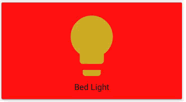
Make a blinking button
type: entity-button
entity: light.bed_light
style: |
  @keyframes blink {
    50% {
      background: red;
    }
  }
  ha-card {
    animation: blink 2s linear infinite;
  }
More examples are available here.

To make things easier, rows in entities cards and buttons in glance cards can be styled individually.
For those, the styles will be applied to the shadowRoot of the element, so a good starting point (rather than ha-card) would be :host:
type: entities
entities:
  - light.bed_light
  - entity: light.kitchen_lights
    style: |
      :host {
        color: red;
      }
  - entity: input_number.value
    style: |
      :host {
        --paper-item-icon-color:
          {% if states(config.entity)|int < 50 %}
            blue
          {% else %}
            red
          {% endif %}
;Jinja templates have access to a few special variables. Those are:
config- an object containing the card, entity row or glance button configurationuser- the username of the currently logged in userbrowser- the deviceID of the current browser (see browser_mod.hash- the hash part of the current URL.
When exploring the cards using the element inspector, you might run into something called a shadow-root and notice that you can't apply styles to anything inside that.
In this case, you can make style: a dictionary instead of a string, where each key is a querySelector string and it's value styles to apply to it - recursively. A key of $ means go into a shadow-root and a key of . the current element.
This is not for the faint of heart.
For some extra help, add debug_cardMod: true to the card config, and the steps taken to apply the styling will be printed in the browser console. It can be removed later.
Example:
Change some things in an alarm-panel card.
type: alarm-panel
card_icon: mdi:bell
name: Alarm Panel
debug_cardMod: true
style:
  .: |
    ha-card {
      --mdc-theme-primary: red;
    }
  "#keypad mwc-button":
    $: |
      :host {
        background: blue;
      }
      button {
        font-size: 24px !important;
      }
  "#keypad mwc-button:nth-of-type(12)":
    $: |
      button {
        font-size: 16px !important;
        --mdc-theme-primary: green;
      }
entity: alarm_control_panel.alarm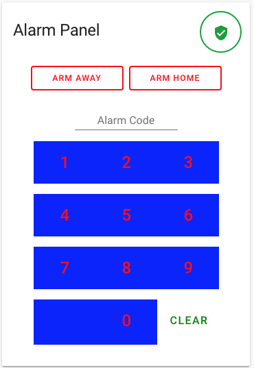
With card-mod installed, you will be able to use tap_action with rows in your entities cards:
Example:
type: entities
entities:
  - entity: light.bed_light
    name: default
  - entity: light.bed_light
    name: toggle
    tap_action:
      action: toggle
  - entity: light.bed_light
    name: navigate
    tap_action:
      action: navigate
      navigation_path: /lovelace/1
  - entity: light.bed_light
    name: url
    tap_action:
      action: url
      url_path: https://google.com
  - entity: light.bed_light
    name: call-service
    tap_action:
      action: call-service
      service: browser_mod.popup
      service_data:
        deviceID: this
        title: Popup
        card:
          type: entities
          entities:
- light.bed_lightFor cards, you just have to wrap everything in ha-card {} and format it as CSS.
So, you go from:
style:
  "--ha-card-background": rgba(200, 0, 0, 0.5)
  color: white
to
style: |
  ha-card {
    --ha-card-background: rgba(200, 0, 0, 0.5);
    color: white
  }
For rows in an entities card, you replace ha-card with :host as described above.
Note that some cards can't be modded with card-mod. See below.
The cards this doesn't work for often are not really cards at all, but change how other cards work. Examples include: conditional, entity-filter, horizontal-stack and vertical-stack as well as some custom cards, like layout-card, auto-entities and state-switch among others.
Common for all those are that they have no ha-card element. A workaround for this is to put the card you want inside an entities card and mod that. For built-in cards, this can be done by setting the type of an entities row to custom:hui-<type>-card:
type: entities
style: |
  ha-card {
    --ha-card-background: red;
    box-shadow: none;
    background: none;
  }
  .card-content {
    padding: 0
  }
entities:
  - type: custom:hui-horizontal-stack-card
    cards:
      - type: entities
        entities:
          - light.bed_light
          - light.kitchen_lights
          - light.ceiling_lights
      - type: glance
        entities:
          - light.bed_light
          - light.kitchen_lights
          - light.ceiling_lights