-
Notifications
You must be signed in to change notification settings - Fork 140
070_010_Line
Previous Chapter Previous Page Next Page Next Chapter Table of content
var data = {
labels : ["January","February","March","April","May","June","July"],
datasets : [
    {
        fillColor : "rgba(220,220,220,0.5)",
        strokeColor : "rgba(220,220,220,1)",
        pointColor : "rgba(220,220,220,1)",
        pointStrokeColor : "#fff",
        data : [65,59,90,81,56,55,40],
        title : "Year 2014"
    },
    {
        fillColor : "rgba(151,187,205,0.5)",
        strokeColor : "rgba(151,187,205,1)",
        pointColor : "rgba(151,187,205,1)",
        pointStrokeColor : "#fff",
        data : [28,48,40,19,96,27,100],
        title : "Year 2013"
    }
]
}
The line chart requires an array of labels for each of the data points. This is show on the X axis.
The data for line charts is broken up into an array of datasets. Each dataset has a colour for the fill, a colour for the line and colours for the points and strokes of the points. These colours are strings just like CSS. You can use RGBA, RGB, HEX or HSL notation.
For each line, you can give a “title” (see the example).
var data = {
labels : ["January","February","March","April","May","June","July"],
xBegin :
xEnd :
datasets : [
    {
        fillColor : "rgba(220,220,220,0.5)",
        strokeColor : "rgba(220,220,220,1)",
        pointColor : "rgba(220,220,220,1)",
        pointStrokeColor : "#fff",
        data : [65,59,90,81,56,55,40],
        title : "Year 2014"
    },
    {
        fillColor : "rgba(151,187,205,0.5)",
        strokeColor : "rgba(151,187,205,1)",
        pointColor : "rgba(151,187,205,1)",
        pointStrokeColor : "#fff",
        data : [28,48,40,19,96,27,100],
        title : "Year 2013"
    }
]
}
In previous description, we have seen how to draw a line where the X value is associated to a label : with such a structure, you can not draw a point located in the middle of two month !
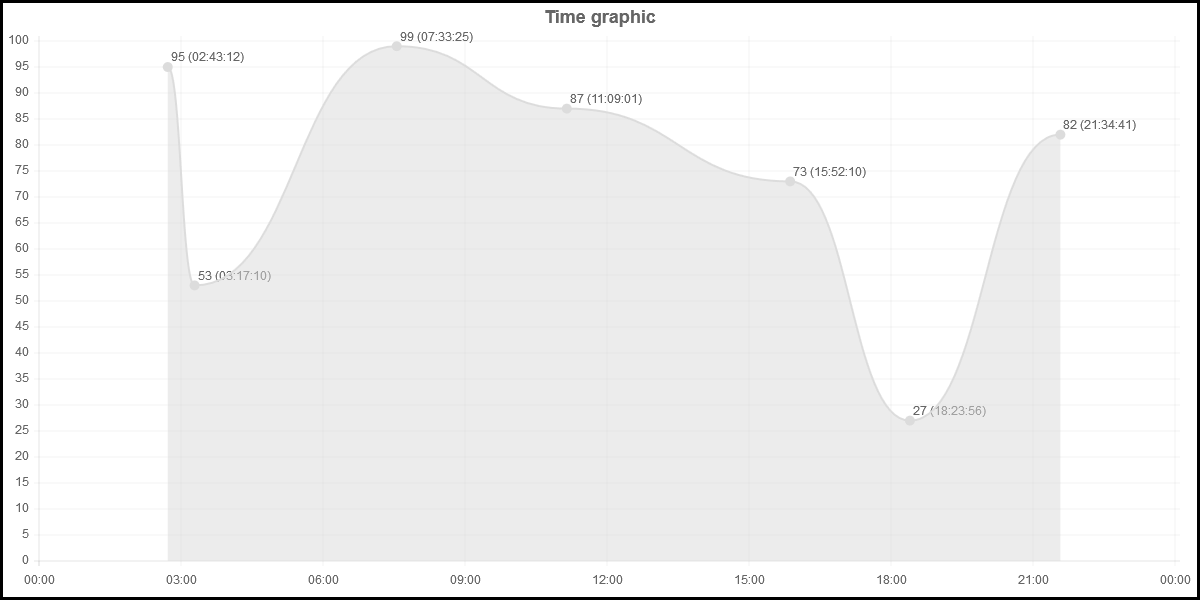
The structure has been extended so that you can draw charts with points at the position of your choice. With the extend structure, you will be able to draw charts like this :
 var mydata1 = {
    labels : [new Date(2014,0,1,0,0,0),new Date(2014,0,1,3,0,0),new Date(2014,0,1,6,0,0),new Date(2014,0,1,9,0,0),new Date(2014,0,1,12,0,0),new Date(2014,0,1,15,0,0),new Date(2014,0,1,18,0,0),new Date(2014,0,1,21,0,0),new Date(2014,0,1,24,0,0)],
    xBegin : new Date(2014,0,1,0,0,0),
    xEnd : new Date(2014,0,1,24,0,0),
    datasets : [
    {
	fillColor : "rgba(220,220,220,0.5)",
	strokeColor : "rgba(220,220,220,1)",
	pointColor : "rgba(220,220,220,1)",
	pointStrokeColor : "rgba(220,220,220,1)",
	data : [95,53,99,87,73,27,82],
	xPos : [new Date(2014,0,1,2,43,12),new Date(2014,0,1,3,17,10),new Date(2014,0,1,7,33,25),new Date(2014,0,1,11,9,01),new Date(2014,0,1,15,52,10),new Date(2014,0,1,18,23,56),new Date(2014,0,1,21,34,41)],
	title : "With xPos"
    }
]
 }
Source to produce this chart : https://github.com/FVANCOP/ChartNew.js/tree/master/Samples/time_graph.html
Compared to the "original" structure, the variable xBegin and xEnd have been added. Those two values specifies the numeric value associated to the first label and to the last label. All data values have to be in the range [xBegin,xEnd].
If xBegin (xEnd) is not specified and if the first (last) label is numeric, xBegin (xEnd) will be initialized to the value of the first (last) label.
If xBegin (xEnd) is not specified and if the first (last) label is not numeric, xBegin (xEnd) will be initialized to the value 0 (100).
The datasets[*].xPos array has also be added. This specifies the position on the X Axis of the corresponding data value.
In the Samples folder, you will find some examples.
Source to produce this chart : https://github.com/FVANCOP/ChartNew.js/tree/master/Samples/function_sinus_cosinus.html
Source to produce this chart : https://github.com/FVANCOP/ChartNew.js/tree/master/Samples/plot_graph.html
See also wiki about statistics for information about Linear Regression
Other samples :
function x^2 : https://github.com/FVANCOP/ChartNew.js/tree/master/Samples/function_x2.html
function 1/x : https://github.com/FVANCOP/ChartNew.js/tree/master/Samples/function_X-1.html
In the first version, only "circles" could be drawn on the points. Since version 2, you can now specify other shapes for the points : "diamond", "plus", "cross", "triangle", "square" or "circle". By default, "circle" is used. To specify the marker for a line, just add a "markerShape" specification in the dataset. You can also specify the radius of the shape (pointDotRadius) and the width of the stroke (pointDotStrokeWidth). You can also specify a style for each line with pointStrokeStyle. If makerShape, pointDotRadius, pointStrokeStyle or pointStrokeWidth are not specified in the dataset, the value defined in the corresponding option (markerShape, pointDotRadius, datasetStrokeStyle, pointDotStrokeWidth) is used.
var data = {
labels : ["January","February","March","April","May","June","July"],
xBegin :
xEnd :
datasets : [
    {
        fillColor : "rgba(220,220,220,0.5)",
        strokeColor : "rgba(220,220,220,1)",
        pointColor : "rgba(220,220,220,1)",
        pointStrokeColor : "#fff",
        markerShape : "square",
        pointDotRadius : 5,
        pointStrokeWidth : 2,
        data : [65,59,90,81,56,55,40],
        title : "Year 2014"
    },
    {
        fillColor : "rgba(151,187,205,0.5)",
        strokeColor : "rgba(151,187,205,1)",
        pointColor : "rgba(151,187,205,1)",
        pointStrokeColor : "#fff",
        markerShape : "triangle",
        pointDotRadius : 10,
        pointStrokeWidth : 3,
        data : [28,48,40,19,96,27,100],
        title : "Year 2013"
    }
]
}
Example: See Samples/markers.html
##Array and function values
The value associated to "fillColor", "strokeColor", "pointColor", "pointStrokeColor", "pointDotStrokeColor", "pointDotStrokeWidth" and "markerShape" can be a single value or or an array or a function.
It's possible to draw the mean or standard deviation as a part of a line chart.
Example: (math.html)
How to include and more information about these math functions: Math functions
Previous Chapter Previous Page Next Page Next Chapter Top of Page


