-
Notifications
You must be signed in to change notification settings - Fork 140
070_040_Radar
Previous Chapter Previous Page Next Page Table of content
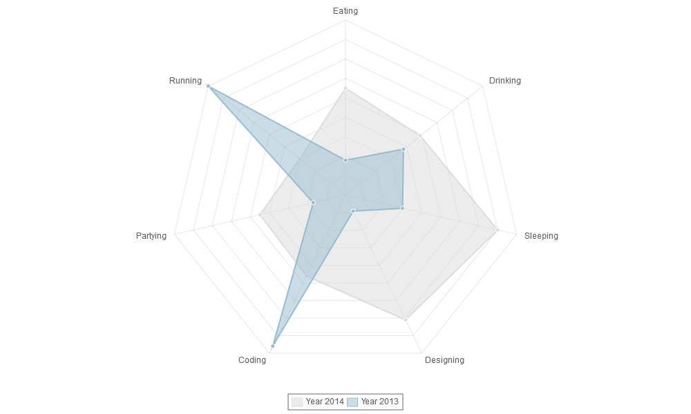
var data = {
labels : ["Eating","Drinking","Sleeping","Designing","Coding","Partying","Running"],
datasets : [
    {
        fillColor : "rgba(220,220,220,0.5)",
        strokeColor : "rgba(220,220,220,1)",
        pointColor : "rgba(220,220,220,1)",
        pointStrokeColor : "#fff",
        data : <nowiki>[</nowiki>65,59,90,81,56,55,40] ],
        title : "Year 2014"
    },
    {
        fillColor : "rgba(151,187,205,0.5)",
        strokeColor : "rgba(151,187,205,1)",
        pointColor : "rgba(151,187,205,1)",
        pointStrokeColor : "#fff",
        data : <nowiki>[</nowiki>28,48,40,19,96,27,100] ],
        title : "Year 2013"
    }
]
}
For a radar chart, usually you will want to show a label on each point of the chart, so we include an array of strings that we show around each point in the chart. If you do not want this, you can either not include the array of labels, or choose to hide them in the chart options.
For the radar chart data, we have an array of datasets. Each of these is an object, with a fill colour, a stroke colour, a colour for the fill of each point, and a colour for the stroke of each point. We also have an array of data values.
For each area, you can give a “title (see the example).
Instead of assigning a real color to the fillColor, strokeColor, pointColor and/or pointStrokeColor variable, you can assign a function that returns a color. See chapter “Color Function” later on.
In the first version, only "circles" could be drawn on the points. Since version 2, you can now specify other shapes for the points : "diamond", "plus", "cross", "triangle", "square" or "circle". By default, "circle" is used. To specify the marker for a line, just add a "markerShape" specification in the dataset. You can also specify the radius of the shape (pointDotRadius) and the width of the stroke (pointDotStrokeWidth). If makerShape, pointDotRadius or pointStrokeWidth are not specified in the dataset, the value defined in the corresponding option (markerShape, pointDotRadius, pointDotStrokeWidth) is used.
var data = {
labels : ["January","February","March","April","May","June","July"],
xBegin :
xEnd :
datasets : [
    {
        fillColor : "rgba(220,220,220,0.5)",
        strokeColor : "rgba(220,220,220,1)",
        pointColor : "rgba(220,220,220,1)",
        pointStrokeColor : "#fff",
        markerShape : "square",
        pointDotRadius : 5,
        pointStrokeWidth : 2,
        data : [65,59,90,81,56,55,40],
        title : "Year 2014"
    },
    {
        fillColor : "rgba(151,187,205,0.5)",
        strokeColor : "rgba(151,187,205,1)",
        pointColor : "rgba(151,187,205,1)",
        pointStrokeColor : "#fff",
        markerShape : "triangle",
        pointDotRadius : 10,
        pointStrokeWidth : 3,
        data : [28,48,40,19,96,27,100],
        title : "Year 2013"
    }
]
}
See : Samples/markers.html

