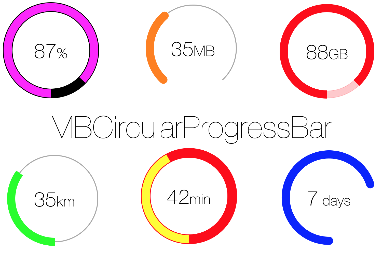
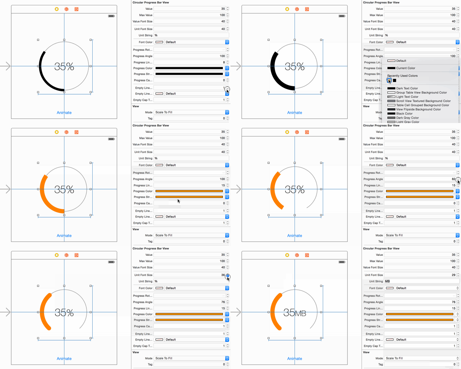
If you use MBCircularProgressBar, please tell me and I will add your app here.
To run the example project, clone the repo, and run pod update from the Example directory first.
MBCircularProgressBar is available through CocoaPods.
To install it, simply add the following lines to your Podfile:
- Add this line to the begining of your Podfile in order to support @IBDesignable. More info here (Thanks to: @StevenMasini)
use_frameworks!- Add this line so with every Pod install/update cocoapods would download the library intro your project:
pod "MBCircularProgressBar"Carthage is a decentralized dependency manager that builds your dependencies and provides you with binary frameworks.
You can install Carthage with Homebrew using the following command:
$ brew update
$ brew install carthage
To integrate MBCircularProgressBar into your Xcode project using Carthage, specify it in your Cartfile:
github "MatiBot/MBCircularProgressBar"
Run carthage update to build the framework and drag the built MBCircularProgressBar.framework into your Xcode project.
You can also download the MBCircularProgressBar{View,Layer}.{m,h} files into your project directly
| Property name | Property type | Description | Range |
|---|---|---|---|
| value | CGFloat | The value to be displayed in the center | [0,maxValue] |
| maxValue | CGFloat | The maximum possible value, used to calculate the progress (value/maxValue) | [0,∞) |
| showValueString | BOOL | Should show value string | |
| showUnitString | BOOL | Should show unit string | |
| valueFontName | NSString | The name of the font of the value string | Any valid font name |
| valueFontSize | CGFloat | The font size of the value text | [0,∞) |
| valueFontName | NSString | The name of the font of the unit string | Any valid font name |
| unitFontSize | CGFloat | The font size of the unit text | [0,∞) |
| unitString | NSString | The string that represents the units, usually % | |
| fontColor | UIColor | The color of the value and unit text | |
| decimalPlaces | NSInteger | Number of decimal places of the value | [0,∞) |
| progressRotationAngle | CGFloat | Progress bar rotation (Clockewise) | [0,100] |
| progressAngle | CGFloat | Set a partial angle for the progress bar | [0,100] |
| progressLineWidth | CGFloat | The width of the progress bar (user space units) | [0,∞) |
| progressColor | UIColor | The color of the progress bar | |
| progressStrokeColor | UIColor | The color of the progress bar frame | |
| progressCapType | NSInteger | The shape of the progress bar cap | {kCGLineCapButt=0, kCGLineCapRound=1, kCGLineCapSquare=2} |
| emptyLineWidth | CGFloat | The width of the background bar (user space units) | [0,∞) |
| emptyLineColor | UIColor | The color of the background bar | |
| emptyCapType | CGFloat | The shape of the background bar cap | {kCGLineCapButt=0, kCGLineCapRound=1, kCGLineCapSquare=2} |
| textOffset | CGPoint | The offset to apply to the unit / value text | (0,0) = center of the circle |
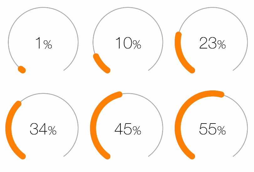
In order to animate a change in the progress bar you should nest the value property manipulation in a [UIView animateWithDuration:] method
    [UIView animateWithDuration:1.f animations:^{
        self.progressBar.value = 55.f;
}];[iOS][Swift] MBCircularProgressBar で円形のプログレスバーを実現 by @cocominap (in Japanese)
Mati Bot, [email protected], @b0tnik
MBCircularProgressBar is available under the MIT license. See the LICENSE file for more info.


