The JavaFX User Interface provides a set of chart components that are a very convenient way for data visualization. These are the available charts in the official library:
-
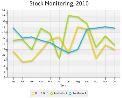
Plots line between the data points in a series. Used usually to view data trends over time.
-
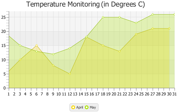
Plots the area between the line that connects the data points and the axis. Good for comparing cumulated totals over time.
-
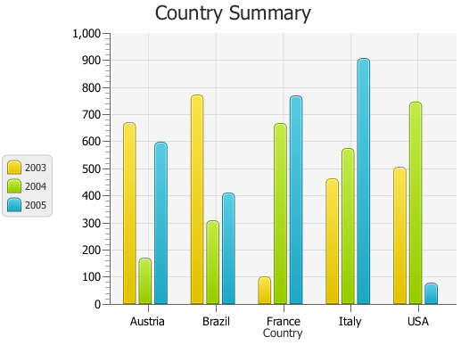
Plots rectangular bars with heights indicating data values they represent, and corresponding to the categories they belongs to. Used for displaying discontinuous / discrete data
-
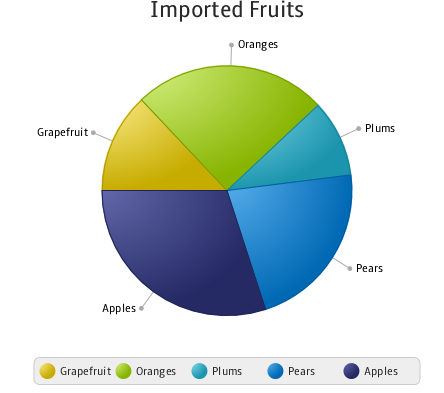
Plots circular chart divided into segments with each segment representing a value as a proportion of the total. It looks like a Pie and hence the name
-
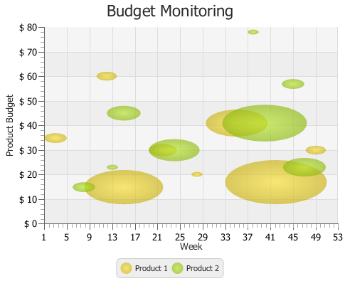
Plots bubbles for data points in a series. Each plotted entity depicts three parameters in a 2D chart and hence a unique chart type.
-
Plots symbols for the data points in a series. This type of chart is useful in viewing distribution of data and its corelation, if there is any clustering.

Finally, the missing one:
-
A donut chart is essentially a Pie Chart with an area of the centre cut out.
Pie Charts are sometimes criticised for focusing readers on the proportional areas of the slices to one another and to the chart as a whole. This makes it tricky to see the differences between slices, especially when you try to compare multiple Pie Charts together.
A Donut Chart somewhat remedies this problem by de-emphasizing the use of the area. Instead, readers focus more on reading the length of the arcs, rather than comparing the proportions between slices.
Also, Donut Charts are more space-efficient than Pie Charts because the blank space inside a Donut Chart can be used to display information inside it.
Furthermore, a DoughnutChart can shome more than a ring of slices in order to improve the value comparison between data in different rings.
