The marketing team of a sports equipment company wants to create a new cycling computer, and you have been chosen as an independent developer due to your technical and UX background to create a prototype and validate the idea.
More details on the course website:
Members:
- Ricardo Ribeiro Rodrigues
- Guilherme Fontana Louro
Brand Name:
- Bikometro
![]()

- For buttons, we will use Image button (lv_imgbtn) to use icons as buttons.
- For choosing the unit in the second screen, we will use Switch (lv_switch).
- We will use Image (lv_img) for the logo.
- For text, we will use Label (lv_label).
- For choosing the bike rim size, we will use Roller (lv_roller).
- For inputting weight, we will use Slider (lv_slider).


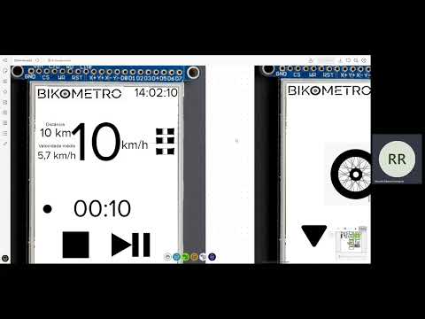
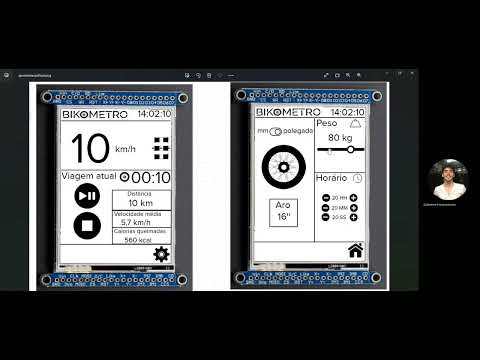
Details of the second iteration of the interface proposal:
Based on Luiz's feedback, some changes were made to the interface, such as:
- Maximizing screen space, giving more space to speed and buttons.
- Adding the ability to switch between units of measurement (cm/inches).
- The bike rim change buttons switch between predefined values.
- The current bike rim value is displayed on the screen.
- Added a button to return to the home screen on the second screen.
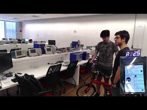
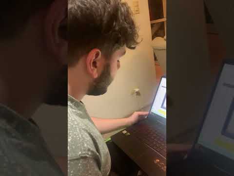
Video Explaining Iteration 1:


In this iteration, the fonts and sizes used in the interface were also decided:
- For the logo, the Raleway Medium Alt1 font was used.
- For the rest of the interface, the Montserrat Alternates Extralight 200 font was used.
These fonts are futuristic, conveying a sense of technology, and are combined with the simplicity and clean design of black on white. This maintains a consistent look with two sans-serif fonts in black on white, making it easy for the user to read during a bike ride.
In the image below, you can see a photo showing the sizes and fonts in the interface.

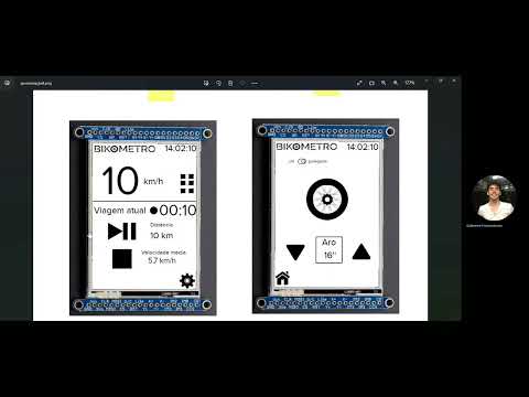
Details of the third iteration of the interface proposal:
Based on the interviewee's feedback, some changes were made:
- A section was added to the interface to show the calories burned during the ride.
- To make this calculation, a field was added for the user to enter their weight, providing greater accuracy to the calorie burn calculation.
- A field was also added to record the current time, so the time is displayed correctly on the display.
- Some repositioning and better use of the screen space.
Video Explaining Iteration 2:
For the cycling computer interface, we chose to use black and white, which is commonly used in modern interfaces and brings a lightness to the interface, making it less cluttered. Considering this and the brand's modern visual identity, this contrast was preferred.