


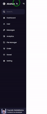
A Vue.js V2 sidebar menu component.
v1.0.0
- Added new props
isUsedVueRouterboolean param by defaultfalse. If you are using vue-router, set the value to true. - Otherwise, when clicking on a menu item the
<a>tag will be used by default and emitted the@menu-item-clickedevent with the value ofitem-link.
Example:
<VueSidebarMenuAkahon
  :isUsedVueRouter="false"
  @menu-item-clicked="fnRouteTo(link)"
/>yarn add vue-sidebar-menu-akahonOr
npm install --save vue-sidebar-menu-akahon// main.js
import VueSidebarMenuAkahon from "vue-sidebar-menu-akahon";
Vue.component('vue-sidebar-menu-akahon', VueSidebarMenuAkahon);<template>
<div>
<VueSidebarMenuAkahon />
</div>
</template>
<script>
import VueSidebarMenuAkahon from "vue-sidebar-menu-akahon";
export default {
name: 'component.vue',
components: {VueSidebarMenuAkahon},
data() {
return {}
}
}
</script>You can use icons from boxicons
| Props (Parameter) | Type | Default | Description |
|---|---|---|---|
| isMenuOpen | Boolean |
true |
Open/Close menu |
| isUsedVueRouter | Boolean |
false |
When clicking on a menu item, if "true", "vue-router" is used instead of the "a" tag. |
| menuTitle | String |
'Akahon' |
Menu title |
| menuLogo | String |
- | Logo |
| menuIcon | String |
'bxl-c-plus-plus' |
Icon (boxicons) |
| Props (Parameter) | Type | Default | Description |
|---|---|---|---|
| menuItems | Array |
[{link: "#",name: "Dashboard", tooltip: "Dashboard", icon: "bx-grid-alt" }] |
Items |
| Props (Parameter) | Type | Default | Description |
|---|---|---|---|
| isSearch | Boolean |
true |
Enable/Disable search input |
| searchPlaceholder | String |
'Search...' |
Search input placeholder |
| searchTooltip | String |
'Search' |
Search input tooltip |
| Props (Parameter) | Type | Default | Description |
|---|---|---|---|
| profileImg | String |
'' |
Profile avatar |
| profileName | String |
'Fayzullo Saidakbarov' |
Profile full name |
| profileRole | String |
'Frontend vue developer' |
Profile role title |
| isExitButton | Boolean |
true |
Enable/Disable exit button |
| Props (Parameter) | Type | Default | Description |
|---|---|---|---|
| bgColor | String |
'#11101d' |
Background color |
| secondaryColor | String |
'#1d1b31' |
Secondary color |
| homeSectionColor | String |
'#e4e9f7' |
|
| logoTitleColor | String |
'#fff' |
|
| iconsColor | String |
'#fff' |
|
| itemsTooltipColor | String |
'#e4e9f7' |
|
| searchInputTextColor | String |
'#fff' |
|
| menuItemsHoverColor | String |
'#fff' |
|
| menuItemsTextColor | String |
'#fff' |
|
| menuFooterTextColor | String |
'#fff' |
| Event | Output | Description |
|---|---|---|
| @menu-item-clcked | item-link | If isUsedVueRouter=false, emitted when the menu item has been clicked |
| @button-exit-clicked | - | Emitted when the exit button has been clicked |
| @search-input-emit | String | Emitted when user types in the search input |