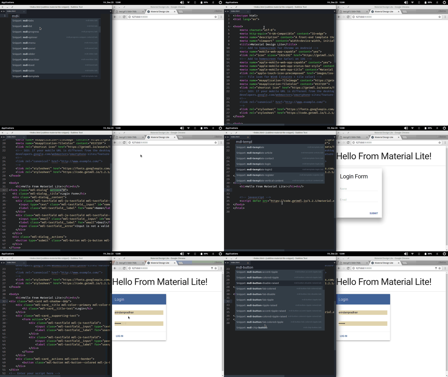
A new styling framework material lite now comes to Sublime.
- badges
- buttons
- cards
- chips
- dialogs
- extras
- layouts
- lists
- loading
- menus
- panel
- sliders
- snackbar
- tables
- template
- textfields
- toggles
- tooltips
- LICENSE
There are 3 methods for installing this plugin.
- Search for "Material Lite Snippets" via the "Package Control: Install Packages" menu.
Note: If you don't have Sublime Package Control installed, you can find out how to install it here https://sublime.wbond.net/installation
-
Clone the repository into your Sublime Text 2/3 packages directory. `git clone https://github.com/arindam/sublime-material-lite.git
-
Download the .zip file and unzip it into your Sublime Text 2/3 packages directory. Note: You can find your Sublime Text 2/3 packages directory by going to Preferences > Browse Packages.
| Snippet code | Component |
|---|---|
| mdl-badge-icon | badge on icon |
| mdl-badge-no-icon | badge on text |
| mdl-badge | simple badge |
| Snippet code | Component |
|---|---|
| mdl-button-accent-ripple-raised | ripple effect , accent color , raised button |
| mdl-button-accent-ripple | ripple effect , accent color |
| mdl-button-colored-ripple-raised | ripple effect , primary color , raised button |
| mdl-button-colored-ripple | ripple effect , primary color |
| mdl-button-fab-colored-ripple | fab button , primary color , ripple effect |
| mdl-button-fab-colored | fab button , primary color |
| mdl-button-fab-ripple | fab button , ripple effect |
| mdl-button-fab-disable | fab button , disabled |
| mdl-button-fab | fab button |
| mdl-button-ripple-raised | ripple effect , raised button |
| mdl-button-disable-raised | disabled , raised button |
| mdl-button-raised | raised button |
| mdl-button-ripple | ripple effect button |
| mdl-button-disable | disabled , raised button |
| mdl-button | simple button |
| Snippet code | Component |
|---|---|
| mdl-card-event-nostyle | card event with inline style |
| mdl-card-event | card event with styling |
| mdl-card-square-nostyle | card event square dimension inline style |
| mdl-card-square | card event square dimension with styling |
| mdl-card-wide-nostyle | card wide with inline style |
| mdl-card-wide | simple card |
| Snippet code | Component |
|---|---|
| mdl-chip-button | Button Chip |
| mdl-chip-contact | Contact Chip |
| mdl-chip-deletable2 | Deletable Contact Chip |
| mdl-chip-deletable | Deletable Chip |
| mdl-chip | Basic Chip |
| Snippet code | Component |
|---|---|
| mdl-dialog-full-script | wide/full dialog with button onlick javascript |
| mdl-dialog-full | wide/full dialog |
| mdl-dialog-script | dialog with button onlick javascript |
| mdl-dialog | simple dialog |
| Snippet code | Component |
|---|---|
| mdl-link | cdn link for stylesheets and font |
| mdl-script | cdn for material.js |
| mdl-cdn | all cdn for material design lite |
| Snippet code | Component |
|---|---|
| mdl-cell-phone | responsive grid column for phone |
| mdl-cell-tablet | responsive grid column for tablet |
| mdl-cell | responsive grid column for web |
| mdl-content-tab | Content tabs |
| mdl-footer-mega | Mega footer |
| mdl-footer | Basic Footer |
| mdl-grid | responsive grid layout |
| mdl-layout-drawer | Side drawer (Only) |
| mdl-layout-fixed | Fixed Side drawer |
| mdl-layout-scroll | Scrolling header |
| mdl-layout | Basic Layout: Navbar + SideBar |
| mdl-layout-tab-fixed | Fixed tabs |
| mdl-layout-tab | Scrollable tabs |
| mdl-layout-transparent | Transparent header - with background image |
| mdl-layout-waterfall | Waterfall header |
| mdl-tabs | Multiple Navbar tabs |
| mdl-tab | Basic Navbar tab |
| Snippet code | Component |
|---|---|
| mdl-list-3line | Three line (in content) |
| mdl-list-actions | Avatars and actions |
| mdl-list-basic | Basic list |
| mdl-list-controls | Avatars and controls |
| mdl-list | Simple list |
| mdl-list-2line | Two line (in content) |
| Snippet code | Component |
|---|---|
| mdl-progress-buffer | Buffering |
| mdl-progress-indeterminate | Indeterminate |
| mdl-progress | Basic Progress bar |
| mdl-spinner | Basic Spinner |
| mdl-spinner-colored | Basic Spinner Color(Primary) |
| Snippet code | Component |
|---|---|
| mdl-menu-left | Bottom left |
| mdl-menu-left-top | Top left |
| mdl-menu-right | Bottom right |
| mdl-menu-right-top | Top right |
| mdl-menu | default -> lower left (dropdown style) |
| Snippet code | Component |
|---|---|
| mdl-panel | Panel element |
| Snippet code | Component |
|---|---|
| mdl-slider | Basic slider |
| Snippet code | Component |
|---|---|
| mdl-snackbar-script | Snackbar with javascript |
| mdl-snackbar | Snackbar |
| mdl-toast-script | Toast with javascript |
| mdl-toast | Toast |
| Snippet code | Component |
|---|---|
| mdl-table-selectable | Selectable Data table |
| mdl-table | Basic Data table |
| Snippet code | Component |
|---|---|
| mdl-template-article | Template for article |
| mdl-template-contact | Template for Contact |
| mdl-template-login2 | Template for login different style |
| mdl-template-login | Template for login |
| mdl-template-register | Template for registration |
| mdl-template-vertical-content | Template for vertical column |
| mdl-template | Template starter |
NOTE: New templates coming soon!.
| Snippet code | Component |
|---|---|
| mdl-form-expand | Expandable Textfield |
| mdl-form-float | Text with floating label |
| mdl-form-multiline | Floating Multiline Textfield |
| mdl-form-number | Numeric input |
| mdl-form | Simple Textfield |
| Snippet code | Component |
|---|---|
| mdl-check-icon | CheckBox |
| mdl-check-ripple | CheckBox ripple effect |
| mdl-check | CheckBox |
| mdl-switch | Switch |
| mdl-radio-group | Radio |
| mdl-radio | Radio |
| Snippet code | Component |
|---|---|
| mdl-tooltip-large | Large Tooltip |
| mdl-tooltip | Basic Tooltip |
Coming Soon!
MIT
