-
Notifications
You must be signed in to change notification settings - Fork 413
In this chapter we’ll discuss theming with CSS in Codename One.
|
Tip
|
CSS Changes Don’t Require a Recompile
You can change the CSS values while the simulator is running and the changes will reflect in the simulator within a few seconds
|
Codename One applications always use the resource file. The CSS support compiles a file in CSS syntax to a Codename One resource file and adds it to the application. In runtime the CSS no longer exists and the file acts like a regular theme file.
To enable CSS support in Codename One you need to flip a switch in Codename One Settings.
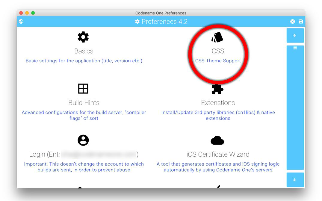
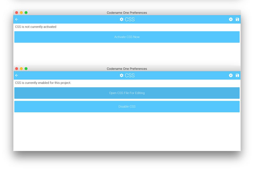
Once enabled your theme.res file will regenerate from a CSS file that resides under the css directory. Changes you make to the CSS file will instantly update the simulator as you save. However, there are some limits to this live update so in some cases a simulator restart would be necessary.
Since Codename One stylesheets are meant to be used with Codename One component hierarchies instead of XML/HTML documents, selectors work a little differently.
-
All selectors (with some specific exceptions discussed below) are interpreted as UIIDs.
-
Only 4 predefined CSS classes are supported:
-
.pressed— Targets the component when in "Pressed" state. -
.selected— Targets the component when in "Selected" state. -
.unselected— Targets the component when in "Unselected" state. -
.disabled— Targets the component when in "Disabled" state.If no class is specified, then the selector targets "all" states of the given component.
-
The following are a few possible selectors you can include in your stylesheet.
-
Button— Defines styles for the "Button" UIID. -
Button.pressed— Defines styles for the "Button" UIID’s "pressed" state. -
Button, TextField, Form— Defines styles for the "Button", "TextField", and "Form" UIIDs.
The following example creates a simple button with a border, and text aligned center. By default the button will have a transparent background, but when it is pressed, it will have a gray background:
Button {
    text-align: center;
    border: 1pt solid gray;
    background-color: transparent;
}

Button.pressed {
    background-color: gray;
}The #Device selector allows you to define which device resolutions this CSS file should target. Mutli-images generated from this style-sheet will only be include variants for device resolutions in the range (min-resolution, max-resolution) as defined in this section. By default all resolutions are generated.
#Device {
    min-resolution: 120dpi;
    max-resolution: 480dpi;
    resolution: 480dpi;
}The #Constants selector allows you to specify theme constants.
e.g.
#Constants {
    PopupDialogArrowBool: false;
    calTitleDayStyleBool: true;
    calTransitionVertBool: false;
    calendarLeftImage: "calendar-arrow-left.png";
    calendarRightImage: "calendar-arrow-right.png";
    centeredPopupBool: false;
    checkBoxCheckDisFocusImage: "Check-Box_Normal.png";
    checkBoxCheckedFocusImage: "Check-Box_Press.png";
    checkBoxCheckedImage: "Check-Box_Press.png";
    checkBoxOppositeSideBool: true;
    checkBoxUncheckedFocusImage: "Check-Box_Normal.png";
    checkBoxUncheckedImage: "Check-Box_Normal.png";
    comboImage: "combo.png";
    commandBehavior: "Side";
    dialogTransitionIn: "fade";
    dialogTransitionOut: "fade";
    dlgButtonCommandUIID: "DialogButton";
    dlgCommandGridBool: true;
    dlgInvisibleButtons: #1a1a1a;
    formTransitionIn: "empty";
    formTransitionOut: "slide";
    includeNativeBool: true;
    menuImage: "of_menu.png";
    noTextModeBool: true;
    onOffIOSModeBool: true;
    otherPopupRendererBool: false;
    pureTouchBool: true;
    radioSelectedFocusImage: "Radio_btn_Press.png";
    radioSelectedImage: "Radio_btn_Press.png";
    radioUnselectedFocusImage: "Radio_btn_Normal.png";
    radioUnselectedImage: "Radio_btn_Normal.png";
    sideMenuImage: "menu.png";
    switchMaskImage: "switch-mask-3.png";
    switchOffImage: "switch-off-3.png";
    switchOnImage: "switch-on-3.png";
    tabPlacementInt: 0;
    backIconImage: "Back-icon.png";
    articleSourceIconImage: "Source-icon.png";
    articleDateIconImage: "Date-icon.png";
    articleArrowRightImage: "Arrow-right.png";
    articleShareIconImage: "Share-icon.png";
    articleBookmarkIconImage: "Bookmark-icon.png";
    articleTextIconImage: "Text-icon.png";
    articleCommentsIconImage: "Comments-icon.png";
    newsIconImage: "News-icon.png";
    channelsIconImage: "Channels-icon.png";
    bookmarksIconImage: "Bookmarks-icon.png";
    overviewIconImage: "Overview-icon.png";
    calendarIconImage: "Calendar-icon.png";
    timelineIconImage: "Timeline-icon.png";
    profileIconImage: "Profile-icon.png";
    widgetsIconImage: "Widgets-icon.png";
    settingsIconImage: "Settings-icon.png";
    SubmitIconImage: "Submit-icon.png";
    SubmitIconDarkImage: "SubmitButtonLight-icon.png";
    defaultFontSizeInt: 18;
    defaultDesktopFontSizeInt: 14;
    defaultSourceDPIInt: "0";

}
In the above example, the constants referring to an image name as a string requires that the image exists in one of the following locations:
-
res/<cssfilename>/<imageName> -
../res/<cssfilename>/<imageName> -
../../res/<cssfilename>/<imageName>
or that it has been defined as a background image in some selector in this CSS file.
-
padding(and variants) -
margin(and variants) -
border(and variants) -
border-radius -
background(Usage below) -
background-color -
background-repeat -
background-image -
border-image -
border-image-slice -
font(Usage is covered in the following font section) -
font-family(Usage is covered in the following font section) -
font-style(Usage is covered in the following font section) -
font-size(Usage is covered in the following font section) -
@font-face(Usage is covered in the following font section) -
color -
text-align -
text-decoration(Usage below) -
opacity -
box-shadow -
width(only used for generating background-images and borders) -
height(only used for generating background-images and borders)
cn1-source-dpi-
Used to specify source DPI for multi-image generation of background images. Accepted values:
0(Not multi-image),120(Low res),160(Medium Res),320(Very High Res),480(HD), Higher than480(2HD). If not specified, the default value will be the value of thedefaultSourceDPIInttheme constant, if specified, or480, if not specified. cn1-background-type-
Used to explicitly specify the background-type that should be used for the class.
cn1-9patch-
Used to explicitly specify the slices used when generating 9-piece borders. Deprecated - Use
border-imageandborder-image-slicefor 9-piece borders. cn1-derive-
Used to specify that this UIID should derive from an existing UIID.
As of CodenameOne 7.0, you can use variables in your CSS file via the var() CSS function. E.g.
var(--header-color, blue);The var() function can only be used inside property values. I.e. You cannot use it in property names or selectors.
Syntax:
var(<custom-property-name>, <declaration-value>?)The <custom-property-name> must begin with two dashes (--).
The <declaration-value> is the fallback value that will be used if the variable hasn’t been defined in the CSS file. The fallback value may include commas.
Examples
#Constants {
    --main-bg-color: red;
}

MyContainer {
    background-color: var(--main-bg-color);
}#Constants {
--main-bg-color: red;
}
MyContainer {
background-color: var(--main-bg-color, blue);
}See the MDN docs for more details about the CSS variable spec.
This section isn’t as comprehensive as it should be due to the breadth of CSS.
underline |
Underlines text. E.g. |
overline |
Overlines text. E.g. |
line-through |
Strikes through text. E.g. |
none |
No text decoration. E.g. |
cn1-3d |
3D text. E.g. |
cn1-3d-lowered |
3D lowered text. E.g. |
cn1-3d-shadow-north |
3D text with north shadow. E.g. |
For other CSS font settings see the Fonts section
This library supports the border property and most of its variants (e.g. border-width, border-style, and border-color. It will try to use native Codename One styles for generating borders if possible. If the border definition is too complex, it will fall-back to generating a 9-piece image border at compile-time. This has the effect of making the resulting resource file larger, but will produce good runtime performance, and a look that is faithful to the provided CSS.
The algorithm used to determine whether to use a native border or to generate a 9-piece image, is complex, but the following guidelines may help you if you wish to design borders that can be rendered natively in CN1:
-
Non-pixel units
border-width. (Except with thecn1-round-borderandcn1-pill-borderstyles) -
Using the
border-radiusdirective. -
Using
box-shadow(Except when usingcn1-round-borderorcn1-pill-borderstyles) -
Using a background gradient in combination with a border or any kind
-
Using a different
border-width,border-style, orborder-colorfor different sides of the border -
Using a
filter
|
Tip
|
You can open the resulting theme file in the designer and inspect it to see if an image was generated |
Generating the image triggers slower CSS compilation and a larger binary so we generally recommend tuning the CSS so it avoids this fallback.
Rounded borders can be achieved in a few different ways. The easiest methods are:
-
The
cn1-round-borderstyle. This will render a circular round border in the background natively. I.e. this doesn’t require generation of an image border -
The
cn1-pill-borderstyle. This will render a pill-shaped border in the background natively. This also doesn’t require generation of an image border -
The
border-radiusproperty. This will round the corners of the border. If the style can be achieved using theRoundRectBorderin CodenameOne, then it will use that border. If not, this will cause the style to be generated as an image border
Examples using cn1-round-border
RoundBorder {
    border: 1px #3399ff  cn1-round-border;
    text-align:center;
    margin:2mm;
    padding:3mm;
}

RoundBorderFilled {
    background: cn1-round-border;
    background-color: #ccc;
    text-align:center;
    margin:2mm;
    padding:3mm;
}
Examples using cn1-pill-border
PillBorder {
    border: 1pt #3399ff cn1-pill-border;
    text-align:center;
}

PillBorderFilled {
    background: cn1-pill-border;
    background-color: #3399ff;
    color:white;
    text-align:center;
}
Examples using border-radius
RoundRectLabel {
    background-color: red;
    border-radius: 2mm;
}
cn1-pill-border and cn1-round-border don’t support the standard CSS box-shadow property. This is because the box-shadow property parameters don’t map nicely onto the shadow parameters for the Codename One RoundBorder class. To get shadows on the cn1-pill-border, you should use one or more of the following CSS properties:
-
cn1-box-shadow-spread— Accepts values in any scalar unit (e.g. px, mm, cm, etc…). This maps directly to the border’s shadowSpread property. -
cn1-box-shadow-h— Accepts values in real values or integers (not a scalar unit). This maps directly to the border’s shadowX property. -
cn1-box-shadow-v— Accepts values in real values or integers (not a scalar unit). This maps directly to the border’s shadowY property. -
cn1-box-shadow-blur— Scalar value. Maps to the border’s shadowBlur property. -
cn1-box-shadow-color— The shadow color
Currently using the regular CSS box-shadow in conjunction with border-radius will cause a 9-piece border to be generated rather than mapping to the RoundRectBorder. If, however, you use the cn1-box-* properties for the shadow instead, it will use the RoundRectBorder — assuming that no other styles are specified that trigger an image border to be generated.
The background property supports most standard CSS values for setting the background color, or background image.
|
Warning
|
9-piece Image borders always take precedence over background settings in Codename One. If your background directive seems to have no effect, it is likely because the theme has specified a 9-piece image border for the UIID. You can disable the image border using a directive like border: none
|
See Images
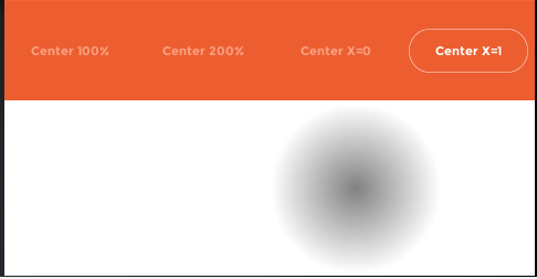
Both the linear-gradient and radial-gradient CSS functions are fully supported by this library. If Codename One is capable of rendering the gradient natively then the theme resource file generated will only include encoded parameters for the gradients. If the gradient is not supported by Codename One, then the module will fall back to an image background which it generates at compile-time. It is generally preferable to try to stick to gradients that Codename One supports natively. This will result in a smaller theme resource file since it doesn’t need to generate any images for the gradient.
Natively Supported linear-gradient Syntax
In order for a linear gradient to be natively supported by Codename One, the following properties must be met:
-
The gradient function has exactly two color stops, and these colors have the same opacity.
-
The gradient is either perfectly horizontal or perfectly vertical. (e.g Direction can be
0deg,90deg,180deg, or270deg.
Examples
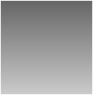
MyContainer {
   background: linear-gradient(0deg, #ccc, #666);
}
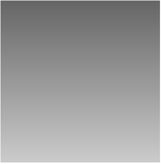
MyContainer {
    background: linear-gradient(to top, #ccc, #666);
}
MyContainer {
    background: linear-gradient(90deg, #ccc, #666);
}
MyContainer {
    background: linear-gradient(to left, #ccc, #666);
}
Unsupported linear-gradient syntax
The following are some examples of linear gradients that aren’t supported natively by Codename One, and will result in a background image to be generated at compile-time:
MyComponent {
    background: linear-gradient(45deg, #eaeaea, #666666);
}
The above example is not supported natively because the gradient direction is 45 degrees. Codename One only supports 0, 90, 180, and 270 degrees natively. Therefore this would result in a background image being generated at compile-time with the appropriate gradient.
MyComponent {
    background: linear-gradient(90deg, rgba(255, 0, 0, 0.6), blue);
}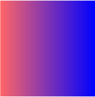
The above linear-gradient is not supported natively because the stop colors have different transparencies. The first color has an opacity of 0.5, and the second as an opacity of 1.0 (implicitly). Therefore, this would result in the gradient being generated as an image at compile-time.
Natively Supported radial-gradient Syntax
The following syntax is supported natively for radial gradients. Other syntaxes are also supported by the CSS library, but they will use compile-time image generation for the gradients rather than generating them at runtime.
background: radial-gradient(circle [closest-side] [at <position>], <color stop>, <color stop>)-
<position>— The position using either offset keywords or percentages. -
<color stop>— Either a color alone, or a color followed by a percentage. 0% indicates that color begins at center of the circle. 100% indicates that the color begins at the closest edge of the bounding box. Higher/lower values (>0%) will shift the color further or closer to circle’s center. If the first color stop is set to a non-zero value, the gradient cannot be rendered natively by Codename One, and an image of the gradient will instead be generated at compile-time.
More complex gradients are supported by this library, but they will be generated at compile-time. For more information about the radial-gradient CSS function see its MDN Wiki page.
Examples
MyContainer {
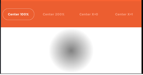
    background: radial-gradient(circle, gray, white);
}
MyContainer {
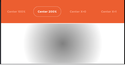
    background: radial-gradient(circle, gray, white 200%);
}
MyContainer {
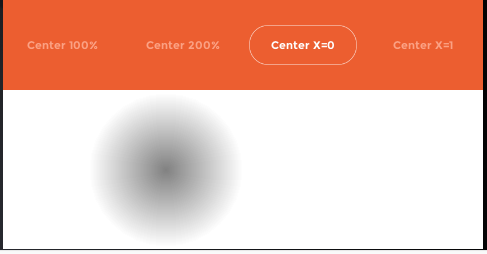
    background: radial-gradient(circle at left, gray, white);
}
MyContainer {
    background: radial-gradient(circle at right, gray, white);
}
It also supports some special Codename One values, which are identifiers with a "cn1-" prefix. The following special values are available. They map to the standard Codename One values we discussed in the theming chapter:
-
cn1-image-scaled -
cn1-image-scaled-fill -
cn1-image-scaled-fit -
cn1-image-tile-both -
cn1-image-tile-valign-left -
cn1-image-tile-valign-center -
cn1-image-tile-valign-right -
cn1-image-tile-halign-top -
cn1-image-tile-halign-center -
cn1-image-tile-halign-bottom -
cn1-image-align-bottom -
cn1-image-align-left -
cn1-image-align-right -
cn1-image-align-center -
cn1-image-align-top-left -
cn1-image-align-top-right -
cn1-image-align-bottom-left -
cn1-image-align-bottom-right -
cn1-image-border -
cn1-none -
cn1-round-border -
cn1-pill-border
Images are supported as both "inputs" of the stylesheet, and as outputs to the compiled resource file. "Input" images are usually specified via the background-image property in a selector. "Output" images are always saved as multi-images inside the resource file.
In order to appropriately size the image, the CSS compiler needs to know what the source density of the image is. E.g. if an image is 160x160 pixels with a source density of 160dpi (i.e. medium density - or the same as an iPhone 3G), then the resulting multi-image will be sized at 160x160 for medium density devices and 320x320 on very high density devices (e.g. iPhone 4S Retina) - which will result in the same perceived size to the user of 1x1 inch.
However if the image has a source density of 320dpi, then the resulting multi-image would be 80x80 pixels on medium density devices and 160x160 pixels on very high density devices.
Some images have this density information embedded in the image itself so that the CSS processor will know how to resize the image properly. However, it is usually better to explicitly document your intentions by including the cn1-source-dpi property as follows:
SomeStyle {
    background-image: url(images/my-image.png);
    cn1-source-dpi: 160;
}|
Note
|
cn1-source-dpi values are meant to fall into threshold ranges. Values less than or equal to 120, are interpreted as low density. 121 - 160 are medium density (iPhone 3GS). 161 - 320, very high density (iPhone 4S). 321 - 480 == HD. 481 and higher == 2HD. In general, you should try to use images that are one of these DPIs exactly: 160, 320, or 480, then images will be scaled up or down to the other densities accordingly.
|
By default all images are imported as multi-images (unless you define the defaultSourceDPIInt theme constant). If you want to import an image as a "regular" image, you can simply set cn1-source-dpi to 0. E.g.
SomeStyle {
    background-image: url(images/my-image.png);
    cn1-source-dpi: 0;
}|
Note
|
You can change the default source DPI for the whole stylesheet by adding #Constants {
defaultSourceDPIInt: 0;
}Most application templates in Codename One Initializr include this constant by default. |
If you have already generated images in all of the appropriate sizes for all densities, you can provide them in the same file structure used by the Codename One XML resource files: The image path is a directory that contains images named after the density that they are intended to be used for. The possible names include:
-
verylow.png -
low.png -
medium.png -
high.png -
veryhigh.png -
560.png -
hd.png -
2hd.png -
4k.png
E.g. Given the CSS directives:
MyStyle {
    background-image: url(images/mymultiimage.png);
}
The files would look like:
css/
 +--- mycssfile.css
 +--- images/
       +--- mymultiimage.png/
             +--- verylow.png
             +--- low.png
             +--- medium.png
              ... etc...
|
Note
|
Multi-image inputs are only supported for local URLs. You cannot use remote (e.g. http://) urls with multi-image inputs
|
Theme constants can be images. The convention is to suffix the constant name with "Image" so that it will be treated as an image. In addition to the standard url() notation for specifying a constant image, you can provide a simple string name of the image, and the CSS processor will try to find an image by that name specified as a background image for one of the styles. If it cannot find one, it will look inside a special directory named "res" (located in the same directory as the CSS stylesheet), inside which it will look for a directory named the same as the stylesheet, inside which it will look for a directory with the specified multi-image. This directory structure is the same as used for Codename One’s XML resources directory.
E.g. In the CSS file "mycssfile.css":
radioSelectedFocusImage: "Radio_btn_Press.png";
Will look for a directory located at res/mycssfile.css/Radio_btn_Press.png/ with the following images:
-
verylow.png -
low.png -
medium.png -
high.png -
veryhigh.png -
560.png -
hd.png -
2hd.png -
4k.png
It will then create a multi-image from these images and include them in the resource file.
It is quite useful to be able to embed images inside the resource file that is generated from the CSS stylesheet so that you can access the images using the Resources.getImage() method in your app and set it as an icon on a button or label. In this case, it is easier to simply create a dummy style that you don’t intend to use and include multiple images in the background-image property like so:
Images {
    background-image: url(images/NowLogo.png),
        url(images/Username-icon.png),
        url(images/Password-icon.png),
        url(images/Name-icon.png),
        url(images/Email-icon.png),
        url(images/SeaIce.png),
        url(images/Back-icon.png),
        url(images/Source-icon.png),
        url(images/Date-icon.png),
        url(images/Arrow-right.png),
        url(images/Share-icon.png),
        url(images/Text-icon.png),
        url(images/Comments-icon.png),
        url(images/RedPlanet.png),
        url(images/News-icon.png),
        url(images/Channels-icon.png),
        url(images/Bookmarks-icon.png),
        url(images/Overview-icon.png),
        url(images/Calendar-icon.png),
        url(images/Timeline-icon.png),
        url(images/Profile-icon.png),
        url(images/Widgets-icon.png),
        url(images/Settings-icon.png),
        url(images/Bookmark-icon.png);
}
Then in Java, I might do something like:
Resources theme = Resources.openLayered("/theme");

Label bookmark = new Label(theme.getImage("Bookmark-icon.png"));You can also load images from remote URLs. E.g.
Images {
    background-image: url(http://solutions.weblite.ca/logo.png);
}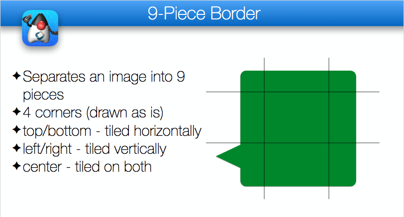
9-Piece image borders can be created using the image-border and image-border-slice properties.
E.g.
NinePiece {
	border-image:url('dashbg_landscape.png');
}
In the above example we omitted the border-image-slice property, so it defaults to "40%", which means that the image is sliced 40% from the top, 40% from the bottom, 40% from the left, and 40% from the right.
If you want more specific "slice" points, you can add the border-image-slice property. E.g.
NinePiece {
	border-image:url('dashbg_landscape.png');
	border-image-slice:10% 49%;  /*vertical horizontal*/
}

NinePiece2 {
	border-image:url('dashbg_landscape.png');
	border-image-slice:10% 49% 20%;  /*top horizontal bottom*/
}

NinePiece3 {
	border-image:url('dashbg_landscape.png');
	border-image-slice:10% 30% 40% 20%;  /*top right bottom left*/
}

NinePiece4 {
	border-image:url('dashbg_landscape.png');
	border-image-slice:10%;  /*all*/
}Component backgrounds in Codename One are a common source of confusion for newcomers because there are 3 different properties that can be used to define what a component’s background looks like, and they have priorities:
-
Background Color - You can specify an RGB color to be used as the background for a component.
-
Background Image - You can specify an image to be used as the background for a component. Codename One includes settings to define how the image is treated, e.g. scale/fill, tile, etc. If a background image is specified, it will override the background color setting - unless the image has transparent regions.
-
Image Border - You can define a 9-piece image border which will effectively cover the entire background of the component. If an image border is specified, it will override the background image of the component.
A common scenario that I run into is trying to set the background color of a component and see no change when I preview my form because the style had an image background defined - which overrides my background color change.
The potential for confusion is mitigated somewhat, but still exists when using CSS. You can make your intentions explicit by adding the cn1-background-type property to your style. Possible values include:
-
cn1-image-scaled -
cn1-image-scaled-fill -
cn1-image-scaled-fit -
cn1-image-tile-both -
cn1-image-tile-valign-left -
cn1-image-tile-valign-center -
cn1-image-tile-valign-right -
cn1-image-tile-halign-top -
cn1-image-tile-halign-center -
cn1-image-tile-halign-bottom -
cn1-image-align-bottom -
cn1-image-align-left -
cn1-image-align-right -
cn1-image-align-center -
cn1-image-align-top-left -
cn1-image-align-top-right -
cn1-image-align-bottom-left -
cn1-image-align-bottom-right -
cn1-image-border -
cn1-none -
none
CN1 resource files support both PNG and JPEG images, but PNG is the default. Multi-images that are generated by the CSS compiler will be PNG if they include alpha transparency, and JPEG otherwise. This is to try to reduce the file size as much as possible while not sacrificing quality.
This library supports the font, font-size, font-family, font-style, font-weight, and text-decoration properties, as well at the @font-face CSS "at" rule for including TTF/OTF fonts.
By default, CN1’s native fonts are used. The appropriate native font is selected for the provided font-weight and font-style properties. You can also explicitly specify the native font you wish to use in the font-family property. E.g.
SideCommand {
    font-family:  "native:MainThin";
}
If you omit the font-family directive altogether, it will use native:MainRegular. The following native fonts are available:
-
native:MainThin -
native:MainLight -
native:MainRegular -
native:MainBold -
native:MainBlack -
native:ItalicThin -
native:ItalicLight -
native:ItalicRegular -
native:ItalicBold -
native:ItalicBlack
If you want to use a font other than the built-in fonts, you’ll need to define the font using the @font-face rule. E.g.
@font-face {
    font-family: "Montserrat";
    src: url(res/Montserrat-Regular.ttf);
}
Then you’ll be able to reference the font using the specified font-family in any CSS element. E.g.
MyLabel {
    font-family: "Montserrat";
}
The @font-face directive’s src property will accept both local and remote URLs. E.g.
@font-face {
    font-family: "MyFont";
    src: url(http://example.com/path/to/myfont.ttf);
}
In this case, it will download the myfont.ttf file to the same directory as the CSS file. From then on it will use that locally downloaded version of the font so that it doesn’t have to make a network request for each build.
Fonts are automatically copied to the project’s "src" directory when the CSS file is compiled so that they will be distributed with the app and available at runtime.
Github URLs
Fonts hosted on GitHub are accessible using a special github: protocol to make it easier to reference such fonts. E.g. the following directive includes the "FontAwesome" font directly from Github
@font-face {
    font-family: "FontAwesome";
    src: url(github://FontAwesome/Font-Awesome/blob/master/fonts/fontawesome-webfont.ttf);
}|
Note
|
Apparently FontAwesome has removed its public repositories from Github so this URL no longer works. |
It is best practice to size your fonts using millimetres (rem) (or another "real-world" measurement unit such as inches (in), centimetres (cm), millimetres (mm). This will allow the font to be sized appropriate for all display densities. If you specify size in pixels (px), it will treat it the same as if you sized it in points (pt), where 1pt == 1/72 inches (one seventy-second of an inch).
If you size your font in percentage units (e.g. 150%) it will set the font size relative to the medium font size of the platform. This is different than the standard behaviour of a web browser, which would size it relative to the parent element’s font size.
|
Note
|
font-size: 150% is the same as font-size: 1.5rem.
|
You can use system fonts, true type fonts, and native fonts in your CSS stylesheet. True Type fonts need to be defined in a @font-face directive before they can be referenced. True-type fonts and native fonts have the advantage that you can specify their sizes in generic terms (e.g. small, medium, large) and in more specific units such as millimeters (mm) or pixels (px).
When trying to make a design look “good” across multiple platforms it can be difficult to deal with the differing default font sizes on different platforms. You may spend hours tweaking your UI to look perfect on iPhone X, only to find out that the fonts are too small when viewed on an android device. We have now added theme constants to explicitly set the the default font size in “screen-independent-pixels”.
Note In this case, 1 screen-independent-pixel is defined as 1/160th of an inch on a device, and 1/96th of an inch on desktop. These values correspond to Android’s definition on device, and Windows' definition on the desktop.
If you add the following to your stylesheet, it will set the default font size to 18 screen-independent pixels (or 18/160th of an inch), which corresponds to the Android native default “medium” font size.
#Constants {
    defaultFontSizeInt: 18;
}|
Tip
|
I have found that a value of 18 here gives optimum results across devices. |
On the desktop, you may find that 18 is too big. You can additionally define a default font size for for tablet and desktop using defaultDesktopFontSizeInt and defaultTabletFontSizeInt respectively. I have found that a defaultDesktopFontSizeInt gives results that closely match the Mac OS default font size.
#Constants {
    defaultFontSizeInt: 18;
    defaultDesktopFontSizeInt: 14;
}See the text-decoration section in the "Supported Properties" page.
@font-face {
    font-family: "Montserrat";
    src: url(res/Montserrat-Regular.ttf);
}

@font-face {
    font-family: "Montserrat-Bold";
    src: url(res/Montserrat-Bold.ttf);
}

@font-face {
    font-family: "FontAwesome";
    src: url(github://FontAwesome/Font-Awesome/blob/master/fonts/fontawesome-webfont.ttf);
}

PlainText0p5mm {
    font-size: 0.5mm;
}

PlainText1mm {
    font-size: 1mm;
}

PlainText2mm {
    font-size: 2mm;
}

PlainText5mm {
    font-size: 5mm;
}

PlainText10mm {
    font-size: 10mm;
}

PlainText50mm {
    font-size: 50mm;
}

PlainTextSmall {
    font-size: small;
}

PlainTextMedium {
    font-size: medium;
}

PlainTextLarge {
    font-size: large;
}

PlainText3pt {
    font-size: 3pt;
}

PlainText6pt {
    font-size: 6pt;
}

PlainText12pt {
    font-size: 12pt;
}

PlainText20pt {
    font-size: 20pt;
}

PlainText36pt {
    font-size: 36pt;
}

BoldText {
    font-weight: bold;
}

BoldText1mm {
    font-weight: bold;
    font-size: 1mm;
}

BoldText2mm {
    font-weight: bold;
    font-size: 2mm;
}

BoldText3mm {
    font-weight: bold;
    font-size: 3mm;
}

BoldText5mm {
    font-weight: bold;
    font-size: 5mm;
}

ItalicText {
    font-style: italic;
}

ItalicText3mm {
    font-style: italic;
    font-size: 3mm;
}

ItalicBoldText {
    font-style: italic;
    font-weight: bold;
}

PlainTextUnderline {
    text-decoration: underline;
}

BoldTextUnderline {
    text-decoration: underline;
    font-weight: bold;
}

ItalicTextUnderline {
    text-decoration: underline;
    font-style: italic;
}

PlainText3d {
    text-decoration: cn1-3d;
    color:white;
    background-color: #3399ff
}

BoldText3d {
    text-decoration: cn1-3d;
    font-weight: bold;
    color:white;
    background-color: #3399ff;
}

ItalicText3d {
    text-decoration: cn1-3d;
    font-style: italic;
    color:white;
    background-color: #3399ff;
}

PlainText3dLowered {
    text-decoration: cn1-3d-lowered;
    color:black;
    background-color: #3399ff;
}

BoldText3dLowered {
    text-decoration: cn1-3d-lowered;
    font-weight: bold;
    color:black;
    background-color: #3399ff;
}

ItalicText3dLowered {
    text-decoration: cn1-3d-lowered;
    font-style: italic;
    color:black;
    background-color: #3399ff;
}

PlainText3dShadow {
    text-decoration: cn1-3d-shadow-north;
    color:white;
    background-color: #3399ff;
}

BoldText3dShadow {
    text-decoration: cn1-3d-shadow-north;
    font-weight: bold;
    color:white;
    background-color: #3399ff;
}

ItalicText3dShadow {
    text-decoration: cn1-3d-shadow-north;
    font-style: italic;
    color:white;
    background-color: #3399ff;
}


MainThin {

    font-size: 200%;
    background: radial-gradient(circle at top left, yellow, blue 100%);
}

MainRegular0001 {
    font-family: "native:MainRegular";
    /*background: cn1-pill-border;
    background-color: red;*/
    color: blue;
    border: 1px cn1-pill-border blue;
    /*box-shadow: 1mm 1mm 0 2mm rgba(0,0,0,1.0);*/
    padding: 2mm;
}

MainRegular0001.pressed {
    font-family: "native:MainRegular";
    background: cn1-pill-border blue;
    /*background-color: red;*/
    color: white;
    border: 1px solid white;
    /*box-shadow: 1mm 1mm 0 2mm rgba(0,0,0,1.0);*/
    padding: 2mm;
}

Heading {
    font-size: 4mm;
    font-family: "Montserrat-Bold";
    color: black;
    padding: 2mm;
    text-align: center;
}

XMLVIewIcon {
    font-family: "FontAwesome";
}You can use media queries to target styles to specific platforms, devices, and device densities. Currently the following media queries are supported:
-
platform-xxx- Target a specific platform. E.g.platform-and,platform-ios,platform-mac,platform-win. -
density-xxx- Target a specific device density. E.g.density-very-low,density-low,density-medium,density-high,density-very-high,density-hd,density-2hd, anddensity-560. -
device-xxx- Target a specific device type. E.g.device-desktop,device-tablet,device-phone.
Label {
    color: black;
}

@media platform-and {
    Label {
        color: green;
    }
}

@media platform-ios {
    Label {
        color: red;
    }
}Label {
color: black;
}
@media density-very-low, density-low, density-medium, density-high {
Label {
color: green;
}
}
@media density-very-high, density-h2, density-2hd, density-560 {
Label {
color: red;
}
}
Label {
    color: black;
}

@media device-desktop {
    Label {
        color: green;
    }
}

@media device-tablet, device-phone {
    Label {
        color: red;
    }
}
|
Note
|
When deploying your app using the Javascript port, it will use a platform name derived from the "UserAgent" string in the browser, rather than the result of Display.getPlatformName(), which is used for other ports. When running on Android, then, the platform will be "and". When running on iOS, the platform will be "ios". Etc…
|
You can combine multiple media queries together, separated by a comma. Queries of the same type are "OR"ed together. Queries of different types are "AND"ed together. For example if you have a media query that specifies two different device densities (e.g. density-low and density-high) the query will match both devices with low density and high density. However, if the query specifies a device density and a platform (e.g. density-low and platform-and), then it will only match a device if it matches the platform and the density.
@media platform-and, density-high {
    ....
}@media platform-ios, density-high, density-low {
....
}@media device-desktop, platform-mac {
....
}The order of precendence when applying styles differs slightly from the way styles would be applied in standard CSS. The order of precendence is as follows:
-
Styles defined inside
@mediablocks will always take precendence over styles defined outside of@mediablocks. -
@mediablocks with more query matches will take precendence over blocks with fewer query matches. E.g. A media block matching density, platform, and device will take precendence over a block that only matches the density and platform. -
If the same style is defined in two media blocks which contain the same number of query matches, then the order precedence is
platform,device,densityin decreasing order. I.e. the block that matches on platform will take precedence over the block that matches on density. -
If the same style is defined in two media blocks with identical query matches, then the order of precedence is undefined.
In some cases you may find that fonts are coming out too large or too small across the board on certain types of devices. You can use standard media queries to customize font sizes, but you can also use font-scaling constants to scale font sizes for the entires stylesheet based on platform, device, and/or density. In some cases you may find this approach easier.
For example, consider the following simple stylesheet that defines a font size of 2mm on labels:
Label {
    font-size: 3mm;
}
During testing, perhaps you find that, on desktop, the fonts are a little bit too small. In this case, you can apply a font-scale constant that only applies to the desktop.
#Constants {
    device-desktop-font-scale: "1.5";
}

Label {
    font-size: 3mm;
}
Now, on most devices the Label style will have 3mm fonts. But on desktop, it will have 4.5mm fonts.
The above would be roughly equivalent to:
Label {
    font-size: 3mm;
}

@media device-desktop {
    Label {
        font-size: 4.5mm;
    }
}#Constants {
device-phone-font-scale: "1.5";
device-tablet-font-scale: "1.2";
device-desktop-font-scale: "1.4";
platform-ios-font-scale: "0.9";
density-low-font-scale: "1.2";
platform-ios-density-low-font-scale: "1.3";
}|
Important
|
All matching font-scale constants will be applied to the styles. If you define 3 font-scale constants that all match the current runtime environment, they will all be applied. E.g. If there are 3 matching font-scale constants with "2.0", "3.0", and "4.0", then fonts will be scaled by 2*3*4=24!
|
About This Guide
Introduction
Basics: Themes, Styles, Components & Layouts
Theme Basics
Advanced Theming
Working With The GUI Builder
The Components Of Codename One
Using ComponentSelector
Animations & Transitions
The EDT - Event Dispatch Thread
Monetization
Graphics, Drawing, Images & Fonts
Events
File-System,-Storage,-Network-&-Parsing
Miscellaneous Features
Performance, Size & Debugging
Advanced Topics/Under The Hood
Signing, Certificates & Provisioning
Appendix: Working With iOS
Appendix: Working with Mac OS X
Appendix: Working With Javascript
Appendix: Working With UWP
Security
cn1libs
Appendix: Casual Game Programming


