(originally hosted at Google Code: https://code.google.com/p/rockbox-themes)
This is a Rockbox theme for devices with the following screen resolutions:
- 240x320 (Toshiba Gigabeat F/X/S, Sansa Fuze+, Samsung YP-R0)
- 220x176 (Sansa Fuze v1/v2, iPod Color/Photo, iRiver H3XX, Philips GoGear HDD63x0)
- 320x240 (iPod 5G Video, Cowon D2)
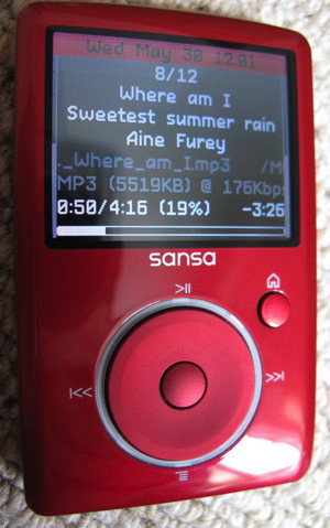
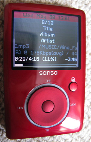
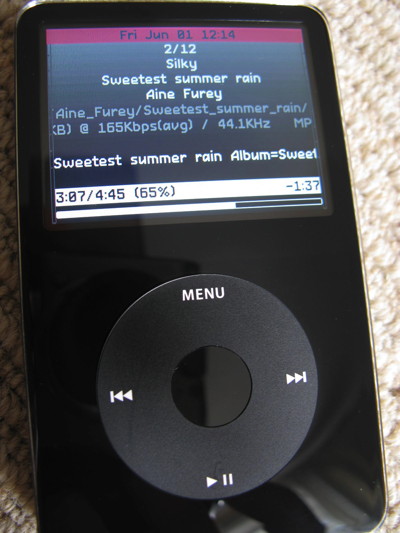
OptimalInfo is a high-contrast coloured theme with minimalist graphics, which displays an optimal amount of information using an easy-to-read 9-line layout (or 10 lines + 2 extra blank spacing for taller displays) based on a legible font. Layout tricks such as alternating line text, as well as separate screens for volume and seek controls, are used to maximise usability whilst reserving screen real estate for high-priority information.
- Sansa Fuze v1/v2, iPod Color/Photo, iRiver H3XX, Philips GoGear HDD63x0: http://forums.rockbox.org/index.php/topic,34471.0.html
- Toshiba Gigabeat F/X/S, Sansa Fuze+, Samsung YP-R0: http://forums.rockbox.org/index.php/topic,34473.0.html
- iPod 5G Video, Cowon D2: http://forums.rockbox.org/index.php/topic,34493.0.html
- Sansa Fuze v1: http://themes.rockbox.org/index.php?themeid=1624&target=sansafuze
- Sansa Fuze v2: http://themes.rockbox.org/index.php?themeid=1624&target=sansafuzev2
- iPod Color/Photo: http://themes.rockbox.org/index.php?themeid=1624&target=ipodcolor
- iRiver H3XX: http://themes.rockbox.org/index.php?themeid=1624&target=iriverh300
- Philips GoGear HDD63x0: http://themes.rockbox.org/index.php?themeid=1624&target=gogearhdd6330
- Toshiba Gigabeat F/X: http://themes.rockbox.org/index.php?themeid=1627&target=gigabeatfx
- Toshiba Gigabeat F/X (BIG font): http://themes.rockbox.org/index.php?themeid=1628&target=gigabeatfx
- Toshiba Gigabeat S: http://themes.rockbox.org/index.php?themeid=1627&target=gigabeats
- Toshiba Gigabeat S (BIG font): http://themes.rockbox.org/index.php?themeid=1628&target=gigabeats
- Sansa Fuze+: http://themes.rockbox.org/index.php?themeid=1627&target=sansafuzeplus
- Sansa Fuze+ (BIG font): http://themes.rockbox.org/index.php?themeid=1628&target=sansafuzeplus
- Samsung YP-R0: http://themes.rockbox.org/index.php?themeid=1627&target=samsungypr0
- Samsung YP-R0 (BIG font): http://themes.rockbox.org/index.php?themeid=1628&target=samsungypr0
- iPod 5G Video: http://themes.rockbox.org/index.php?themeid=1626&target=ipodvideo
- Cowon D2: http://themes.rockbox.org/index.php?themeid=1626&target=cowond2
The 9/10-line layout is composed of:
-
- a red-ish heading at the top, alternating between the date/time and the battery level
-
- the track number (out of total playlist items)
-
- track title
-
- track album
-
- track artist
-
- full file path (dimmed)
-
- audio codec details (dimmed)
- 7 BIS) next track information (only for taller displays)
-
- playback progress information (current time / track duration, percentage, remaining time)
-
- progress bar
Additionally, there are discrete vertical volume level indicators on either side of the screen (live peak meters for the left and right audio channels).
(note that the scrolling lines in the screendumps are displayed with jagged fonts due to how Rockbox captures the LCD data, the text is perfectly smooth in real life)
The main screen, playing (note the stereo peak meters):
Main screen, paused (note the white highlight to indicate the playback state)(also note that coincidentally, the red-ish heading at the top is displaying the battery level instead of the date/time):
A separate screen is displayed when the volume level is changing (wheel action):
A separate screen is displayed during seeking (rewind, fast-forward):
The menu style is in keeping with the "while playing screen", nothing fancy (note that the image background is actually not used in the WPS, a similar gradient is drawn instead):
My Sansa Fuze v2 is red, thus why I chose a similar hue in the color scheme:
(note that the scrolling lines in the screendumps are displayed with jagged fonts due to how Rockbox captures the LCD data, the text is perfectly smooth in real life)
Main screen, paused (note the white highlight to indicate the playback state):
The main screen, playing (note the stereo peak meters):
The menu style is in keeping with the "while playing screen", nothing fancy (note that the image background is actually not used in the WPS, a similar gradient is drawn instead):
The color scheme works well with the black iPod Video / 5G:
The main screen, paused (note the white highlight to indicate the playback state):
The main screen, playing (note the stereo peak meters)(also note that coincidentally, the red-ish heading at the top is displaying the battery level instead of the date/time):
A separate screen is displayed when the volume level is changing:
A separate screen is displayed during seeking (rewind, fast-forward):
The menu style is in keeping with the "while playing screen", nothing fancy (note that the image background is actually not used in the WPS, a similar gradient is drawn instead):
The main screen, paused (note the white highlight to indicate the playback state):
A separate screen is displayed when the volume level is changing:
A separate screen is displayed during seeking (rewind, fast-forward):
The menu style is in keeping with the "while playing screen", nothing fancy (note that the image background is actually not used in the WPS, a similar gradient is drawn instead):


