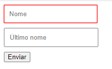
React Jsx component used to auto-validation of form fields
npm install @buuhv/react-forms-js --save
Use class name 'form-validation-alert' to format form css alert
import Sidebar from "#/components/sidebar";
import { FormValidation } from "@buuhv/react-forms";
import { useState } from "react";

function FormScreen(): JSX.Element {
	const [state, setState] = useState({
		title: ''
	});

	const onSubmitForm = () => {
		console.log(state);
	}
	const onChangeInputForm = (e: { target: { name: any; value: any; }; }) => {
		setState((prev) => {
			return {
				...prev,
				[e.target.name]: e.target.value
			}
		})
	}

	return (
		<div className='container'>
			<FormValidation onSubmit={onSubmitForm} noValidate>
				<div
					style={{
						marginBottom: 10,
					}}
				>
					<input
						style={{
							padding: 10,
						}}
						className="form-control input-name"
						name="title"
						placeholder="title"
						value={state.title}
						required={true}
						onChange={onChangeInputForm}
					/>
				</div>
				<button type="submit">Submit</button>
			</FormValidation>
		</div>
	);
}

export default FormScreen;Used to submit your form. When your type your submit function, you doesn't need to use preventDefault and stopPropagation. FormValidation already do that.
| Type | Required |
|---|---|
| Function | Yes |
Used to say for FormValidation if element need is required
| Type | Required |
|---|---|
| boolean | Yes |
All field need them own class.
| Type | Required |
|---|---|
| prototype | Yes |
This module was extracted from React Js core. Please reffer to https://github.com/buuhv/react-forms/graphs/contributors for the complete list of contributors.
The library is released under the MIT licence. For more information see LICENSE.
