Releases: giuseppelt/feelback-integrations
v0.3 - New layouts and configurations
This v0.3 release brings overall refinements, small tweaks and new UI configurations for the builtin components.
You can read the full announcement on the Feelback blog.
Highlights
- feat: new
evaluationpreset - feat: new email field for message-based components
- feat: new layout
reveal-messagefor tagged-message feelback - feat: new builtin styles
TaggedMessage improvements
New preset
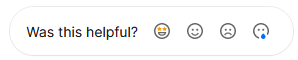
A new evaluation preset is available. It defines four values — love, happy, sad, hate — usually mapped to face emojis:
New layouts
This release introduces three new layout for the TaggedMessage.
-
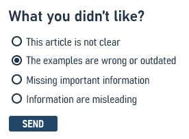
radio-group
The tags (or categories) can be displayed as a set of radio the user can easily pick
You can specify both a title and an optional description, with will be places as subtitle for each option.
At the moment, an icon is not supported.
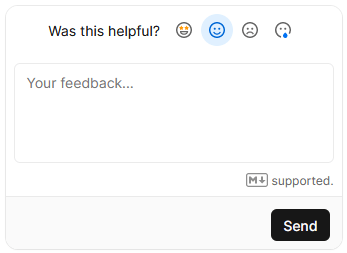
-
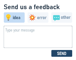
reveal-message
The tags are displayed as reaction emojis.
After the user selects one of them, a textarea with an optional message appears.
New Email field
Now it's possible to include an email filed into the form.
// one
<FeelbackTaggedMessage contentSetId="$content-set-id-from-panel"
    preset={PRESET_EVALUATION}
    withEmail="optional"
/>
The email field will be placed after the text message. The email can be optional or required.
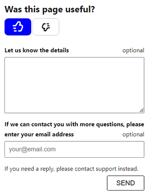
The email will be sent as Feelback metadata, identifying the user.
New builtin styles
You can now customize the appearance with some builtin styles. You use the style prop of the component:
// one
<FeelbackTaggedMessage contentSetId="$content-set-id-from-panel"
    preset={PRESET_EVALUATION}
    layout="reveal-message"
    style="bordered"
    title="Was this page useful?"
    placeholder="(optional) Type your feedback"
/>

// or multiple
<FeelbackTaggedMessage contentSetId="$content-set-id-from-panel"
    preset={PRESET_EVALUATION}
    layout="reveal-message"
    style={["bordered", "width-sm"]}
    title="Was this page useful?"
    placeholder="(optional) Type your feedback"
/>
Available styles:
| style | description |
|---|---|
| bordered | add a thin rounded border with some padding around the form |
| align-center | align the content to the center |
| width-sm | set the max-width to 320px |
| width-md | set the max-width to 440px |
For total control, you can still use custom CSS to override any style.
New Astro Starlight integration
You can collect feedback in your documentation pages built with Astro Starlight.
You can see the complete setup in the samples/astro-starlight directory.
Read the complete integration guide.
SDKs update
Contributing
Feelback SKDs are open source and developed publicly on GitHub.
Any contribution is much appreciated. Issues, bug reports and feature requests are welcome. Do not hesitate to reach us or ask for help.
v0.2 Form-Like Feelbacks
Major release
This release introduces FeelbackMessage and FeelbackTaggedMessage to receive message-like feelbacks such as advices, error reporting and similar.
The Feelback SDKs provide builtin components for form-like feelbacks which support 3 layouts:
- inline: display the form in the page
- switch: display a "Send Feedback" button, when pressed shows the form
- dialog: display a "Send Feedback" button, when pressed shows a full screen blocking modal with the form
Check the documentation for full details.
Highlights
- feat: New feelback types: FeelbackMessage, FeelbackTaggedMessage
- feat: Style improvements with per-component styling possible
SDKs update
- v0.2.0
@feelback/js-- Updated with new components setup logic Changelog - v0.2.0
@feelback/react-- Updated with new FeelbackMessage, FeelbackTaggedMessage components Changelog - v0.2.0
astro-feelback-- Updated integration with Astro with new FeelbackMessage and FeelbackTaggedMessage components Changelog
Samples
- new nextjs (bare template) with sample Like integration
- new nextra (docs template) with sample FeelbackMessage integration