Collection of nice reusable React components
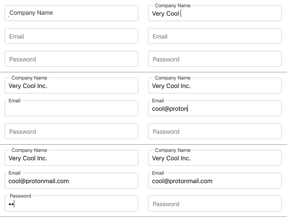
A11y compliant text input component with animated labels
<FormInput text="Email" id="email" onChange={handleChange} autocomplete />
<FormInput text="Password" id="password" onChange={handleChange} password />text: is the label name, it is also used as placeholder.id: is the unique identifier of the input field and is also used asforattribute of the label.onChangepassword: hides input if present.autocomplete: is disabled by default.
Compound component to create Tab views
<Tabs>
  <Tabs.List>
    <Tabs.Tab>Sign Up</Tabs.Tab>
    <Tabs.Tab>Sign In</Tabs.Tab>
  </Tabs.List>
  <Tabs.Panels>
    <Tabs.Panel>
      <div> I am the sign up tab </div>
    </Tabs.Panel>
    <Tabs.Panel>
      <div> I am the sign in tab </div>
    </Tabs.Panel>
  </Tabs.Panels>
</Tabs>- Note that
Tabs.Listshould have as many children asTabs.Panel.
