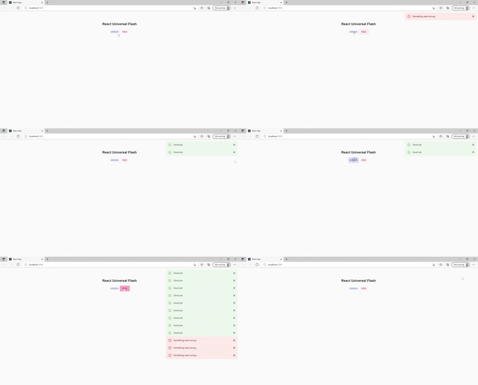
React library which provides a function to flash messages.
- Flasher component needs to be added only at one place in App
- Message can be programatically flashed from anywhere in code
- Custom component can be created to style the messages or one can use components like "Alert" from material-ui,react-bootstrap or any other library
React-Redux(flashing from reducer)
npm install react-universal-flash --save
- Configure the flasher by importing Flasher component and adding it to App/index file of your app which will be rendered always.
- If we pass child to the Flasher component that child will be used to Flash the messages.
- Flasher takes position,width and styles as props, if no position is provided default position will be"top_right"
import {Flasher} from "react-universal-flash";

const App = () => {
  return (
    <Router>
    <Flasher position="bottom_center"/>
    {/* Routes*/}
    </Router>
  );
}- if position is provided as "custom" styles prop will be applied to the Flasher.
import {Flasher} from "react-universal-flash";

const App = () => {
  return (
    <div className="App">
      <Flasher position="custom" customStyles={{top:20,right:10}}>
      </Flasher>
      <h1>React Universal Flash</h1>
    </div>
  );
}- import the flash function and fire it from anywhere in the App
- flash function takes three inputs message content, time to live(in milliseconds) and type .
- "type" can be used in the custom component to modify the message.
import {flash} from "react-universal-flash";

const Layout = () => {
  return (
    <>
      <div onClick={() => flash("Haha",6000)}>Click for Hello</div>
      <div onClick={() => flash("Hi",6000,"success")}>Click for Hi</div>
    </>
  );
};It is better you create you own message component based on the styling or library you use in your app. The default message component provided has very less styling and is available only in one color.
You can create a custom component or use one from any styling library and pass it as a child to Flasher. Examples of creating the component from scratch and creating using components from libraries like material-ui,react-bootstrap and styled-components are given below.
We can pass a custom message component as child to Flasher. Then message will be flashed in custom component. Child component will receive props - content,type and deleteFlash which can be used to show the message and delete it manually.
import {Flasher} from "react-universal-flash";
import Message from "./Message"

const App = () => {
  return (
    <Router>
     <Flasher>
       <Message/>
     </Flasher>
    {/* Routes*/}
    </Router>
  );
}const messageBarStyle = {
"padding": "20px",
"backgroundColor": "red",
"color": "white",
"marginBottom": "15px"}
const closeButtonStyle = {
marginLeft: "15px",
color: "white",
fontWeight: "bold",
float: "right",
fontSize: "22px",
lineHeight: "20px",
cursor: "pointer"
}
const Message = ({type,content,deleteFlash}) => {
const style = ((type === "green")||(type === "success")) ? {...messageBarStyle,"backgroundColor":"green"}:messageBarStyle;
return
(<div style={ style } >
{content}
<span style={closeButtonStyle} onClick={deleteFlash}>×</span>
</div>)
}
export default Message;import {flash} from "react-universal-flash";
const Test = ({ }) => {
return (
<div>
<div onClick={() => flash("Red click",12000,"red")}>Red</div>
<div onClick={() => flash("Green click",12000,"green")}>Green</div>
<div onClick={() => flash("Danger click",15000,"danger")}>Danger</div>
<div onClick={() => flash("Success click",20000,"success")}>Success</div>
</div>
);
};We can create the message component using material-ui as below and pass it as a child to Flasher
import Alert from '@material-ui/lab/Alert';

export const Message = ({type,content,deleteFlash}) =>
<Alert severity={type} onClose={deleteFlash}>
  {content}
</Alert>
`We can create the message component using react-bootstrap as below and pass it as a child to Flasher
import Alert from 'react-bootstrap/Alert';

export const Message = ({type,content,deleteFlash}) =>
<Alert variant={type} onClose={deleteFlash} dismissible>
  {content}
</Alert>We can create the message component using styled-component as below and pass it as a child to Flasher
const MessageBar = styled.div`
"padding": "20px",
"backgroundColor": ${(props) => props.color || "green"},
"color": "white",
"marginBottom": "15px"
`;
const CloseButton = styled.span`
marginLeft: "15px",
color: "white",
fontWeight: "bold",
float: "right",
fontSize: "22px",
lineHeight: "20px",
cursor: "pointer"
`;
const Message = ({ type, content, deleteFlash }) => {
return (
<MessageBar color={type}>
{content}
<CloseButton onClick={deleteFlash}>×</CloseButton>
</MessageBar>
);
};In nextjs you can add the Flasher in _app.js in pages folder. It will not affect the static generation of pages. After adding flasher flash function can be imported to any component.
//Message is a custom component , check above documents for implementation
function MyApp({ Component, pageProps }) {
  return (
    <>
      <Flasher>
        <Message />
      </Flasher>
      <Component {...pageProps} />
    </>
  );
}