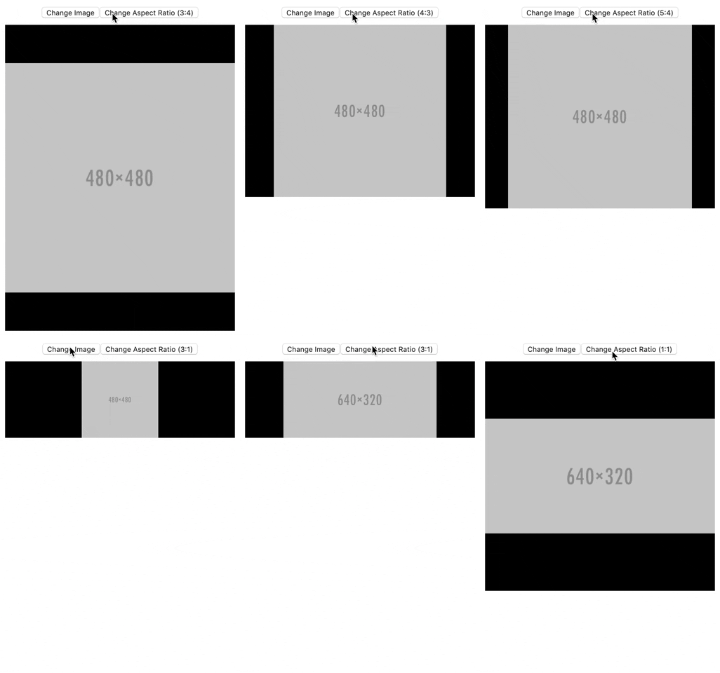
AngularJS component for a fixed aspect ratio image container.
This component can be used in responsive layouts where the image container size is variable (e.g. depends on display width).
- Fills the parent element, which can have dynamic width/height
- Keeps a fixed aspect ratio, that can be set/changed dynamically
- Holds an image, which is centered within the container, stretched to either full width or full height depending on the aspect ratio of the image and the container; if the image aspect ratio does not exactly match the container aspect ratio, black (or any user-set color) bars fill the remaining space on the top/bottom or left/right.
npm install angular-fixed-aspect-img
import fixedAspectImg from 'fixed-aspect-img';

const app = angular.module('app', [fixedAspectImg]);
Include node_modules/angular-fixed-aspect-img/dist/angular-fixed-aspect-img.umd.js in src attribute of <script> tag. Or, pull in the dependencies from a unpkg.
<script src="https://unpkg.com/angular-fixed-aspect-img/dist/angular-fixed-aspect-img.umd.js"></script>Inject dependency into your app
const app = angular.module('app', ['fixedAspectImg']);
<fixed-aspect-img
  aspect-ratio="'4:3'"
  img-src="my-image.jpg"
  bg-color="'red'"
></fixed-aspect-img>See example/, which pulls in all dependencies through a CDN, so all you have to do it open example/example.html in your browser.
imageSrc: the image URLaspectRatiooptional: a string representing an aspect ratio using : notation (e.g.'4:3', '16:9'). Default:4:3bgColoroptional: a string representing a CSS color value, used as the background of the image container (top or side bars). Default:blackaltMsgoptional: string to fill
Note: each binding is one-way component binding (<), thus if you are passing a string directly rather than a variable containing a string, you must enclose the string in quotes.
This package is licensed under The MIT License.
- Add example
- Enhanced README
- Add minified library to
dist/ - Written tests
