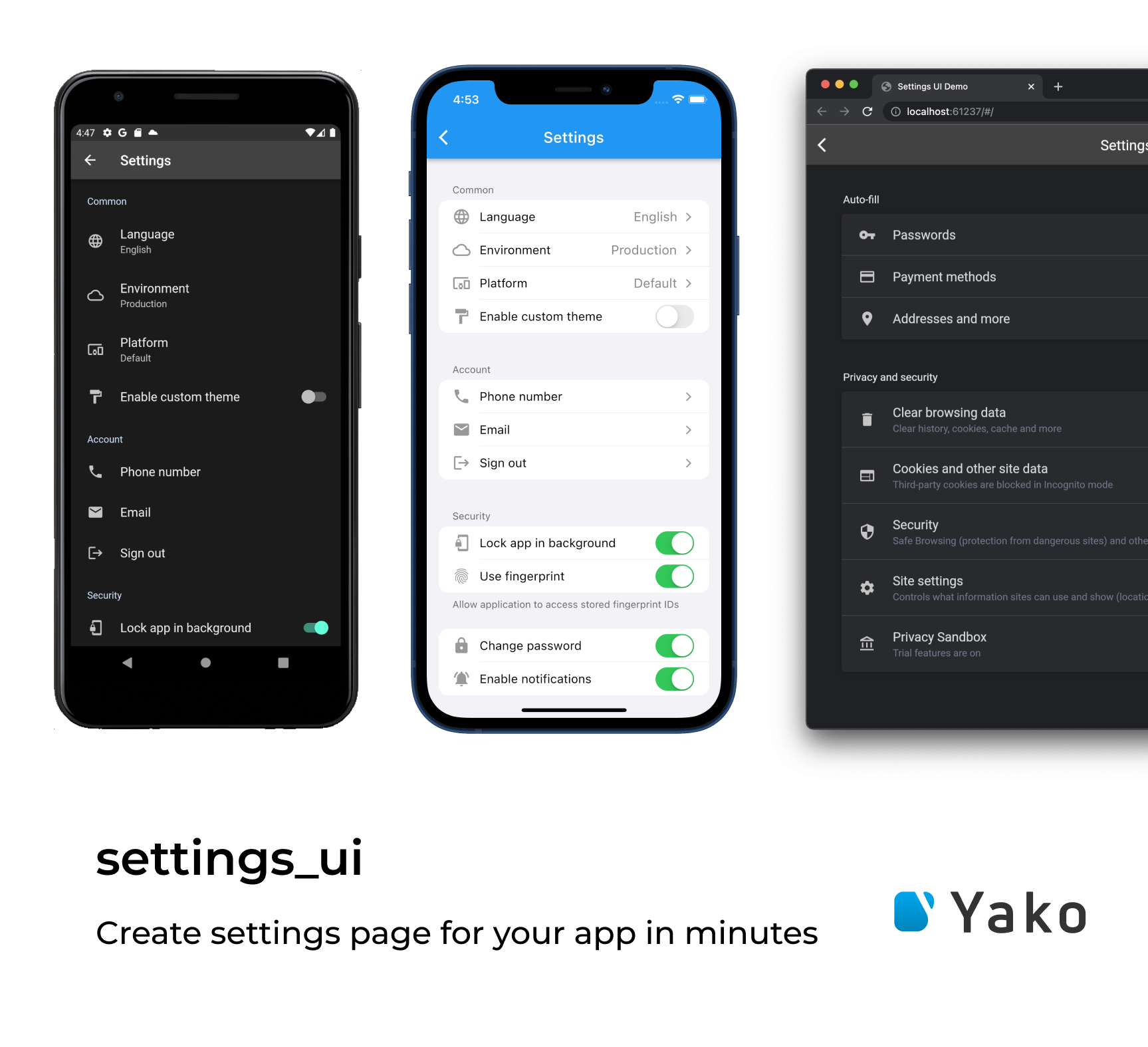
Build the beautiful settings screen UI in one moment with Settings UI for Flutter
- Add the dependency in your
pubspec.yamlfile.
dependencies:
settings_ui: <latest version>- Import the
settings_uipackage.
import 'package:settings_ui/settings_ui.dart'; SettingsList(
sections: [
SettingsSection(
title: Text('Common'),
tiles: <SettingsTile>[
SettingsTile.navigation(
leading: Icon(Icons.language),
title: Text('Language'),
value: Text('English'),
),
SettingsTile.switchTile(
onToggle: (value) {},
initialValue: true,
leading: Icon(Icons.format_paint),
title: Text('Enable custom theme'),
),
],
),
],
),Settings list it's a wrapper for your settings UI.
| Parameter | Description | Required |
|---|---|---|
| List<AbstractSettingsSection> sections | The list of your settings sections | + |
| bool shrinkWrap | Enable/disable the shrink wrap for the list | - |
| ScrollPhysics physics | Setup your custom scroll physics | - |
| DevicePlatform platform | Chose the platform view you prefer | - |
| SettingsThemeData lightTheme | Setup your light theme | - |
| SettingsThemeData darkTheme | Setup your dark theme | - |
| Brightness brightness | Overwrite the brightness you want | - |
| EdgeInsetsGeometry contentPadding | Set custom paddings | - |
| ApplicationType applicationType | Setup the application type you use: the material for MaterialApp, the cupertino for CupertinoApp, and the both, if you running the MaterialApp and the CupertinoApp depending on the device's OC |
- |
The Setting section is the block of your settings tiles located in your SettingsList.
| Type | Description |
|---|---|
| AbstractSettingsSection | An abstract entity. Just an OOP's thing (so you can expand it yourself) |
| CustomSettingsSection | You asked a lot. We implemented this for you. Now you can put anything you want as a child inside this custom section. Just paste the image of your cat or the weather widget inside the SettingsList. Feel free and enjoy |
| SettingsSection | The default section widget, contains Widget title, EdgeInsetsDirectional margin and the required list of AbstractSettingsTile we called tiles |
Here it is. The section tile. It displays the elements you want to show.
| Type | Description |
|---|---|
| AbstractSettingsTile | One more OOP's thing (so you can expand it yourself) |
| CustomSettingsTile | The main idea is the same as for the CustomSettingsSection. You can put anything as a child inside your SettingsSection. |
| SettingsTile | I think that we need to discuss this deeper. See below for the details. |
The implementation of AbstractSettingsTile. It has a lot of fabric methods and parameters. Let's
take a look.
| Constructor / Fabric method | Description |
|---|---|
| SettingsTile | Displays the default setting tile. Nothing special. |
| SettingsTile.navigation | Created to indicate this tile as a navigation tile. It adds a right-located arrow for the iOS design as an example. |
| SettingsTile.switchTile | Creates a switch tile. Do you want some switch? Just use this one. |
| Parameter | Description |
|---|---|
| Widget leading | Adds some leading for your tile. Just like with the ListTile. |
| Widget trailing | Adds some trailing for your tile. Just like with the ListTile. |
| Widget title | The title of your tile. |
| Widget description | Additional info about this tile. Displays different ways according to the platform |
| Function(BuildContext context) onPressed | More interactivity for your tiles. Just tap it. |
| Color activeSwitchColor | Set the switch color for your SettingsTile.switchTile |
| Widget value | Just like the description but more declarative. You can compare and choose which exactly you want to use. |
| Function(bool value) onToggle | Override the on switch event in your SettingsTile.switchTile |
| bool initialValue | Choose the initial value for your SettingsTile.switchTile |
| bool enabled | Mark your tile as disabled. It's pretty easy! |
This project is licensed under the Apache License 2.0 - see the LICENSE file for details

