1. Toolkit for Open and Sustainable City Planning and Analysis ‐ User manual
Table of contents
5 Workshops with the Toolkit for Open and Sustainable City Planning and Analysis
The Toolkit for Open and Sustainable City Planning and Analysis was developed in cooperation between the Digital City Science of the HafenCity University Hamburg (HCU) and Deutsche Gesellschaft für Internationale Zusammenarbeit GmbH (GIZ) in India and Ecuador. It is an open source tool and the software for this project is based entirely on open source components.
The Toolkit for Open and Sustainable City Planning and Analysis is a web-based geographic information system (GIS) for multi-touch tables that is optimised for the use by non-GIS-experts. It supports integrated and participatory urban planning processes, fostering dialogue between governments and citizens and exchange of knowledge and data between government departments.
The main functionality of the Toolkit for Open and Sustainable City Planning and Analysis is to visualise and analyse complex urban data, jointly among local practitioners and with citizens.
Figure 1 - Overview of the user interface

The workflow of the Toolkit for Open and Sustainable City Planning and Analysis follows the logic of a regular GIS work session. First, the user provides a ‘basemap’ which contains the basic map layers of the area of concern. Then, the user sets the selection area in which computations will take place.
Figure 2 illustrates the overall workflow of the tool. It describes the basic settings that need to be done before running each module. The detailed instructions for running each module are provided in the module section of this manual.
Figure 2 - Overview of the general work-flow

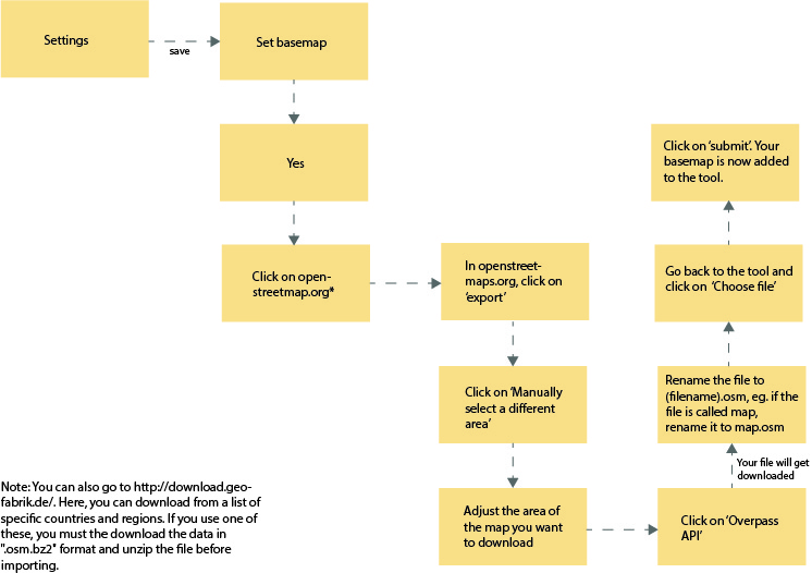
A 'basemap' is a set of map layers that serves as a basis for the analytic works.
It needs to be set before conducting any operations in the Toolkit for Open and Sustainable City Planning and Analysis because the basemap layers are needed in later calculations.
The basemap contains the road networks, buildings and water lines of the geographic area of concern. These three map layers are extracted from an OpenStreetMap file uploaded by the user.
To set the basemap, click on ‘Set basemap’ from the Settings menu.
A message will show in the message panel to inform the user if a basemap already exists and ask if the user wants to set a new basemap. Click ‘Yes’ to confirm.
It is then required to upload an .osm file as the new basemap.
To download an .osm file, the user needs to:
- Navigate to openstreetmap.org.
- Click on the ‘Export’ button at the top
- Find in the world map the area that he/she wants to work on
- Click on Manually select a different area in the left panel
- Press and drag the cursor on the map to select the area of concern
- Click on ‘Overpass API’ in the left panel and the download should start in a few seconds.
- Rename the downloaded file to .osm. For example, if the file name is ‘map’, rename it to ‘map.osm’.
Figure 3 - Steps of downloading .osm file on user interface

When the download is complete, the user clicks on the ‘Choose file’ button in the Toolkit for Open and Sustainable City Planning and Analysis, selects the .osm file and clicks on ‘Submit’ to upload the file. For a file containing the area of a medium-sized city this process will take roughly 10 seconds, but it could take longer if the file is particularly large.
In order to view the area of the uploaded basemap, the layer “Basemap bounding box” can be activated in the layer switcher.
Figure 4 - Work-flow to add a base-map
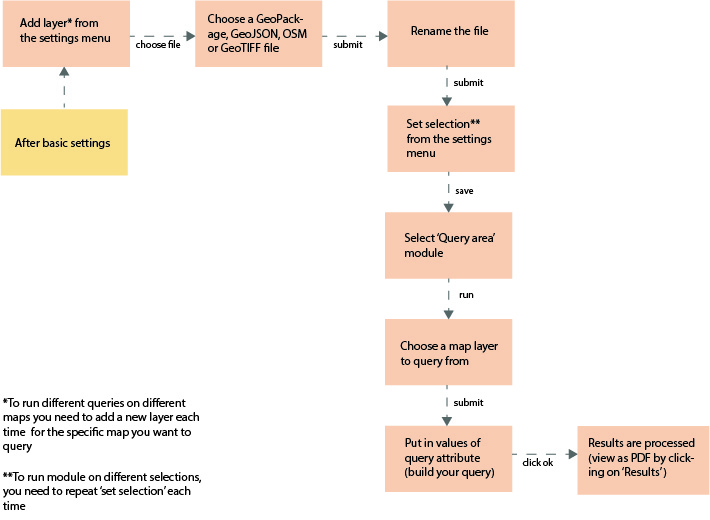
A 'map layer' is a geodata file containing geographic features related to a specific topic. It is different from the basemap, which is a general-purpose map.
In order to conduct analyses on certain topics, the user first uploads an appropriate map layer into Toolkit for Open and Sustainable City Planning and Analysis. Unlike the basemap, many map layers can be stored in the Toolkit for Open and Sustainable City Planning and Analysis system at the same time. Usually, these map layers need to be prepared by GIS experts in the user’s organization, based on the available data.
Figure 5 - Work-flow to add a map layer

A ‘selection’ is a selected part of the available basemap area, for example, a district of the city. Calculations will only be performed for this selection.
The user sets a selection before conducting any operations in the Toolkit for Open and Sustainable City Planning and Analysis. The system can only have one selection at any given time.
Figure 6 - Work-flow to set a selection


Spatial resolution is the precision at which raster-based analyses (e.g., time-map calculation) are performed. The higher the resolution in metres, the lower the quality of the analysis result PDF would be (the lower the definition the result image will have), and by default, the quicker the calculation will be.
Resolution is defined in metres. The user sets a resolution before running the time-map module. The system can only have one resolution at any given time.
Figure 7 - Work-flow to set a selection

Modules are computational functions that generate specific analytic results. They are the core features of the Toolkit for Open and Sustainable City Planning and Analysis.
The ‘Calculate time map’ module creates an isochrone, showing the time it takes to reach any part of the selected area from a ‘start point’.
The time-map module can calculate the time map for three different transport modes: car, bicycle and by foot. At the start of the module, the user can choose between the three options. Please note that the module calculates the time-map on the basis of the existing road network and does not consider bicycling or walking infrastructure. The speeds used for the calculations are averages for the different road types and transport modes, as shown in table 1.
Table 1 - Average road speeds
| Type of road | Automobile | Bicycle | Walking |
|---|---|---|---|
| Motorways | 100 | 0 | 0 |
| Trunk roads | 80 | 0 | 0 |
| Primary roads | 60 | 12 | 5 |
| Secondary roads | 50 | 12 | 5 |
| Tertiary roads | 50 | 12 | 5 |
| Connecting roads | 50 | 12 | 5 |
| Service and track roads | 50 | 12 | 5 |
| Residential roads | 40 | 12 | 5 |
| Living streets | 10 | 10 | 5 |
| Footways | 0 | 5 | 5 |
In case the average speeds in the user’s chosen location are different from the ones used by the system, there is the possibility to adapt the average speeds for all road types and transport modes. This needs to be done by an administrator, who will find instructions in the administrator's guide.
As an option, an ‘affected area’ can be defined. An ‘affected area’ is an area where traffic is slowed down (for example, because of a street parade or flooding).
Remember, the calculation will be carried out within the ‘selection’ area only. Therefore, the ‘start point’ and the ‘affected area’ both need to be within the limits of the ‘selection’ area. To view the current selection, the ‘Current selection’ layer in the layer switcher can be activated.
Figure 8 is an example of the PDF result, which is the type of output to be expected when using the calculate time-map module. The yellow cross is the startpoint from where the time taken to reach the perimeter of the chosen selection area (shown by the shape of the base-map) is calculated. The irregular quadrilateral is the ‘affected area’. The parts of the road network in green show that these are the fastest parts to access (in roughly three and half minutes, as shown in the legend), while the affected area significantly affects time taken to reach other parts of the selection area due to slowing down of speeds in the affected area. The parts in red show that they take the longest to reach (up to 7 to 9 minutes) and yellow and orange parts take less time in comparison.
Figure 8 - PDF result example of the time map module

Note: The value represented by a particular colour in a chosen transport mode differs from another transport mode in the time map results. For example, in case the user chooses bicycle as the transport option, the colour green in the legend for the bicycle time map analysis may refer to 0 to 5 minutes. However, in the case of the user choosing walking as the transport option, the same colour may refer to 0 to 10 minutes. Dark red may refer to areas that are not feasible or are too far to be accessed by the specific mode of transport.
To start the calculation, the user selects ‘Calculate time map’ from the ‘Modules’ menu, clicks ‘Run’, and the guide for each step will appear in the message panel.
Step 1: The user defines the transport mode for the calculation. There is a choice between ‘car’, ‘bike’ and ‘by foot’.
Step 2: The user is required to provide a start point. The ‘circlemarker’ drawing tool should be automatically activated and the user will be able to draw a marker on the map as a start point.
When the drawing is done, the user clicks ‘Save’ in the message panel.
Step 3: The user is asked to draw an affected area. This step is optional, so one can either click ‘Skip’ to skip this step or draw an affected area and click ‘Save’. To draw an affected area, the ‘polygon’ drawing tool can be used. After the drawing is done, the user clicks on ‘Save’ to continue.
After the above steps are done, the calculation should start. The time it will take varies from a few seconds to around one minute depending on the ‘resolution’ value and the size of the ‘selection’ area. When the process is complete, the user clicks on the ‘Results’ button at the top of the screen to view the PDF result. Alternatively, he/she can switch on the ‘Road-level time map’ from the layer switcher on the right side to view the results on the map window.
Figure 9 - Work-flow to run the 'calculate time map' module

While using the time map module, please be aware that the analysis is based on the road network derived from OpenStreetMap data, which may be inaccurate in some places. Please refer to the base map section in the Administrator's manual for more information.
To query an area means to filter the map features/elements based on some user-defined values. For example, one can query a housing map layer based on the household population and monthly income, and only the houses within the corresponding value range will be returned.
As in the time map module, the querying calculation will only work on the ‘selection’ area. The user can always reset the selection area if the current selection is not suitable.
To start the calculation, the user selects ‘Query area’ from the ‘Modules’ menu, and clicks ‘Run’. Step-by-step instructions will start to appear in the message panel.
Step 1: The user will be asked to select a map layer to query. To view the details of each map layer option, one clicks on the map layer name and clicks on the ‘Show attributes’ button and an attribute window will appear. To confirm a map layer selection, one clicks on ‘Submit’.
Step 2: A query form appears in the message panel. Firstly, the user is presented with a ‘query cluster’ consisting of a query attribute input, a minimum value input and a maximum value input. This example illustrates what these inputs are for:
Imagine one wants to query a housing map layer. The map layer shows all housing facilities within a city area, and contains information such as household population and household income of each facility. To query all households with the household income between 200 and 3000, one needs to set the query attribute as ‘household income’, minimum value as ‘200’ and maximum value as ‘3000’. The query can only be run with numeric values and not words or letters.
One can add query clusters by clicking on the ‘+’ button, and remove query clusters by clicking on the ‘x’ button on each cluster. One also has to set the logical relation (‘AND’, ‘OR’) between clusters if there is more than one cluster.
After the query clusters are set, the user clicks on ‘OK’ to start the calculation process. When the process completes, a PDF result will appear in the results window.
Figure 10 - Work-flow to run the 'query' module
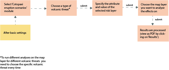
This module is designed to help users in Latacunga, Ecuador to identify infrastructure that could be affected by threats of a potential eruption of the Cotopaxi volcano.
There are three types of threats identified: ash fall, lahar flows and lava flows. To start the module, the user selects ‘Cotopaxi eruption scenarios’ from the ‘Modules’ menu and clicks ‘Run’. Step-by-step instructions will appear in the message panel section.
Figure 11 is an example of an output with the cotopaxi eruption scenarios module. It shows the farmlands potentially affected by lahar flows in the type 5 (lahar) risk zones. In the result, the red striped area is the lahar risk zone, and the polygons with the grey fill are the affected farmlands.
Figure 11 - Output example of the 'Cotopaxi eruption scenario' module

Step 1: The user is asked to choose a type of volcanic threat whose potential impact shall be analysed.
Step 2: One is asked to choose an attribute and a value. Some values are already suggested in the value input section. After choosing the attribute and value, one clicks on ‘submit’.
Step 3: The user is presented with a list of layers to query from. This will include the layers (if any) in the layer switcher and those added by the user through the ‘add layer’ function. After choosing the layer to analyse the effects on, one clicks on ‘Submit’. The PDF results can be viewed in the ‘Results’ window.
Figure 12 - Work-flow to run the 'Cotopaxi eruption scenario' module
- Get-feature-info- The user can click on individual layers and see what the layer contains in detail. For this, the chosen layer needs to be switched on from the layer-switcher (eg. 'Markets and squares'). The user can then click on a polygon from this layer and a pop-up box displaying all the information contained in the chosen polygon will be displayed.
Figure 13 shows an example of what displays when you click on a layer, in this case 'Markets and squares'.
Figure 13 - Example of the 'get-feature-info' map tool

- Measuring tool- This tool allows the user to measure areas drawn on the map. The process of using the measuring tool is similar to drawing a selection area. After drawing the polygon is completed, the measurement of the area (in square kilometer and square miles) and the perimeter (in kilometers and miles) is displayed.
In order to make urban development processes more comprehensible, predictable and interactive, GIZ & HCU have developed this scalable, mobile and low-cost tool based on multi-touch table technology. The interactive technology can be used to visualise and analyse complex urban data, jointly among local practitioners and/or with citizens. It can complement "traditional" forms of public participation as well as purely internet-based forms of participation, or support multi-stakeholder decision-making. Thus, the quality and effectiveness of consultation and participation of both public and institutional stakeholders increases, fostering more transparent and evidence-based planning and driving digitalisation in different sectors of local city governments. Furthermore, it helps public administrations to overcome the sectoral divide by sharing spatial data in an easy and comprehensive way.
Digitization offers great potential to facilitate participatory, more transparent planning and evidence-based decision making. However, existing digital solutions fail to bring stakeholders together and to enable real dialogue due to their purely virtual nature (i.e. online-based platforms). Furthermore, quantitative (e.g. statistical) data often is too complex and abstract for decision-makers and citizens to comprehend - let alone to work with.
Resulting from this are two major use cases for the application of the open city toolkit:
-
The use in expert discussions to support decision-making: Using, and interacting with complex urban data such as legal planning frameworks, planning information, or infrastructural systems, without necessarily having expertise in Geographic Information Systems (GIS)
-
The use in multi-stakeholder participation workshops: Effectively involving the broad citizenship into urban development planning projects in order to address their needs and ensure their engagement and participation in the decision-making and acceptance-finding processes.
The following chapter summarises lessons on how to use the TOSCA for the above mentioned use cases. These lessons are mainly drawn from three projects that the CityScienceLab at HafenCity University has implemented in cooperation with different departments in the city of Hamburg: DIPAS (Digital Participation System), COSI (Cockpit for Social Infrastructure) and FindingPlaces. While the DIPAS project is the implementation of an integrated digital participation system for informal citizen participation in planning, that can be used online and on-site, the COSI project focuses on creating a digital planning support tool to provide city planners with a range of analysis functions as basis for decision-making and discussion and is hence, meant for experts. The FindingPlaces project organised numerous workshops with citizens to identify public areas for building refugee accommodation. Besides encouraging a city-wide dialogue on how and where to find accommodation for a large group of refugees arriving in Hamburg, it showcased the complexity of planning processes and thus helped develop an increased acceptance within civil society.
These lessons also built on experiences with a first prototype of the Toolkit for Open and Sustainable City Planning and Analysis that was used in workshops with local stakeholders in India and Ukraine.
Advantages of using tools such as the TOSCA in expert discussions:
- Allow inter-disciplinary use within different specialist authorities and district offices and hence, encourages dialogue and cooperation between different experts/departments.
- Data integration through cross-layering or overlaying information allows for different kinds of analyses.
- Social planners or planners without GIS expertise can also conduct their own analyses due to the simplified nature of such tools.
- Applications are not limited to urban planning, but can be multiple, such as health, social services, real estate, etc.
- They simplify analytical tasks, visualize connected data in a readable and tangible way and can be tailored to reflect the actual workflow of planners.
- They enable users to access data and /or models to make better decisions, thus leaving the human user as the one ultimately drawing conclusions.
Advantages of using tools such as the TOSCA for multi-stakeholder participation:
- Facilitates direct discussion between experts and non-experts leading to evidence-based and goal-oriented interaction.
- The dialogue between citizens can be rationalized by shifting from a theoretical discussion to a more tangible level through clear visualization of facts thus providing a reality check.
- Incorrect/vague information can immediately be replaced by evidence-based data on specific locations. Participants can help bridge a data availability gap by providing their valuable local knowledge of the city and area in question. This could result in complementing already available data.
- Can enhance the ’soft’ level of human interaction, making citizens feel like partners in decisions that affect their lives.
- Can contribute to political literacy of the general citizenship.
Possible disadvantages of using tools such as the TOSCA for the two described use cases:
- The success of such workshops is highly dependent on the local moderation teams and how they conduct the workshop, explaining the use of the table and inviting participants. For example, the positioning of the moderator influences distribution of participants at the table.
- Each workshop requires heavy adaptation to the number and characteristics of the participants and the nature of the event.
- Tight schedules can result in insufficient time to carry out an effective round of workshop.
- The size of the touch-table limits the number of participants and can contribute to a selection bias.
- Non-experts might have problems understanding professional planning content, e.g. if they are not used to working with maps and satellite images.
- Lack of available urban data can lead to insufficient, inaccurate or asymmetric results.
- Pre-processing of data can allow for manipulation of the overall process outcome.
- Legal considerations and transparency laws should be considered, e.g. in terms of access to data.
Concrete lessons for organizing multi-stakeholder participation workshops with tools such as the TOSCA:
- The workshop should be adapted to (a) the type of openness of the event (participation with or without registration has an influence on the involvement in the workshop), (b) the content and depth of the event (brainstorming or in-depth concept), (c) the format (information event, workshop), (d) the number and characteristics of participants.
- Interaction works well if the table is integrated into the workshop process, e.g. with a specific task/narrative and time during the workshop programme. Setting clear goals for the table use is thus of high importance.
- It is important to make sure that participants perceive the table and understand that they are invited to take part, even without actively asking for information, e.g. spatially/visually - for example by means of posters or movable walls.
- The location of the table within the room is decisive for interaction and to increase access.
- The moderator should actively help participants to distribute evenly and e.g. to create a second row.
- There can be a feeling of being excluded in the north of the map. It should be considered to leave this side free, or position the moderator there.
- There is a need to address different personalities, e.g. the moderator can encourage quieter participants to make sure their voices are also heard, and not only focus on those that are the loudest or most active ones.
- Moderation and workshop programme need to be adapted depending on participants’ age and experience with digital media.
- If there is no moderator, which can also be an option, the purpose and central functionalities need to be explained in writing, either on a poster next to the table or by the system itself, thus inviting participants to become acquainted with the system autonomously.
- There needs to be a balancing between the time used to understand how the tool works and the actual content discussion. Consider to only have a limited number of people operate the tool (with prior instructions and familiarisation).
- Importance to reduce participant’s potential perception that control of technology and analyses are in the hands of the tool developers.
- Exit-surveys and post-workshop meetings are important for a feedback loop.
- Team capacities for conducting such workshops are 4-8 people: a combination of relevant authorities, moderator, scientific researcher and tech support.
- It should be transparent for all participants how their inputs and contributions are used in the participatory process. What effect they might have and what decisions/questions are outside of the participatory process.
- All results produced in the workshops shall be aptly communicated to participants in / after workshops and be made accessible.
Example workshop choreography:
- Introduction of the tool and role of its use in the workshop
- Tutored test play to familiarise with the system
- Focus issue: Jointly working on a specific task
- Participants independently search and analyse (according to instructions/guidelines)