MS7
The mobile app aims to address the problem of "Difficulties finding people to practice a sport" by providing a platform that connects Uniandes students with other like-minded individuals interested in sports. The app provides users with a range of tools and features to help them overcome logistical and social barriers, making it easier to engage in regular physical activity and pursue athletic interests. By fostering a sense of community, the app can encourage ongoing engagement in physical activity, which can lead to improved physical and mental health. The value proposal of the app is to provide users with a convenient and efficient way to connect with others who share similar interests, find and book available sports facilities, and receive relevant notifications about their preferred sports activities, all in one place.
Furthermore, regarding smart features help a lot with the value proposition by providing users with a more personalized, efficient, and engaging experience. For instance, the Real Time Facility Availability feature helps users make informed decisions about when and where to engage in physical activity, reducing scheduling conflicts and minimizing wait times, while the Personalized Sports Recommendations feature helps users discover new sports or activities and find compatible sports partners based on their preferences and activity history. Both features increase user satisfaction and loyalty to the app and can help users achieve their fitness goals.
On another hand, Context Aware features can help to add value to the app's proposition by providing personalized recommendations based on the real time context of the app. For example, one of these features could suggest the best time of day to engage in physical activity, based on the real time tracking of current sports events. Additionally, another CAS feature such as Friends' Activity Tracking could identify and suggest specific times to play sports based on the user's Friends real time event activities.
After prototyping our new screens for a while, we made the decision to change the color palette.

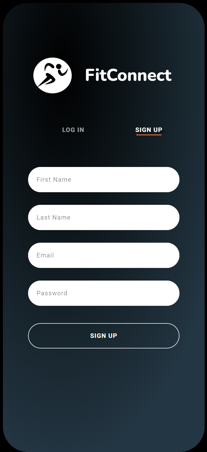
The color palette chosen for this solution statement includes 5 distinct colors:
- 0x20A4F3 (a bright blue)
- 091540 (a dark blue)
- DC602E (a deep orange/red)
- FF8750 (a lighter, more muted orange)
- FFFFFF (white)
The bright blue color (#0x20A4F3) was chosen as the primary color for the app, as it conveys a sense of energy, excitement, and innovation, which may be appealing to potential users. It also represents the idea of being connected and in motion, which is appropriate for a sports-oriented app.
The dark blue (#091540) may be used to provide contrast or to indicate secondary information or navigation elements. As a darker color, it may also help reduce eye strain and improve readability in low-light environments.
The deep orange/red (#DC602E) and lighter, more muted orange (#FF8750) likely represent the idea of movement, warmth, and enthusiasm, which aligns with the app's purpose of promoting physical activity and creating a sense of community. These colors also provide visual contrast and can help draw attention to specific areas of the app or calls to action.
Finally, the use of white (#FFFFFF) may help create a sense of cleanliness, simplicity, and ease of use for the app, which can be especially important for user interfaces. It can also help to balance out the brighter, more energetic colors used elsewhere in the app's design.
For our application we have decided to use the fonts Roboto and Nunito for our texts and titles.
Using a combination of Roboto and Nunito fonts in a our app can create a visually engaging and clear user interface. Roboto is a modern sans-serif font that is easy to read and great for headings, while Nunito is a rounded sans-serif font that is friendly and approachable, and suitable for body text. Together, they can create a visual hierarchy that helps guide the user's attention to important information while maintaining a friendly and approachable feel. The combination of these fonts can help to break up long blocks of text and create a more dynamic and visually interesting interface that is easy to use and navigate.
https://m3.material.io/styles/typography/overview
Post MS6 Edit: In the end, after careful consideration we decided to switch the secondary font Nunito for Rubik since it shared most of Nunito's characteristics, but it was easier to use and implement. Furthermore, some Material UI articles recommended Rubik over Nunito.
For our app we're planning on using Material UI Icons because they can improve the user experience by making it easier for users to identify and interact with different parts of the interface. These icons have a simple and intuitive design that is easily recognizable and universally understood. Incorporating Material UI icons can also help to create a consistent and cohesive design language throughout the application, complementing the overall visual style and creating a polished and professional look. Overall, using Material UI icons is a smart choice for a sports and fitness application, as it can improve usability and visual appeal.
https://m3.material.io/styles/icons/overview
Our sports app is going to use bottom navigation combined with the movement by pressing sections on a screen for several reasons. First, it allows for easy and quick navigation throughout the app, making it simple for users to find the features they need. With the home screen serving as a central hub to access subsections like joining an event, opening exercise guides, or reserving a court, the bottom navigation bar offers a convenient way to switch between these subsections. Additionally, the movement by pressing sections on a screen adds an intuitive and interactive element to the navigation, making it feel more natural and engaging for users. By combining these two navigation patterns, users will be able to seamlessly move through the app and access the features they need with minimal effort. Finally, the inclusion of a profile section in the bottom navigation bar allows users to quickly access and manage their account information, further streamlining the overall user experience.
For this microsprint we have designed 10 different app views. All of these were created and developed by the whole group. The specific views are the following:


You can check out the native digital prototype here.