Sprint 2
This is the main wiki page for the Sprint 2 development by the Team 24. Here you will find a directory that links to all the microsprints and the Sprint 2 Activity Deliverable.
- Which are the local features that take the longest time to execute compared to the average execution time? Which part in the code is causing this performance impact?
- How many times has the app crashed over the past week? Which elements are causing the crashes?
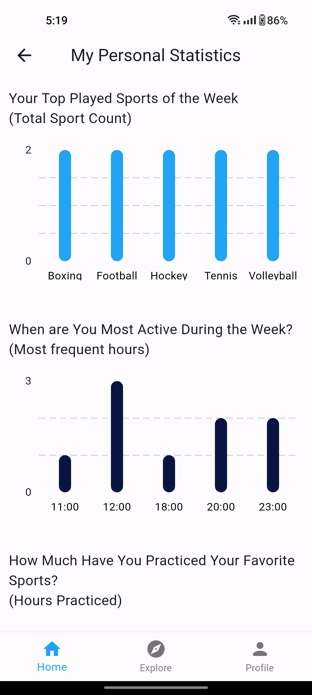
- Which are the most searched/played sports by the user per week? This can help us recommend better information regarding exercises and food to eat during/after playing the sport.
- What are the most frequent hours in which the user attends or creates events? Recommend existing matches to the user based on their history of played matches.
- How many hours has the user practiced a specific sport during the week? This information is used for the functionalities of personal statistics, achievements and university ranking, there will be an achievement that is the star of the week by sport, and the user will also be notified if they have lost the ranking podium so that they can continue practicing the sport.
- Set up and integrate Firebase Crashlytics into your app:
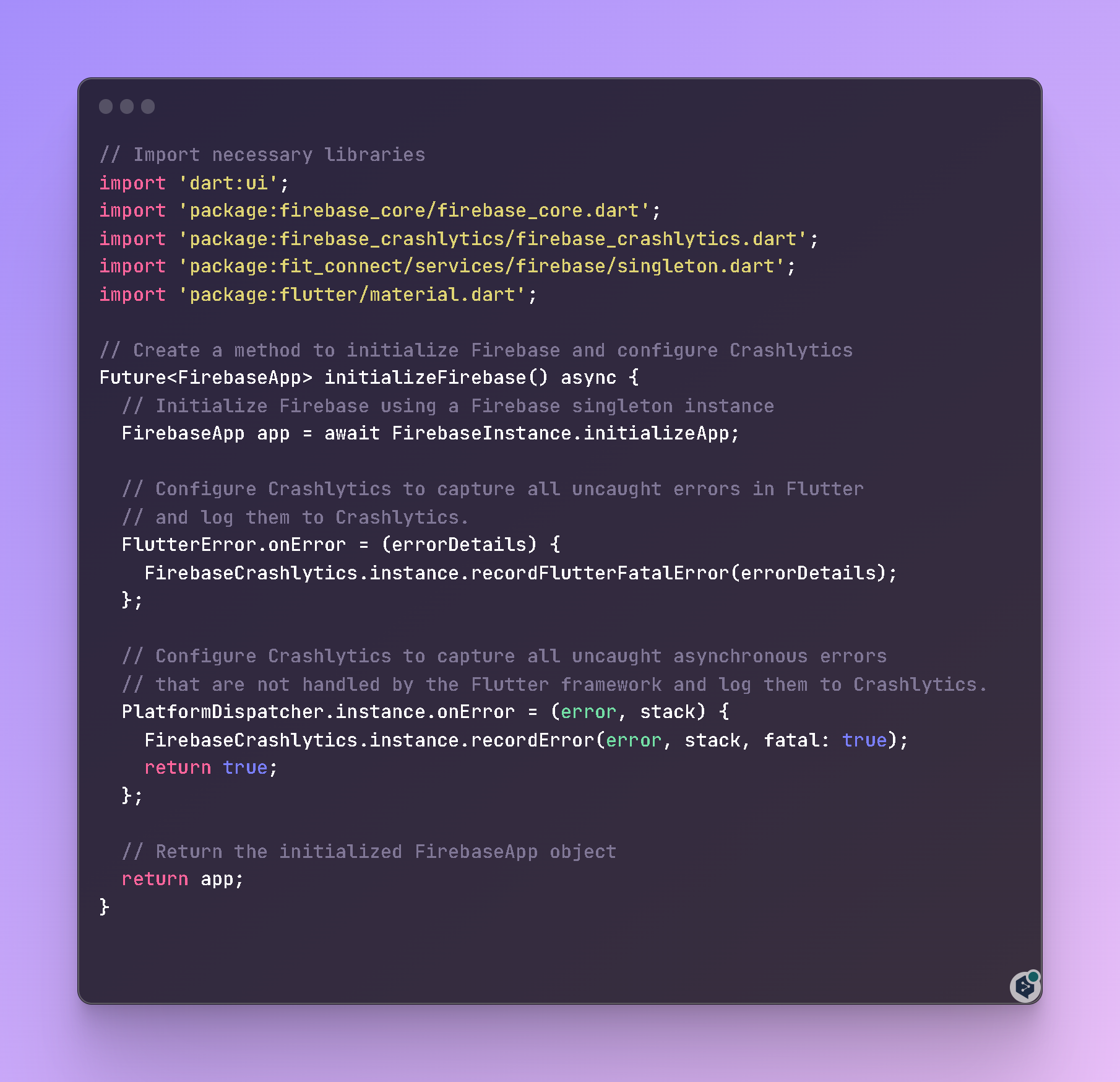 {width="600"}
- Testing Crashlytics: We verified that Crashlytics was working correctly in our app by forcing a crash and checking the Crashlytics dashboard in the Firebase console.
- Monitor crashes in the Firebase console: We logged in into the Firebase console and selected the FitConnect project. Then we navigated to the Crashlytics section (Quality > Crashlytics) to view the app crash reports.
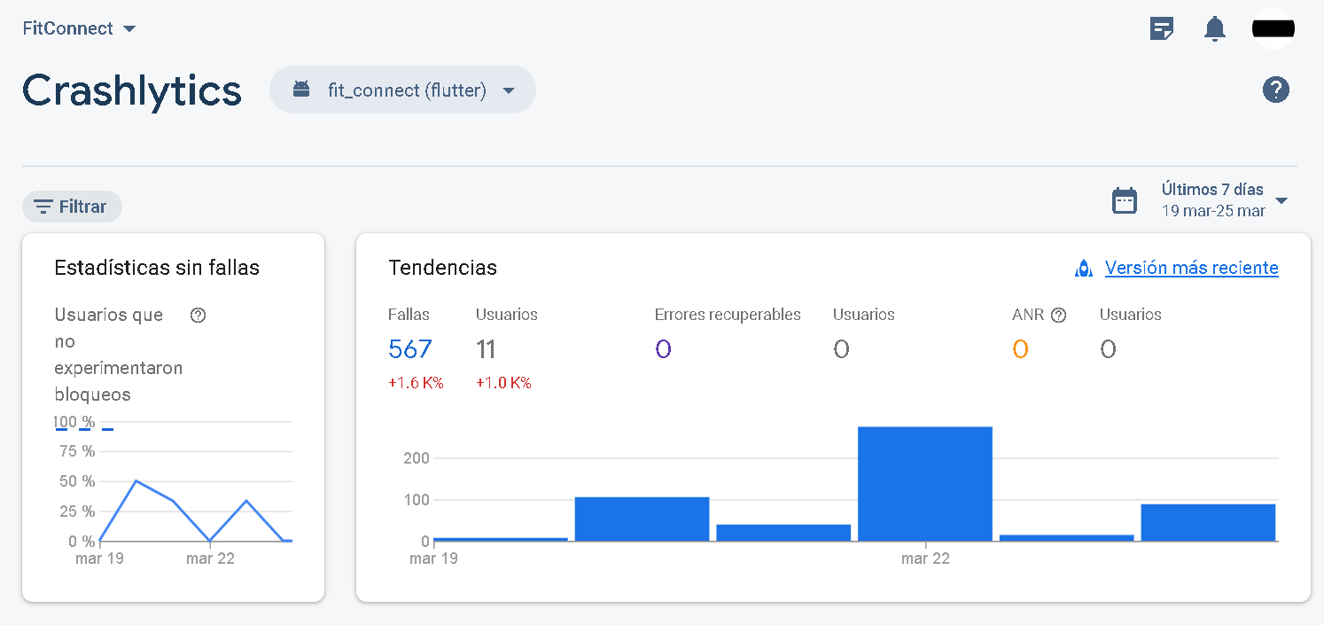
- Filter crash reports by date: In the Crashlytics section, we can use the filters to select a specific date range. In this case, the crash reports were filtered to show only those that occurred in the last week.
- Analyze and fix crashes: Reviewed crash details in the Firebase Crashlytics console, including the number of times a crash occurred, the percentage of users affected, and the associated stack trace. With this we identified the problematic elements in our code that were causing the crashes, and worked to fix them based on the information provided by Crashlytics.
- Test and validate the solutions: After fixing the issues in the code, we did extensive testing to make sure the crashes no longer occurred. Also, we continued to monitor the Firebase Crashlytics console to make sure no new crashes were being reported.
By following these steps, we were able to determine how many times the app had crashed in the last week and what elements were causing the crashes. In addition, we worked on solving the problems found to improve the stability and quality of the application.
For instance, in this image we can see that there were 567 failures in the last week.
 {width="800"}
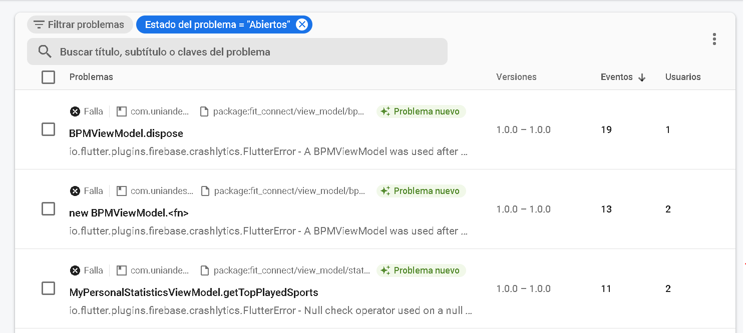
In this image we can see where these failures are being caused, in which project files.
 {width="800"}
Lastly, we can see how many users of the application this fail is affecting, the error and a possible solution.
 {width="800"}
Which are the local features that take the longest time to execute compared to the average execution time? Which part in the code is causing this performance impact?
Regarding the local features that take the longest time to execute compared to the average execution time, we used custom traces from Flutter and the performance dashboard from Firebase to analyze the application's performance. These tools helped us identify the specific parts of the code that were causing performance issues and taking longer to execute than average.
Here you can find how to use this:

This is our Firebase Performance dashboard, where we can find our user loading times from main events defined with the custom traces:

After analyzing the performance data, we were able to pinpoint the problematic code and optimize it to improve the app's overall performance. This process involved reviewing the code and identifying any potential bottlenecks or inefficiencies, as well as making any necessary changes to improve the performance of the application.
By optimizing the code in this way, we were able to significantly improve the performance of the application and provide a better user experience for our users.
To answer these questions, we collected and analyzed user data such as search history, play activity, and event attendance.
Once we had analyzed the data, we displayed the results back to the user in a personalized format such as a dashboard in the "My Stats" view screen. For example, we showed the user the most searched/played sports per week in a chart or graph format, making it easy for them to see their preferences at a glance.
Similarly, we displayed the most frequent hours the user attended or created events in a similar format, providing recommendations for existing matches based on their history of played matches.
Finally, we showed the user how many hours they had practiced a specific sport during the week, along with their personal statistics and achievements. This included a star of the week by sport, as well as notifications if they had lost their ranking podium, motivating them to continue practicing the sport.
You can see an example of this dashboard in action below:
 {width="250"}!
  {width="250"}!
To ensure a fast and reliable backend system for our app, we decided to use Firebase and its services as our primary set of tools. By using Firestore, Firebase Analytics, Firebase Crashlytics and Firebase performance within our analysis pipeline, we can track user behavior in real-time, monitor custom events specific to our app, and receive detailed crash and performance reports. Additionally, with the scalability of Firebase, we can trust that it will handle the large volume of data our app generates. With that in mind, we propose the following design for our analytics pipeline:
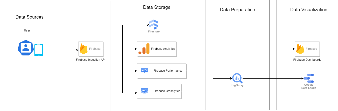 For this pipeline we propose 4 main layers that will handle the data collected:
- Data Source: In this case, the data source are our mobile app users. Data is sent from the app usage, which can include a wide range of data points such as user behavior, user demographics, user preferences, performance and analytics metrics and more.
- Data Storage: The data is stored in Firebase's Firestore, which is a cloud-hosted NoSQL database. The data is collected through Firebase Analytics, Crashlytics, and Performance, which are all part of the Firebase platform. Firebase Analytics collects usage and event data, Crashlytics collects data about app crashes and errors, and Performance collects data about app performance.
- Data Processing: Data is then gathered by BigQuery, which is a cloud-based data warehousing and processing platform. BigQuery is used to process and analyze large datasets, and it integrates with many different data sources. In this case, BigQuery is used to process and analyze the data from Firebase and prepare it for visualization.
- Data Visualization: The final layer in the analytics pipeline is data visualization, which is where the data is presented to an analytics user. In this case, Firebase dashboards are used to provide a simple way of performing analysis and queries on the collected data from the mobile app users. Additionally, Google Data Studio is used for more complex and advanced data visualization. Data Studio is a powerful data visualization tool that allows us to create interactive dashboards and reports, and it seamlessly integrates with multiple data sources, including BigQuery, making it an excellent choice for visualizing data from this analytics pipeline.
(You can click on the diagrams to open them at full resolution)

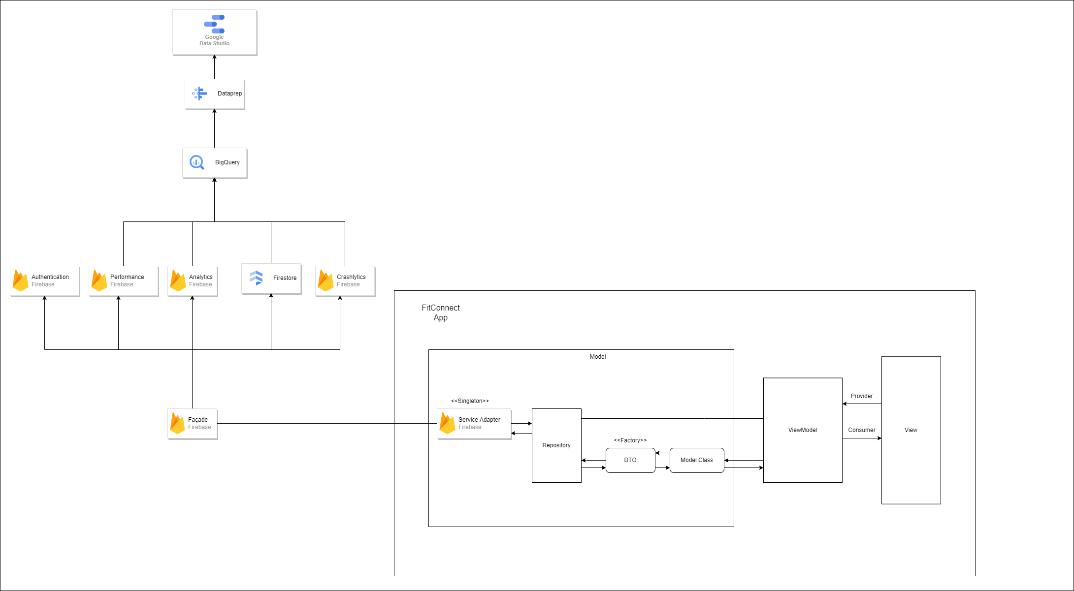
- Java team:
The Java team has opted for the Model-View-ViewModel pattern in their software architecture diagram. The MVVM pattern separates the concerns of an application into three components: the model, the view, and the view model. The model represents the data and business logic of the application, the view represents the user interface, and the view model acts as an intermediary between the view and the model, which makes it easier to update the user interface in response to changes in the model. By separating the concerns of the application in this way, the Java team has made their application more modular, maintainable, and scalable.
In addition, the Java team has implemented the Repository pattern to access Firebase, which provides a layer of abstraction between the database and the application. This allows for easy integration with other data sources in the future. The use of Data Transfer Objects (DTOs) ensures that the model is not tightly coupled to the database structure, making it easier to make changes to the database schema without affecting the application's code. Finally, the Java team has implemented the Singleton pattern to handle the Firebase instance, ensuring that there is only one instance of the database connection in the application and preventing conflicts
- Flutter team:
The Flutter team has decided to use the Model-View-ViewModel (MVVM) pattern with the Provider implementation for their software architecture diagram. The MVVM pattern is similar to the MVC pattern in that it separates the concerns of an application into three components: the model, the view, and the view model. However, in the MVVM pattern, the view model acts as an intermediary between the view and the model, which makes it easier to update the user interface in response to changes in the model. By using Provider, the Flutter team has also ensured that their application is reactive, meaning that the UI updates automatically when the underlying data changes.
As with the Java team's architecture, the Flutter team has implemented the Repository pattern to access Firebase, providing a layer of abstraction between the database and the application. DTOs are used to handle the data and ensure that the model is not tightly coupled to the database structure, and factories are used to handle the construction of DTO and Model classes, providing an additional layer of abstraction and making it easy to add new data types to the application. The Singleton pattern is used to handle the Firebase instance, ensuring that there is only one instance of the database connection in the application and preventing conflicts.
Both the Java and Flutter teams have chosen Firebase as their backend service, which serves as the database for their applications. Firebase provides a number of features such as data storage, crash analytics, performance analytics, and authentication management. By using Firebase, both teams are able to easily store and retrieve data from the cloud, track application usage and performance, and manage user authentication without having to build these functionalities from scratch.
Furthermore, both teams have chosen to process their data using Google's BigQuery service. BigQuery is a fully-managed, serverless data warehouse that allows for easy querying of large datasets. By using BigQuery, both teams are able to analyze and extract insights from their data quickly and efficiently. Moreover, after the data is collected by BigQuery, it needs to be cleaned and preprocessed. To accomplish this, both teams are using Google's Data Prep service to easily clean, reshape, and combine all of the data provided. By using Data Prep, both teams are able to ensure that their data is properly formatted and ready for analysis in BigQuery.
Finally, both teams are using Google's Data Studio to display their data in a user-friendly way. By using Data Studio, both teams are able to easily create visualizations of their data that can be shared with others.
(As with the diagrams, you can click on each image to see them at full resolution)
| Repository | DTO |
|---|---|
 |
 |
| Model | ViewModel |
|---|---|
 |
 |
 {width="500"}
| Factory | Singleton |
|---|---|
 |
 |
| Observer |
|---|
 {width="600"} {width="600"} |
 {width="600"} {width="600"} |
 {width="600"} {width="600"} |
At the Flutter team, we prioritize following the best Git Flow practices by creating separate branches for each feature or fix, which are then merged onto the development branch. Additionally, we link these branches with relevant issues and conduct Pull Request reviews amongst our team members. Our team also engages in discussions such as the one found at this link.  {width="700"}
 {width="500"}
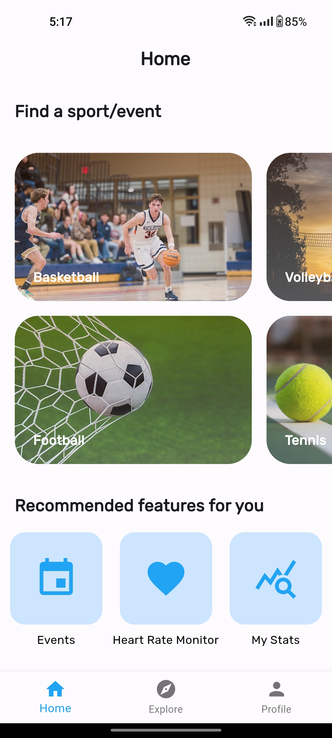
- Home View
- Stats view and features (Type 2 BQs display)
- Profile View
- BPM Monitor view and features
- Firebase Singleton implementation
- Leave event feature
- Assigned issues
- Merge requests
- Authentication view and features (Login/signup)
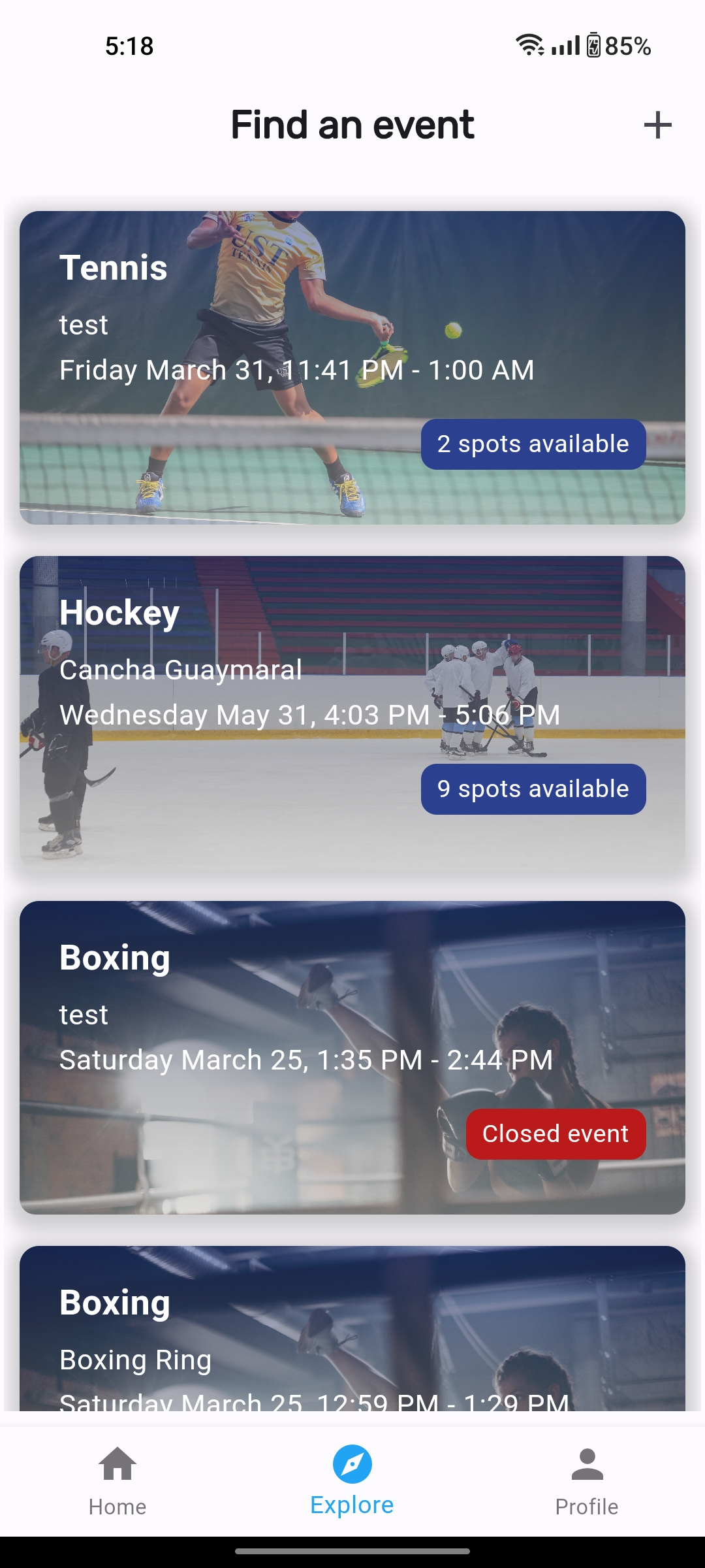
- List Events view
- User model, DTO and Repository implementation
- Icon selection and importing
- Firebase Performance Dashboard Integration: (BQ type 1) Which are the local features that take the longest time to execute compared to the average execution time? Which part in the code is causing this performance impact?
- Assigned issues
- Merge requests
- Create Event view and features
- Event details view and features
- Event model, DTO and Repository implementation
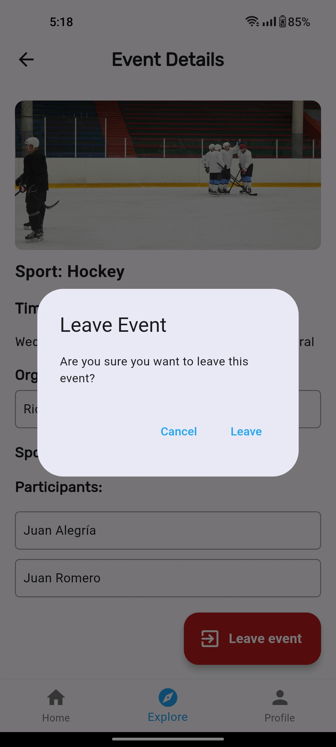
- Join event feature
- (BQ type 1) How many times has the app crashed over the past week? Which elements are causing the crashes?
- Assigned issues
- Merge requests
- Auth features and views (login/signup)
- Crashlytics and performance analysis feature (BQ type 1).
- MVVM implementation
- Singleton implementation
- Models, DTO and repository implementation
- Context aware feature: Landscape and vertical design depending of orientation.
- Assigned issues
- Merge issues
- Design pattern implemented: Observer (BrightnessController, BrightnessObserver)
- View implemented: ProfileActivity (activity_profile.xml)
- ViewModels implemented: PhotoViewModel, UserViewModel
- Repositories implemented: PhotoRepository, UserRepository
- Context aware functionality: Change the brightness of the screen depending on the brightness.
- Functionalities using sensors: Taking a photo to change the user picture. Change the brightness of the screen depending on the brightness
- Functionality that uses external services (different from authentication): Uploading user photo to Firebase Storage.
- Merge requests
In this YouTube link you can check our ethical thoughts about our project.
| Log In | Sign Up | Home 1 | Home 2! |
|---|---|---|---|
 |
 |
 |
 |
| Profile | List Events | Create Event | Event Details |
|---|---|---|---|
 |
 |
 |
 |
| Event Details (joined) | Leave Event | BPM Monitor (disabled) | BPM Monitor (enabled) |
|---|---|---|---|
 |
 |
 |
 |
Stats View
{width="250"}! {width="250"}!
The mobile app aims to address the problem of "Difficulties finding people to practice a sport" by providing a platform that connects Uniandes students with other like-minded individuals interested in sports. The app provides users with a range of tools and features to help them overcome logistical and social barriers, making it easier to engage in regular physical activity and pursue athletic interests. By fostering a sense of community, the app can encourage ongoing engagement in physical activity, which can lead to improved physical and mental health. The value proposal of the app is to provide users with a convenient and efficient way to connect with others who share similar interests, find and book available sports facilities, and receive relevant notifications about their preferred sports activities, all in one place.
Furthermore, regarding smart features help a lot with the value proposition by providing users with a more personalized, efficient, and engaging experience. For instance, the Real Time Facility Availability feature helps users make informed decisions about when and where to engage in physical activity, reducing scheduling conflicts and minimizing wait times, while the Personalized Sports Recommendations feature helps users discover new sports or activities and find compatible sports partners based on their preferences and activity history. Both features increase user satisfaction and loyalty to the app and can help users achieve their fitness goals.
On another hand, Context Aware features can help to add value to the app's proposition by providing personalized recommendations based on the real time context of the app. For example, one of these features could suggest the best time of day to engage in physical activity, based on the real time tracking of current sports events. Additionally, another CAS feature such as Friends' Activity Tracking could identify and suggest specific times to play sports based on the user's Friends real time event activities.
After prototyping our new screens for a while, we made the decision to change the color palette.

The color palette chosen for this solution statement includes 5 distinct colors:
- 0x20A4F3 (a bright blue)
- 091540 (a dark blue)
- DC602E (a deep orange/red)
- FF8750 (a lighter, more muted orange)
- FFFFFF (white)
The bright blue color (#0x20A4F3) was chosen as the primary color for the app, as it conveys a sense of energy, excitement, and innovation, which may be appealing to potential users. It also represents the idea of being connected and in motion, which is appropriate for a sports-oriented app.
The dark blue (#091540) may be used to provide contrast or to indicate secondary information or navigation elements. As a darker color, it may also help reduce eye strain and improve readability in low-light environments.
The deep orange/red (#DC602E) and lighter, more muted orange (#FF8750) likely represent the idea of movement, warmth, and enthusiasm, which aligns with the app's purpose of promoting physical activity and creating a sense of community. These colors also provide visual contrast and can help draw attention to specific areas of the app or calls to action.
Finally, the use of white (#FFFFFF) may help create a sense of cleanliness, simplicity, and ease of use for the app, which can be especially important for user interfaces. It can also help to balance out the brighter, more energetic colors used elsewhere in the app's design.
For our application we have decided to use the fonts Roboto and Nunito for our texts and titles.
Using a combination of Roboto and Nunito fonts in a our app can create a visually engaging and clear user interface. Roboto is a modern sans-serif font that is easy to read and great for headings, while Nunito is a rounded sans-serif font that is friendly and approachable, and suitable for body text. Together, they can create a visual hierarchy that helps guide the user's attention to important information while maintaining a friendly and approachable feel. The combination of these fonts can help to break up long blocks of text and create a more dynamic and visually interesting interface that is easy to use and navigate.
https://m3.material.io/styles/typography/overview
Post MS6 Edit: In the end, after careful consideration we decided to switch the secondary font Nunito for Rubik since it shared most of Nunito's characteristics, but it was easier to use and implement. Furthermore, some Material UI articles recommended Rubik over Nunito.
For our app we're planning on using Material UI Icons because they can improve the user experience by making it easier for users to identify and interact with different parts of the interface. These icons have a simple and intuitive design that is easily recognizable and universally understood. Incorporating Material UI icons can also help to create a consistent and cohesive design language throughout the application, complementing the overall visual style and creating a polished and professional look. Overall, using Material UI icons is a smart choice for a sports and fitness application, as it can improve usability and visual appeal.
https://m3.material.io/styles/icons/overview
Our sports app is going to use bottom navigation combined with the movement by pressing sections on a screen for several reasons. First, it allows for easy and quick navigation throughout the app, making it simple for users to find the features they need. With the home screen serving as a central hub to access subsections like joining an event, opening exercise guides, or reserving a court, the bottom navigation bar offers a convenient way to switch between these subsections. Additionally, the movement by pressing sections on a screen adds an intuitive and interactive element to the navigation, making it feel more natural and engaging for users. By combining these two navigation patterns, users will be able to seamlessly move through the app and access the features they need with minimal effort. Finally, the inclusion of a profile section in the bottom navigation bar allows users to quickly access and manage their account information, further streamlining the overall user experience.
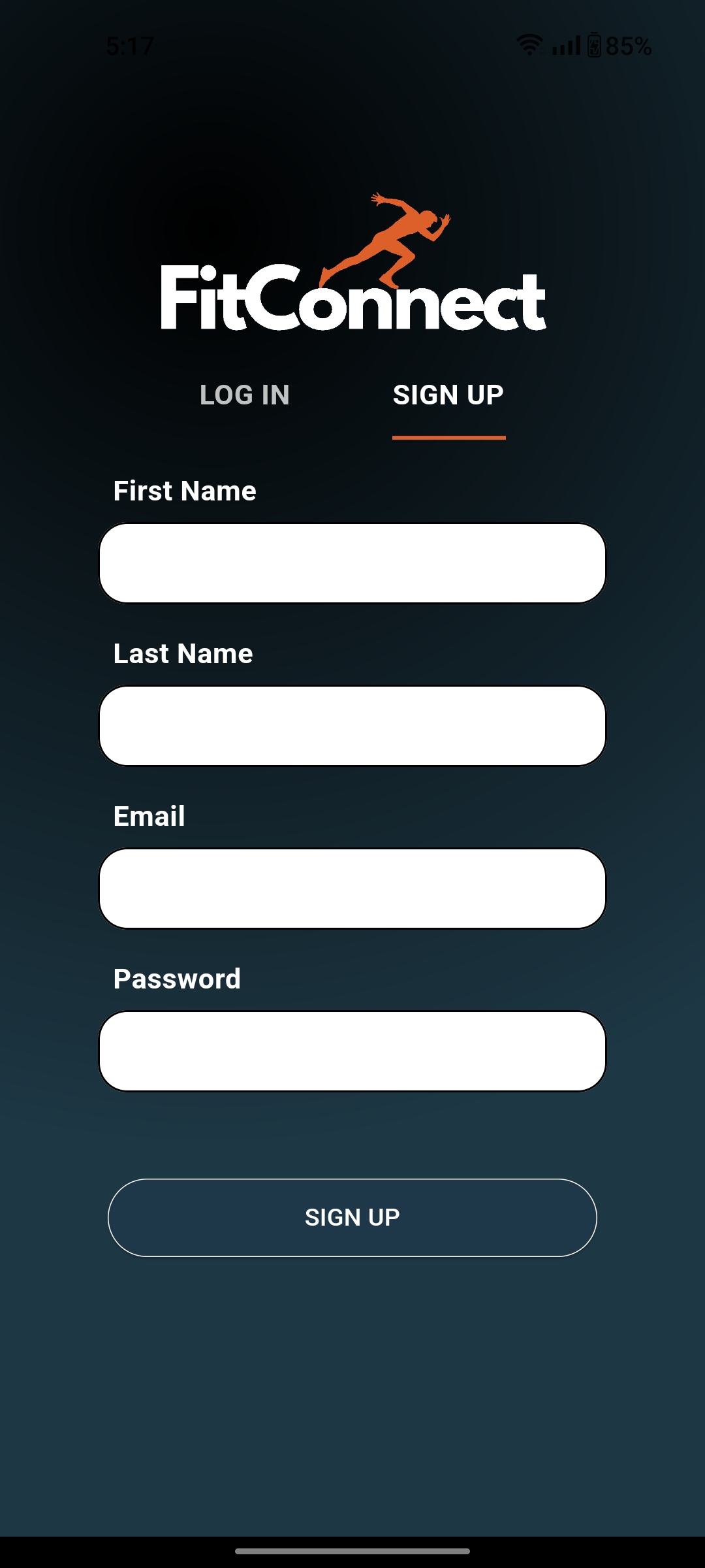
For this microsprint we have designed 10 different app views. All of these were created and developed by the whole group. The specific views are the following:
| Sign In | Sign Up | Home |
|---|---|---|
 |
 |
 |
| Profile | Edit Profile | Event List |
|---|---|---|
 |
 |
 |
| Create Event | Event Details | Exercise Guide List | Exercise Details |
|---|---|---|---|
 |
 |
 |
|
You can check out the native digital prototype here.