updates sections for board members, adds scss file + a little trick or treat fun #132
Conversation
|
Looks like something got broken w/ the mobile first queries: EDIT: If my browser is behaving, this will need some repositioning, though |
|
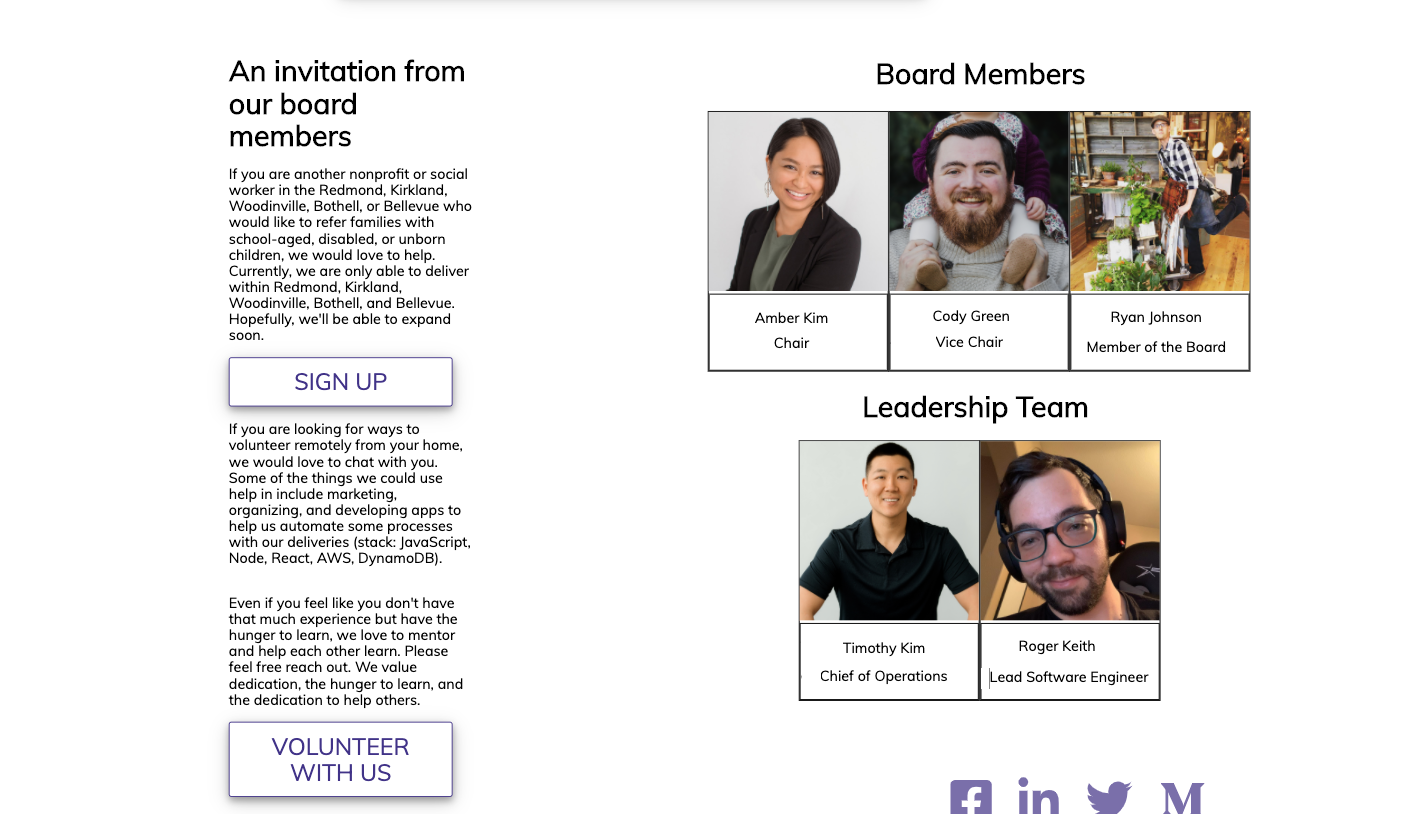
Can you doublecheck this. The profiles are spilling over the width of the page for me.
|
|
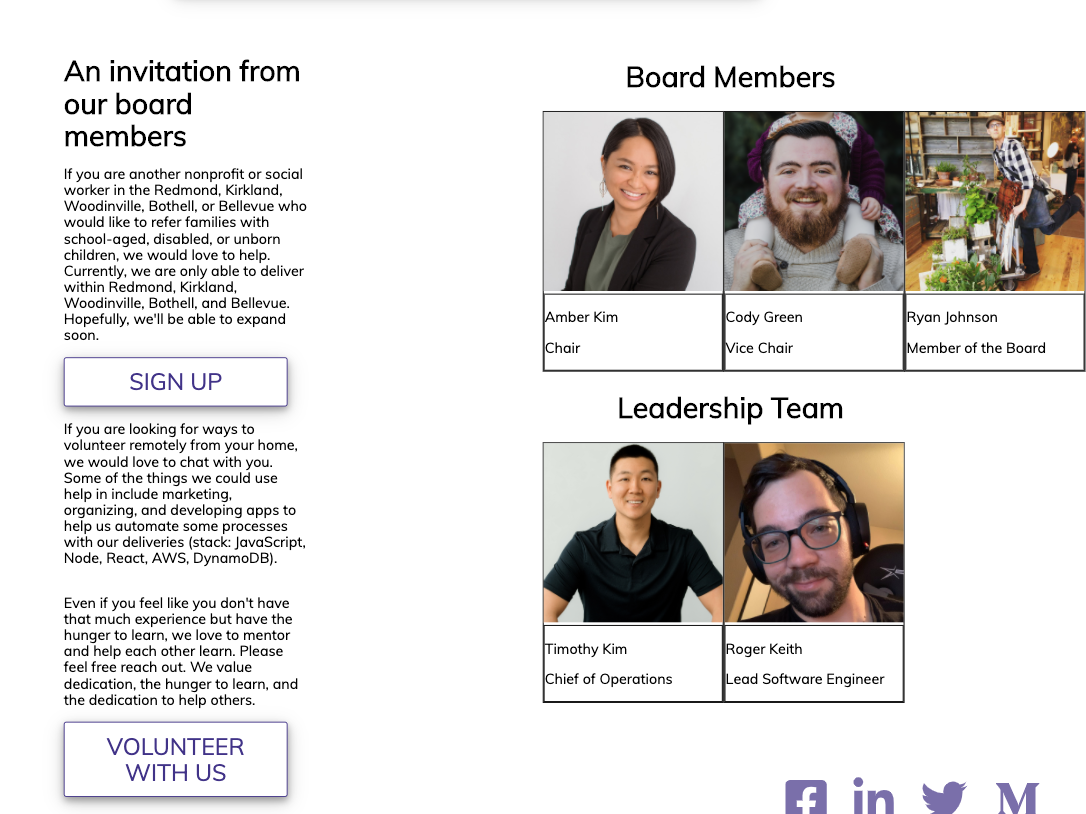
@rhtaylor Are you seeing this on your end? If so, can you get rid of the padding on the left on mobile so that it's more balanced? I don't remember if talked about this one. Not seeing the icons vertical on the iPad. But am seeing it on iPad horizontal and it's disrupting the flow of everything on the page. I think if we're going to have it vertical, it should be vertical for all screens and out of the document flow so that it floats on top and doesn't mess w/ the positioning of everything else. I'm seeing use of flexbox and display block, so it's still in the flow. It would probably be good to move it out into its own component as well. Otherwise, if removing it from the flow gets too complicated, let's keep it unobtrusive at the bottom. Having it switch it between will get us into trouble w/ screen size changes in between different devices and between device versions. Document Flow: https://soulandwolf.com.au/blog/what-is-document-flow/ |
… .links-container for ipadPro
|
@rhtaylor Much improved on mobile. 👏 Some more feedback and refinement
The funkiness at the bottom for larger screens is still overflowing to the right. You can see the border of the top bar ending earlier than the screen. This is probably a matter of the widths of paddings, margins, element widths, and borders, not adding up to more than 100% of the total width. We can also work to center the icons on bigger screens. |
| </a> | ||
| </div> | ||
| </section> | ||
| <BoardMembers /> |
There was a problem hiding this comment.
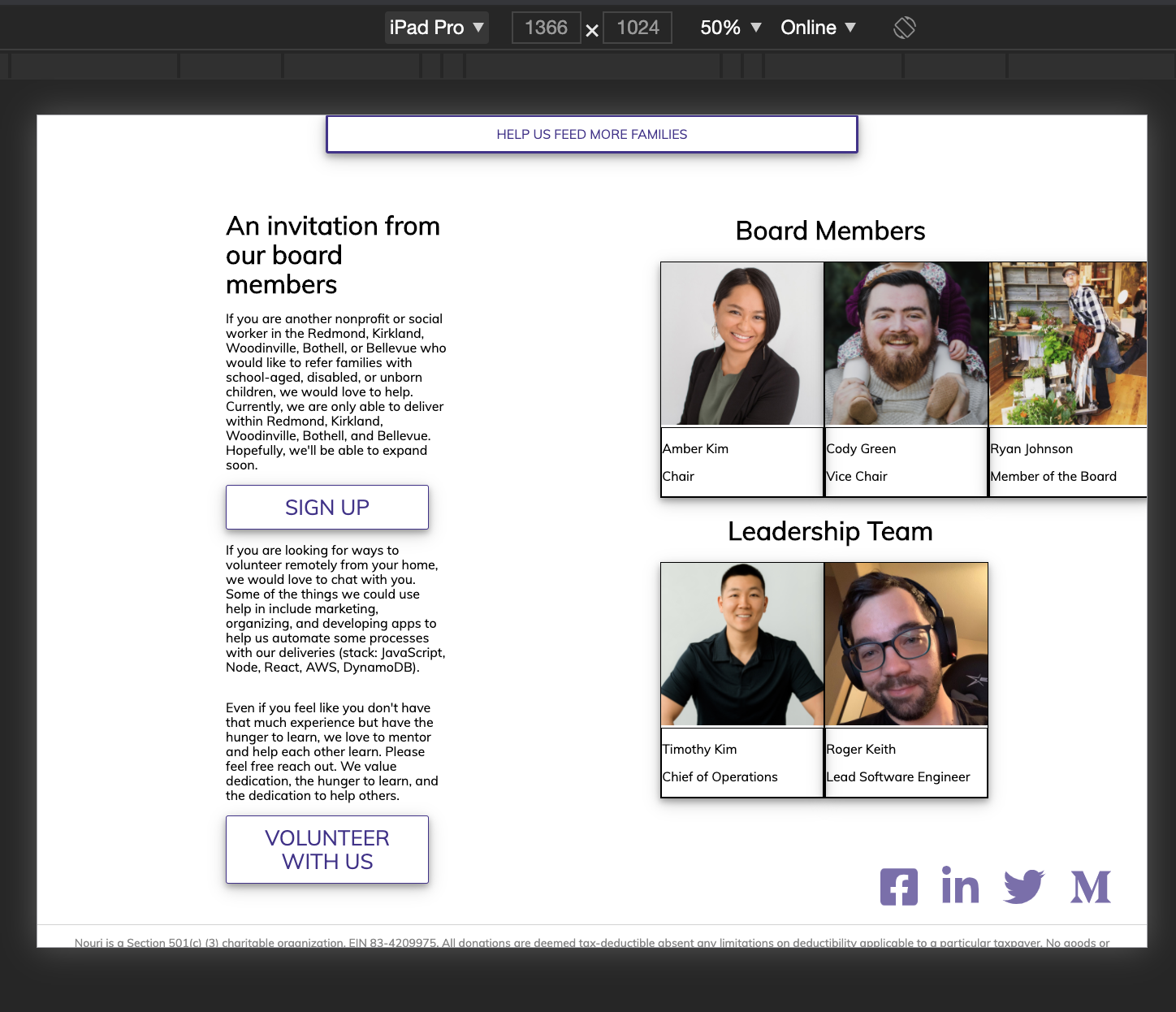
It would probably better to include this in the section as this whole part can be considered one section:
The div that encompasses the paragraphs and the pictures can then be removed.
There was a problem hiding this comment.
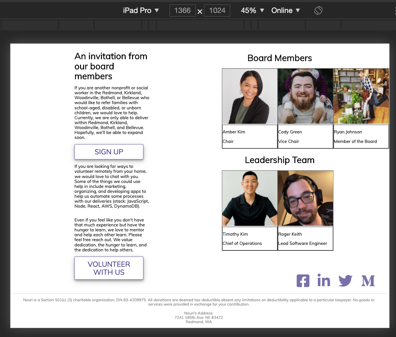
Is it just me or does anyone else think the pics and words should be centered?
There was a problem hiding this comment.
@RaevLogic Are you talking about the text justification or the whole section being off? There is padding that's pushing and making the section off.
There was a problem hiding this comment.
I just edited it in Paint 3D real quick so it's not perfect, but that's more what I was thinking if we're splitting it in two sections like this.
There was a problem hiding this comment.
Two sections being the section with paragraphs and the section with all of our pictures.
There was a problem hiding this comment.
The only thing I don't like about this from a UI perspective is the split vision aspect. I find it awkward for our SPA to read down as a single column for the majority of the page, and then hit this portion and it's a two-column design where I have to read down the paragraphs and then go back up the page to visually scan back down the pictures section.
There was a problem hiding this comment.
🤷♀️I'm good with either one or two columns. I think if we have them stacked, I would put the pictures on top and then the text below.
There was a problem hiding this comment.
I think we can stick w/ the 2 column for now (unless it gets too annoying for you @rhtaylor ) and then create a new task for 1 column if we want to redesign to that.
There was a problem hiding this comment.
Lol, I'm not exactly a designer over here. Just letting everyone know my thoughts so I'm not wondering if I should have said something for two weeks xD
There was a problem hiding this comment.
Constructive feedback is always good. If it can improve user experience, we should think about it.
| } | ||
| } | ||
|
|
||
| .volunteer-content { |
There was a problem hiding this comment.
Duplicate class name from boardmember.scss
There was a problem hiding this comment.
I am thinking this was due to the nesting nature of scss. I believe the class name will have different attributes if it has a different parent so to speak.
There was a problem hiding this comment.
Even if they are in different components and React will automate some things once everything has been processed, it's still good practice to be clearer and more intentional about avoiding collisions w/ naming.
| @media only screen and (max-width: 430px){ | ||
| display: none; | ||
| } | ||
| .volunteer-content{ |
There was a problem hiding this comment.
Duplicate class name from volunteer.scss
There was a problem hiding this comment.
For example, on here we are inside the board member scss and not volunteer content. So it's unclear why we are using "volunteer" here.
| <button className='btn-container'>volunteer with us</button> | ||
| </a> | ||
| </div> | ||
| <h1 className='volunteer-title'>{SECTION_TITLE}</h1> |
There was a problem hiding this comment.
Is this class name being used in css anywhere?
There was a problem hiding this comment.
I believe this is being used. If not it was intended to be used and was never implemented as I was not on the team when the volunteer sections were created.
There was a problem hiding this comment.
No need to keep it if it's not being used.
| <div className='main'> | ||
| <div className='volunteer-content'> | ||
|
|
||
| <h1 className='volunteer-title'>Board Members</h1> |
There was a problem hiding this comment.
Is this class name being used in css anywhere?
There was a problem hiding this comment.
If you are referring to className 'main' then yes. The others were created before I joined the team.
There was a problem hiding this comment.
This one is about the "volunteer-title". Same as above.
| margin: auto; | ||
| width: 40%; | ||
| margin: auto; | ||
| padding-left: 20vh; |
There was a problem hiding this comment.
This is causing the left padding which adds to things being pushed too far to the right.
There was a problem hiding this comment.
I thought I took care of the extra space in the padding?
There was a problem hiding this comment.
This is still causing the issue on my end. Removing it removes the extra padding
With the padding:
Without:
There was a problem hiding this comment.
If you've removed this, can you double check that you pushed your local changes up. I'm still seeing this here on github
| return ( | ||
| <div> | ||
| <> | ||
| <div className='links-container'> |
There was a problem hiding this comment.
I think this links container can actually be put inside the footer tag since it's part of the whole footer. You will have to readjust the styling but the separation between areas of the page will be clearer.
There was a problem hiding this comment.
You would also be able to remove the fragment that surrounds the footer.
There was a problem hiding this comment.
I'm seeing a new span tag added to replace the <> or
There was a problem hiding this comment.
Yes I used a span tag. If you want the elements totally I believe react will let me use an array to wrap the elements in [,
] for example. I don't know how well that would work but worth a try.
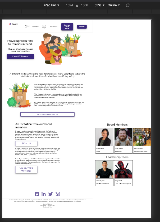
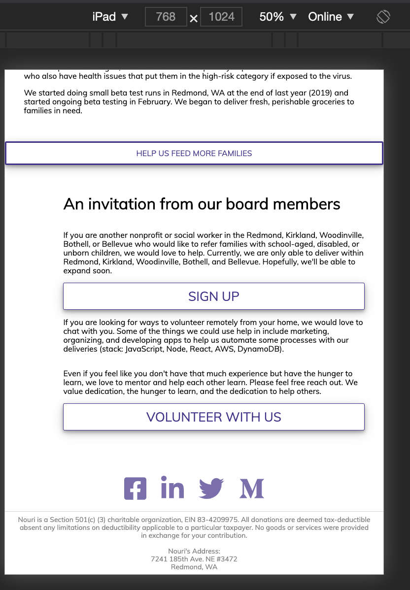
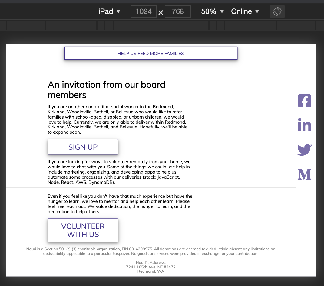
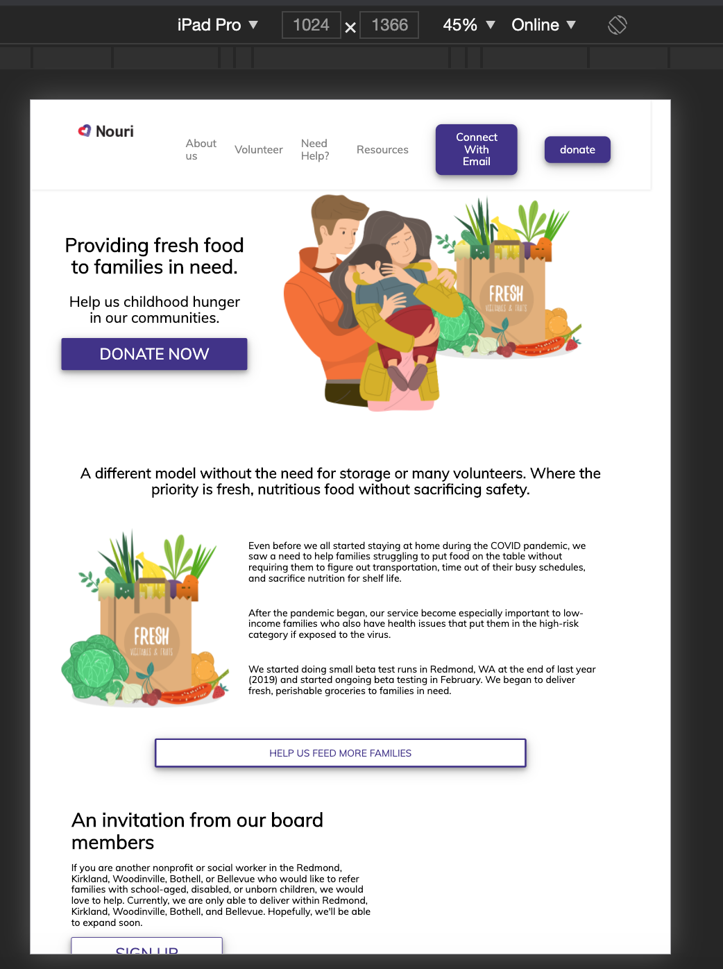
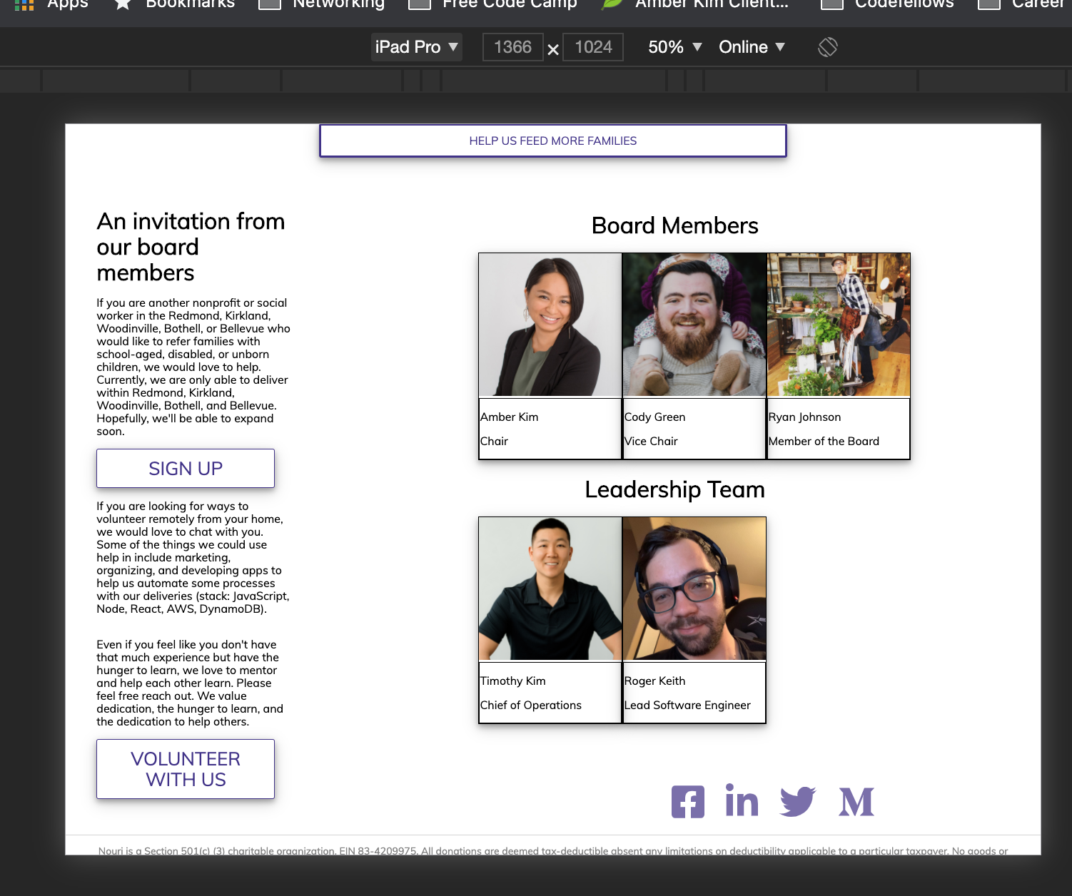
This updates the site to have a new division for "Board Members" and "Leadership on the dev team".
A new jsx component is added with additional scss to section the webpage.
Closes #<Issue Number 89>
This is not perfect but just for a little Halloween fun I created a PR. It needs some additional minor scss spacing correction. However works with mobile.