updates sections for board members, adds scss file + a little trick or treat fun #132
There are no files selected for viewing
| Original file line number | Diff line number | Diff line change |
|---|---|---|
| @@ -0,0 +1,65 @@ | ||
| import React from 'react' | ||
| import './volunteer.scss' | ||
| import './boardmembers.scss' | ||
| /* IMAGES */ | ||
| import johnson from '../../../images/johnson.jpg' | ||
| import kim from '../../../images/kim.jpg' | ||
| import timKim from '../../../images/tim-kim.jpg' | ||
| import green from '../../../images/green.jpg' | ||
| import roger from '../../../images/roger.jpg' | ||
| export const BoardMembers = () => { | ||
| return ( | ||
| <div className='main'> | ||
| <div className='volunteer-content'> | ||
|
|
||
| <h1 className='volunteer-title'>Board Members</h1> | ||
|
Member
There was a problem hiding this comment. Is this class name being used in css anywhere?
Contributor
Author
There was a problem hiding this comment. If you are referring to className 'main' then yes. The others were created before I joined the team.
Member
There was a problem hiding this comment. This one is about the "volunteer-title". Same as above. |
||
| <div className='board'> | ||
| <div className='individual'> | ||
| <img src={kim} alt='board-img' /> | ||
| <div className='text-div'> | ||
| <p>Amber Kim</p> | ||
| <p>Chair</p> | ||
| </div> | ||
| </div> | ||
|
|
||
| <div className='individual'> | ||
| <img src={green} alt='board-img' /> | ||
| <div className='text-div'> | ||
| <p>Cody Green</p> | ||
| <p>Vice Chair</p> | ||
| </div> | ||
| </div> | ||
| <div className='individual'> | ||
| <img src={johnson} alt='board-img' /> | ||
| <div className='text-div'> | ||
| <p>Ryan Johnson</p> | ||
| <p>Member of the Board</p> | ||
| </div> | ||
| </div> | ||
|
|
||
| </div> | ||
| <div id='team'> | ||
| <h1 className='volunteer-title'>Leadership Team</h1> | ||
| <div className='board'> | ||
| <div className='individual'> | ||
| <img src={timKim} alt='board-img' /> | ||
| <div className='text-div'> | ||
| <p>Timothy Kim</p> | ||
| <p>Chief of Operations</p> | ||
| </div> | ||
| </div> | ||
|
|
||
| <div className='individual'> | ||
| <img src={roger} alt='deadpool' /> | ||
| <div className='text-div'> | ||
| <p>Roger Keith</p> | ||
| <p>Lead Software Engineer</p> | ||
| </div> | ||
|
|
||
| </div> | ||
| </div> | ||
| </div> | ||
| </div> | ||
| </div> | ||
| ) | ||
| } | ||
| Original file line number | Diff line number | Diff line change |
|---|---|---|
| @@ -1,11 +1,6 @@ | ||
| import React from 'react' | ||
| import './volunteer.scss' | ||
| import { BoardMembers } from './BoardMembers.jsx' | ||
|
|
||
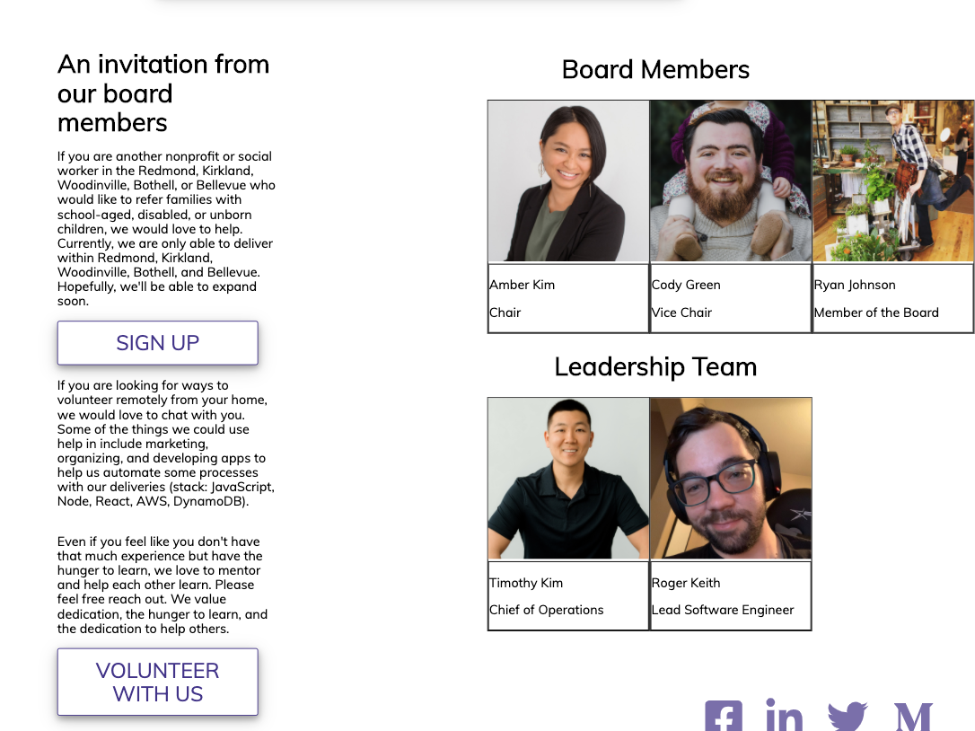
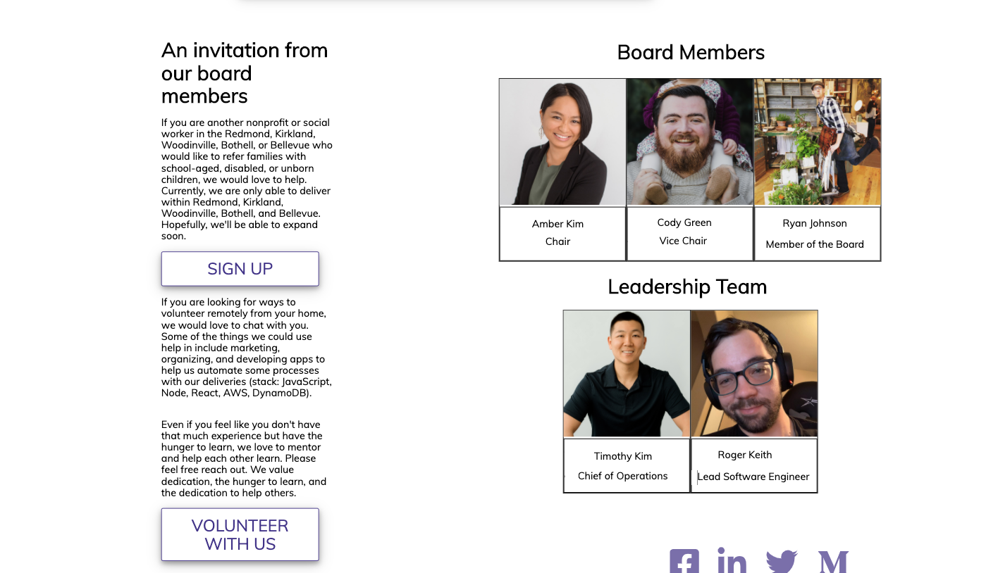
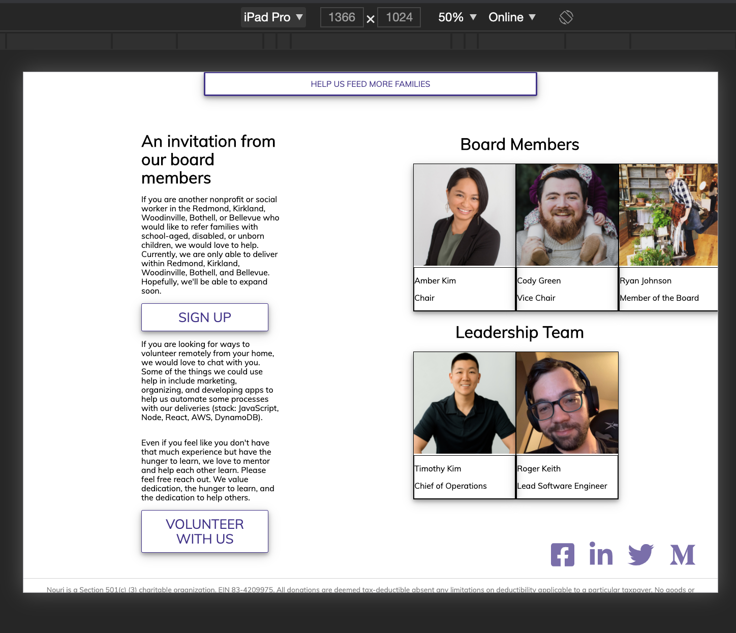
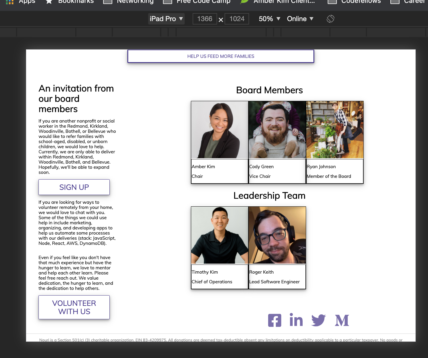
| const CONTENT1 = 'If you are another nonprofit or social worker in the Redmond, Kirkland, Woodinville, Bothell, or Bellevue who would like to refer families with school-aged, disabled, or unborn children, we would love to help. Currently, we are only able to deliver within Redmond, Kirkland, Woodinville, Bothell, and Bellevue. Hopefully, we\'ll be able to expand soon.' | ||
| const CONTENT2 = 'If you are looking for ways to volunteer remotely from your home, we would love to chat with you. Some of the things we could use help in include marketing, organizing, and developing apps to help us automate some processes with our deliveries (stack: JavaScript, Node, React, AWS, DynamoDB).' | ||
|
|
@@ -14,52 +9,24 @@ const SECTION_TITLE = 'An invitation from our board members' | |
|
|
||
| export const Volunteer = () => { | ||
| return ( | ||
| <span> | ||
| <section id='volunteer'> | ||
|
|
||
| <div className='volunteer-content'> | ||
|
|
||
| <h1 className='volunteer-title'>{SECTION_TITLE}</h1> | ||
|
Member
There was a problem hiding this comment. Is this class name being used in css anywhere?
Contributor
Author
There was a problem hiding this comment. I believe this is being used. If not it was intended to be used and was never implemented as I was not on the team when the volunteer sections were created.
Member
There was a problem hiding this comment. No need to keep it if it's not being used. |
||
| <p>{CONTENT1}</p> | ||
| <a href='https://docs.google.com/forms/d/e/1FAIpQLScEOOuZ1iZw9IWbsiWc1AX3OHhFQ4wpxYs_TZHyykx2glsrFw/viewform' target='_blank' rel='noopener noreferrer'><button className='btn-container'>Sign Up</button></a> | ||
| <p>{CONTENT2}</p> | ||
| <p>{CONTENT3}</p> | ||
|
|
||
| <a href='https://docs.google.com/forms/d/e/1FAIpQLSd9N1_wWETbeMs7UAxzUTCMl0FhCnVneozlA-EMAMQXSBFy3A/viewform' target='_blank' rel='noopener noreferrer'> | ||
| <button className='btn-container'>volunteer with us</button> | ||
| </a> | ||
| </div> | ||
| </section> | ||
| <BoardMembers /> | ||
|
Member
There was a problem hiding this comment. It would probably better to include this in the section as this whole part can be considered one section: The div that encompasses the paragraphs and the pictures can then be removed.
Contributor
There was a problem hiding this comment. Is it just me or does anyone else think the pics and words should be centered?
Member
There was a problem hiding this comment. @RaevLogic Are you talking about the text justification or the whole section being off? There is padding that's pushing and making the section off.
Contributor
There was a problem hiding this comment.
Contributor
There was a problem hiding this comment. Two sections being the section with paragraphs and the section with all of our pictures.
Contributor
There was a problem hiding this comment. The only thing I don't like about this from a UI perspective is the split vision aspect. I find it awkward for our SPA to read down as a single column for the majority of the page, and then hit this portion and it's a two-column design where I have to read down the paragraphs and then go back up the page to visually scan back down the pictures section.
Member
There was a problem hiding this comment. 🤷♀️I'm good with either one or two columns. I think if we have them stacked, I would put the pictures on top and then the text below.
Member
There was a problem hiding this comment. I think we can stick w/ the 2 column for now (unless it gets too annoying for you @rhtaylor ) and then create a new task for 1 column if we want to redesign to that.
Contributor
There was a problem hiding this comment. Lol, I'm not exactly a designer over here. Just letting everyone know my thoughts so I'm not wondering if I should have said something for two weeks xD
Member
There was a problem hiding this comment. Constructive feedback is always good. If it can improve user experience, we should think about it. |
||
|
|
||
| </span> | ||
| ) | ||
| } | ||
| Original file line number | Diff line number | Diff line change |
|---|---|---|
| @@ -0,0 +1,77 @@ | ||
| .main{ | ||
| @media only screen and (max-width: 768px){ | ||
| display: block; | ||
| width: 30ev; | ||
| height: 20ev; | ||
| .volunteer-content{ | ||
| margin:auto; | ||
|
|
||
| } | ||
| .board{ | ||
| margin: auto; | ||
| } | ||
| } | ||
| @media only screen and (max-width: 1024px){ | ||
| display: flex; | ||
| width: 30ev; | ||
| height: 20ev; | ||
|
|
||
| } | ||
| display: flex; | ||
| direction: row; | ||
| @media only screen and (max-width: 430px){ | ||
| display: none; | ||
| } | ||
| .volunteer-content{ | ||
|
Member
There was a problem hiding this comment. Duplicate class name from volunteer.scss
Member
There was a problem hiding this comment. For example, on here we are inside the board member scss and not volunteer content. So it's unclear why we are using "volunteer" here. |
||
| width: 70%; | ||
| h1{ | ||
| text-align: center} | ||
| .board{ | ||
| display: flex; | ||
| direction: row; | ||
| align-content: center; | ||
| align-self: center; | ||
| width: 500px; | ||
| @media only screen and (max-width: 1024px){ | ||
| width: 250px; | ||
| } | ||
| #team{ | ||
| flex: 2; | ||
| align-items: center; | ||
| //float: right; | ||
|
|
||
|
|
||
| } | ||
| img{ | ||
| @media only screen and (max-width: 1024px) { | ||
| width: 100px; | ||
| height: 100px; | ||
| } | ||
| width: 200px; | ||
| height: 200px; | ||
| } | ||
| div{ | ||
| border: 1px solid #000; | ||
| // padding: 0 5px; | ||
|
|
||
| } | ||
| } | ||
|
|
||
| } } | ||
|
|
||
| .individual{ | ||
| width: 250px; | ||
| height: 250px; | ||
| box-shadow: 0 4px 8px 0 rgba(0, 0, 0, 0.3), 0 6px 20px 0 rgba(0, 0, 0, 0.19); | ||
| p{ | ||
| font-size: 16px; | ||
| } | ||
| .text-div { | ||
| //position: absolute; | ||
| bottom: 15px; | ||
| width: 90px; | ||
| color: white; | ||
| background-color: rgba(0, 0, 0, 0.75); | ||
| padding: 5px; } | ||
|
|
||
| } | ||
There was a problem hiding this comment.
Choose a reason for hiding this comment
The reason will be displayed to describe this comment to others. Learn more.
I think this links container can actually be put inside the footer tag since it's part of the whole footer. You will have to readjust the styling but the separation between areas of the page will be clearer.
There was a problem hiding this comment.
Choose a reason for hiding this comment
The reason will be displayed to describe this comment to others. Learn more.
You would also be able to remove the fragment that surrounds the footer.
There was a problem hiding this comment.
Choose a reason for hiding this comment
The reason will be displayed to describe this comment to others. Learn more.
Done!
There was a problem hiding this comment.
Choose a reason for hiding this comment
The reason will be displayed to describe this comment to others. Learn more.
I'm seeing a new span tag added to replace the <> or
There was a problem hiding this comment.
Choose a reason for hiding this comment
The reason will be displayed to describe this comment to others. Learn more.
Yes I used a span tag. If you want the elements totally I believe react will let me use an array to wrap the elements in [,
] for example. I don't know how well that would work but worth a try.