-
Notifications
You must be signed in to change notification settings - Fork 13
Introduction
- Pretzel Introduction / Workshop - Notes
Note on the login page : Forgotten your password? Reset Password This sends an email to the email address you enter, with a password reset URL. Clicking on the URL enables you to enter a new password for that email address.
- login
Initial display is the 'Map Viewer' https://plantinformatics.io/mapview
-
Main areas :
- left panel : select datasets
- middle panel : graph display
- right panel : information about features
-
Dataset structure :
Pretzel's key concept is to connect datasets across different platforms / scales / species / institutions.
The Pretzel data structure distills the common elements across these diverse sources, reducing them to 3 :
- Dataset / Block / Feature
Data is organised in datasets, which contain blocks (usually chromosomes but can be eg: linkage groups) and then features within blocks
- left panel
- Datasources : connect to additional Pretzel data servers to view multi-source data combined in a single graph
- Datasets : select datasets with the Dataset Explorer
Data can be accessed from multiple Pretzel servers. This tab lists connected data sources and provides a button to add/connect additional data sources.
This button in the header tab of panel components enables them to be minimised, to gain more screen space for other components :
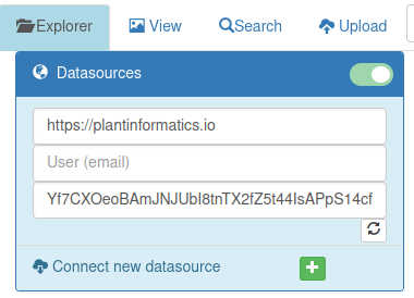
After minimising the Data Sources component, only the header tab remains visible :

For an explanation of how to simultaneously view datasets from multiple Pretzel servers, see Multiple Pretzel Data Sources.
The Dataset Explorer is shown in the left panel, and is the default view when Pretzel is opened. At the top of the Dataset Explorer are :
- a refresh button
- an expand/collapse button to enable viewing the component
- Search Filter
- buttons for the data sources; these are used to change between data sources (Pretzel servers), and the colour corresponds to the coloured circle which is shown beside the axis title when multiple data sources are in use.


Text typed into the search filter will be matched against the names of datasets, and those matching will be displayed in the dataset explorer. To show all datasets, simply clear the search filter input field. Multiple keywords may be entered, separated by spaces. Datasets will be listed if their names match all or any of the keywords.
The toggle buttons select whether the search filter is :
- case sensitive
- match all / any

Initially the explorer shows the 'All Datasets' tab, and it reverts to this tab after changing the search filter.
The 'All Datasets' tab lists the datasets, optionally filtered by the search filter.
Clicking on the
 button expands the dataset to show the chromosomes / Blocks which it contains data for.
The other tabs are shown if there are datasets in that category which match the search filter.
list of genetic maps, with a
 beside each; click on the
 to see the list of chromosomes or linkage groups in the genetic map.

Beside each chromosome name a green [+]
 is shown, click on this to add that chromosome of the genetic map to the graph view.

datasets are grouped by reference assembly, and then by chromosome; click on the
 to expand these;
the 3rd level lists the datasets which provide data within that scope (reference : chromosome : )
These have a
 beside them : click on it to add that chromosome of the dataset to the graph view
This tab lists all datasets, with a simple 2-level dataset / chromosome structure. It has an ellipsis menu with some ownership controls :

If the search filter narrows the list of datasets to a small enough list, then the datasets will automatically be expanded, showing all chromosomes. It is also possible to expand the chromosome list for all datasets using :

This button is a toggle : click it again to collapse all datasets.
The details of the currently-selected dataset are shown in the right panel :
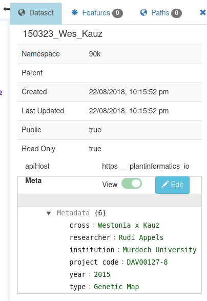
Clicking on a dataset in the Dataset Explorer will select it, as will clicking on the axis title or brshing the axis.
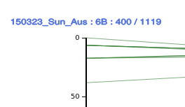
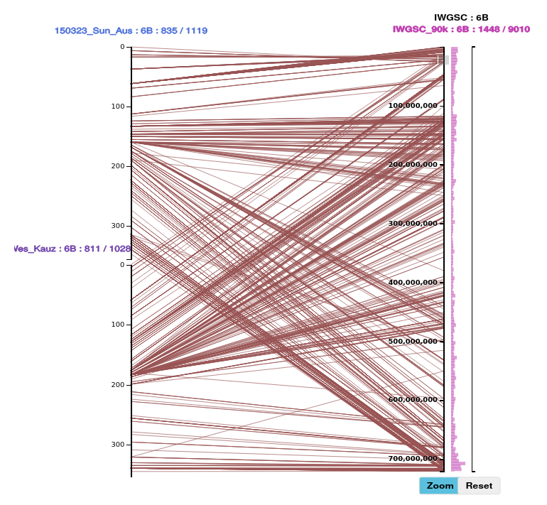
The axis title shows the names of datasets displayed on the axis, and counts of features loaded / total for each dataset:chromosome (block). For example, a genetic map :
For the axis of a reference assembly, the axis title shows the reference and lists the datasets displayed on the axis :

The menu will display either the full name of the dataset, or a shortName if one is defined in the dataset metadata, which can be set in the Metadata worksheet when uploading.
Clicking on the axis title displays the axis title menu, which has controls to close, flip and open the axis.

For the axis of a reference assembly, the axis title has for each dataset a control to remove that dataset:chromosome from the axis view.

(In SVG the lines between axes are implemented as elements, and hence we tend to refer to the alignments as paths)
The alignment paths between axes are based on either matching of feature names, which may be :
- direct (green) : exactly the same name
- alias (brown) : the feature names are different, but there is an alias which indicates that the names are equivalent. This may be a literal equivalence (2 names for the same thing), or a functional equivalence (2 features which are closely related).
Pretzel allows datasets to define namespaces which provide a scope for Feature names. An example of a namespace is 90k. Within a namespace, 2 features (markers) are the same if they have the same name (or can be matched by alias, because markers sometimes have several names).
The alignment query matches by namespace + name, so a 90k marker can't match with a gene, whose name is in a different namespace, e.g. "Triticum_aestivum_IWGSC_RefSeq_v1.0:Triticum_aestivum_IWGSC_RefSeq_v1.0_HC_annotation"
That namespace name is a combination of the reference name "Triticum_aestivum_IWGSC_RefSeq_v1.0" and the type of data of the dataset "Triticum_aestivum_IWGSC_RefSeq_v1.0_HC_annotation", i.e. High Confidence gene annotation.
So gene names from different references or different gene annotations won't match directly; Pretzel also allows datasets to define aliases which allow Features with different names, in different namespaces, to be matched. This concept of "aliases" handles the difference of Gene IDs between genomes. One way to collate aliases is to align the protein sequence of genes e.g. in genome 1 with those in genome 2, and consider them “equivalent” above some threshold. This allows Pretzel to align between species, e.g. align IWGSC 7A HC genes with the genes in rice (Oryza sativa) 6 and 8.
The axis may be opened by clicking this button in the axis title menu :

The split axis displays a track for each dataset displayed on the axis. The track content changes as you zoom in, to display increasing level of resolution / detail. Initially, when zoomed out, it displays feature counts, then after zooming in past a threshold (View : Binned Feature Counts : Threshold), it shows individual features. The detail increases as you zoom in, i.e. more features are requested from the server to maintain a useful density of information. This is controlled by Paths : Sample : default 400, which also controls how many paths are requested and displayed.

To select a section of the axis, move the mouse cursor over the axis, click and hold the left mouse button, drag it vertically to identify a region, then release the mouse button. We use the term brushing to describe this (the graphic element which is sensitive to this action is called the brush).

This will select the features in this region. They are highlighted on the axis with red circles. As necessary to make up the expected number of features it will send a request to the server for more features in this region for those datasets.
The number of features and paths selected will be shown in the right panel :
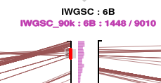
Click on the Features tab to see the table of selected features :

Click on the Paths tab to see the table of selected paths :

The width of the right panel can be adjusted by moving the mouse cursor over this resize symbol
 , holding down Shift, clicking with the left mouse button and dragging left / right.
Scroll the table slightly side-to-side to update its width to fill out the increased width of the right panel.
Click on the Zoom button to zoom in to the brushed region.


To re-arrange axes : move the mouse cursor over the axis, hold Ctrl, click and hold the left mouse button, drag it to the next position, or to the target zone which is highlighted on the other axes, for stacking.
It is possible to make a rectangle selection, e.g. click in the Features table and Ctrl-A to 'Select All', the Ctrl-C to Copy the selection, and then paste into another application such as MS Excel. If pasted in a text editor the format will be TSV (tab-separated values); this can be used to paste into the upload (CSV) table.
The same methods of copy/paste as for the Features Table can be used in the Paths Table, and also there is a 'CSV Download' button :

As described earlier, the amount of information shown on the axes, alignment paths, features table and paths table is controlled by the 'Paths : Sample' slider in the left View panel. To get all information available in the displayed scope, which is useful for data export, use the 'Get all brushed paths' button.
Screen grabs are normally PNG, which is a bitmap format so it is pixelated when zooming in.
The Pretzel Graph is SVG, which is a vector format, and zooming in shows greater detail - the resolution is much higher (limited by the number precision of CPU / language).
It is possible to save the Pretzel graph display as an SVG using a browser extension :
Also (Chrome) : 'svg-grabber', 'Export SVG with Style'